
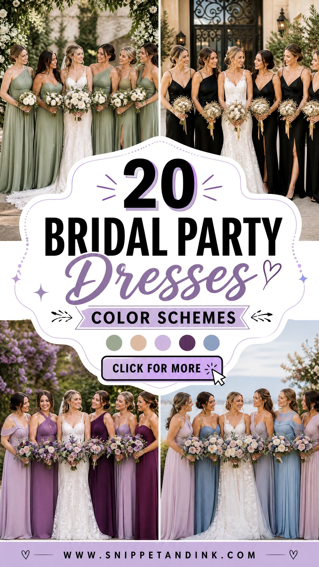
A bridal party palette is more than one pretty shade. It has to sit well against the venue, the season, the flowers, the fabrics and, above all, the skin tones of the people wearing it. Mixed palettes have largely replaced identical dresses, which gives attendants room to pick shades and silhouettes that flatter them. Cohesion can come from a shared fabric, matching accessories, coordinated bouquets or several shades from one color family. I spend most of a wedding day looking at these colors through a lens, so for each of the twenty combinations below I’ve added a note on how it behaves in real light, next to dresses, shoes, jewelry, flowers and the settings it suits.
Testing a Palette in the Light You Will Actually Get
A swatch on a shop counter tells you very little. Fabric color changes with the light it’s seen in, and a wedding day moves through several kinds of light. I ask couples to work out where the group photos will happen and at what time, then judge colors in matching conditions.
- Midday sun outdoors flattens pastels toward white and makes saturated colors glare. Muted mid-tones survive it best.
- Open shade and overcast skies are cool and even. Blues and greens look true, but warm neutrals can turn grey.
- Late afternoon light warms everything. Earthy and golden palettes look their richest; icy blues lose some crispness.
- Indoor tungsten and candlelight push colors yellow. Lavender, dusty blue and silver can drift, so view swatches under warm bulbs.
- Window light in a church or hall is soft but can be dim, which darkens deep greens, navy and burgundy.
My simple test: lay all the swatches together and photograph them on your phone outside at the ceremony time, then again under a lamp at night. If two shades merge or one looks wrong in either photo, change it now.
1. Sage Green And Champagne Bridal Party Dresses
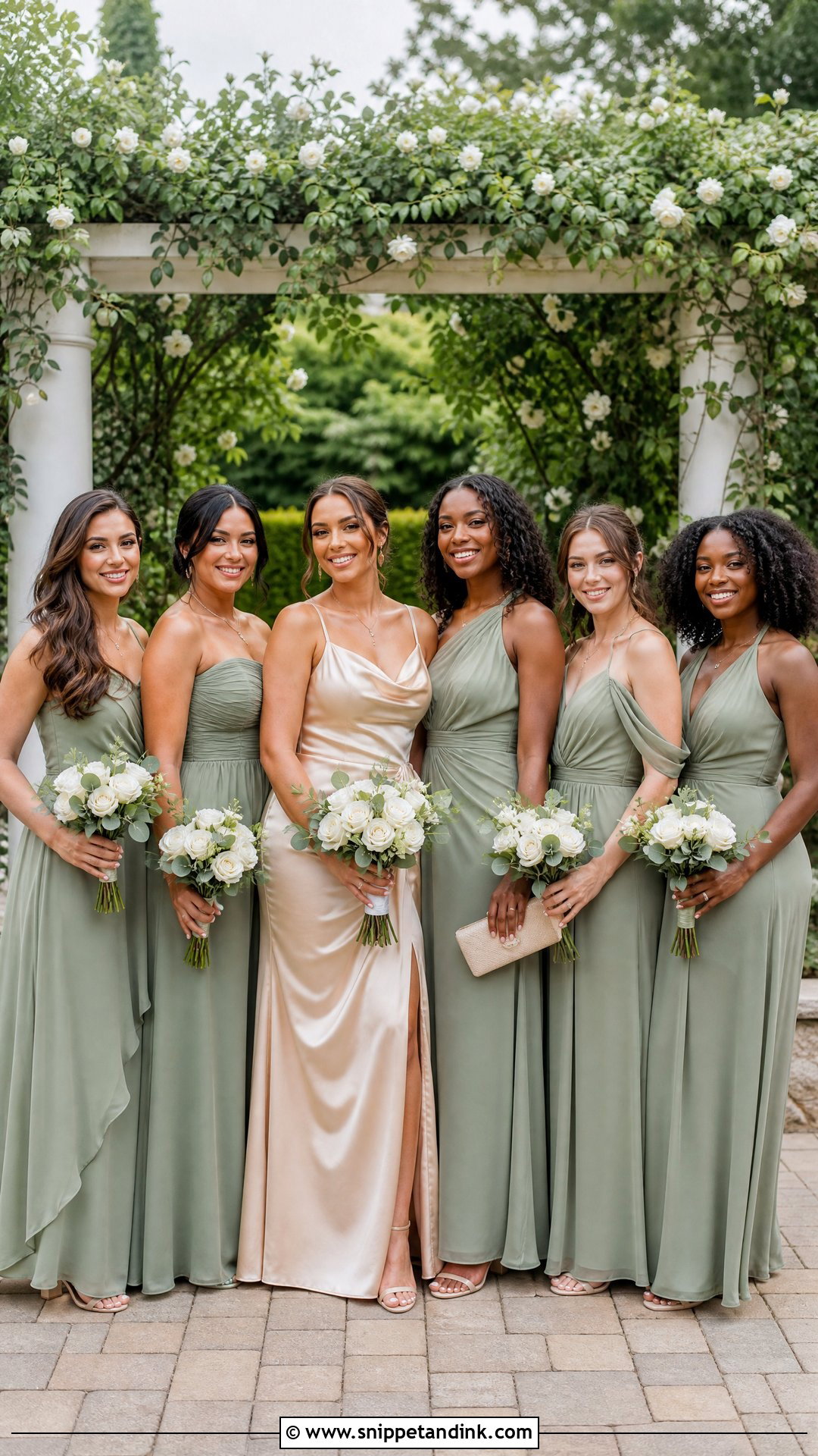
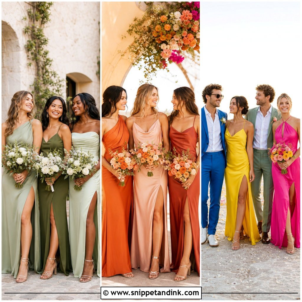
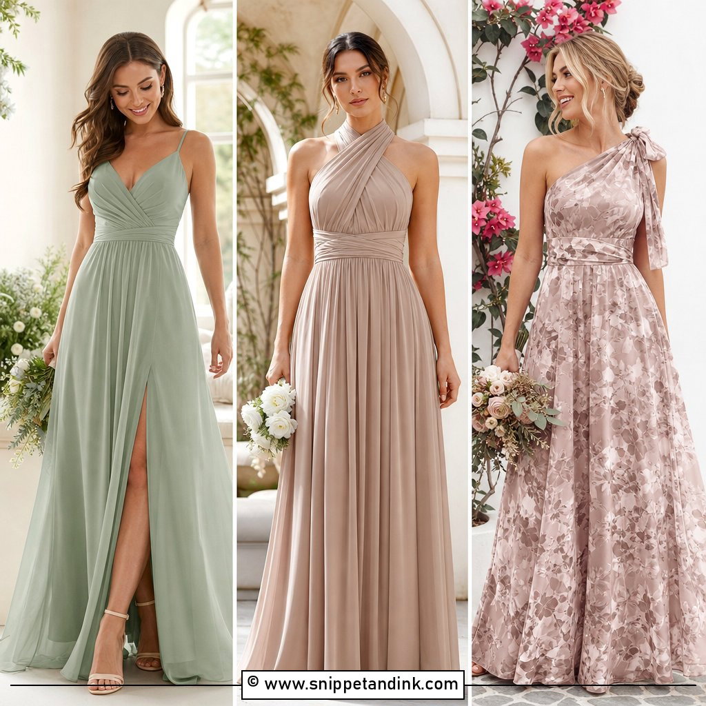
Sage and champagne is one of the easiest palettes to photograph, because neither color fights skin tones or competes with the bride’s white. Dress most attendants in muted sage chiffon or satin and put the maid of honor in champagne, or alternate the two and repeat them in ribbons and bouquets. Floor-length suits formal venues; sage midis suit daytime gardens. Nude block heels, fine gold jewelry and small champagne clutches finish it, with white roses, eucalyptus and pale foliage tying it together. One caution from behind the camera: sage can look grey under overcast skies, so pick a sage with visible green in it rather than the palest version.
2. Dusty Blue And Slate Bridal Party Dresses
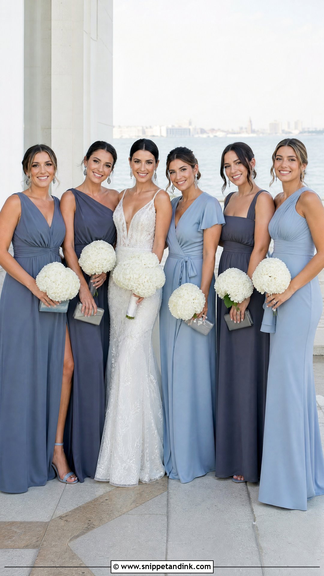
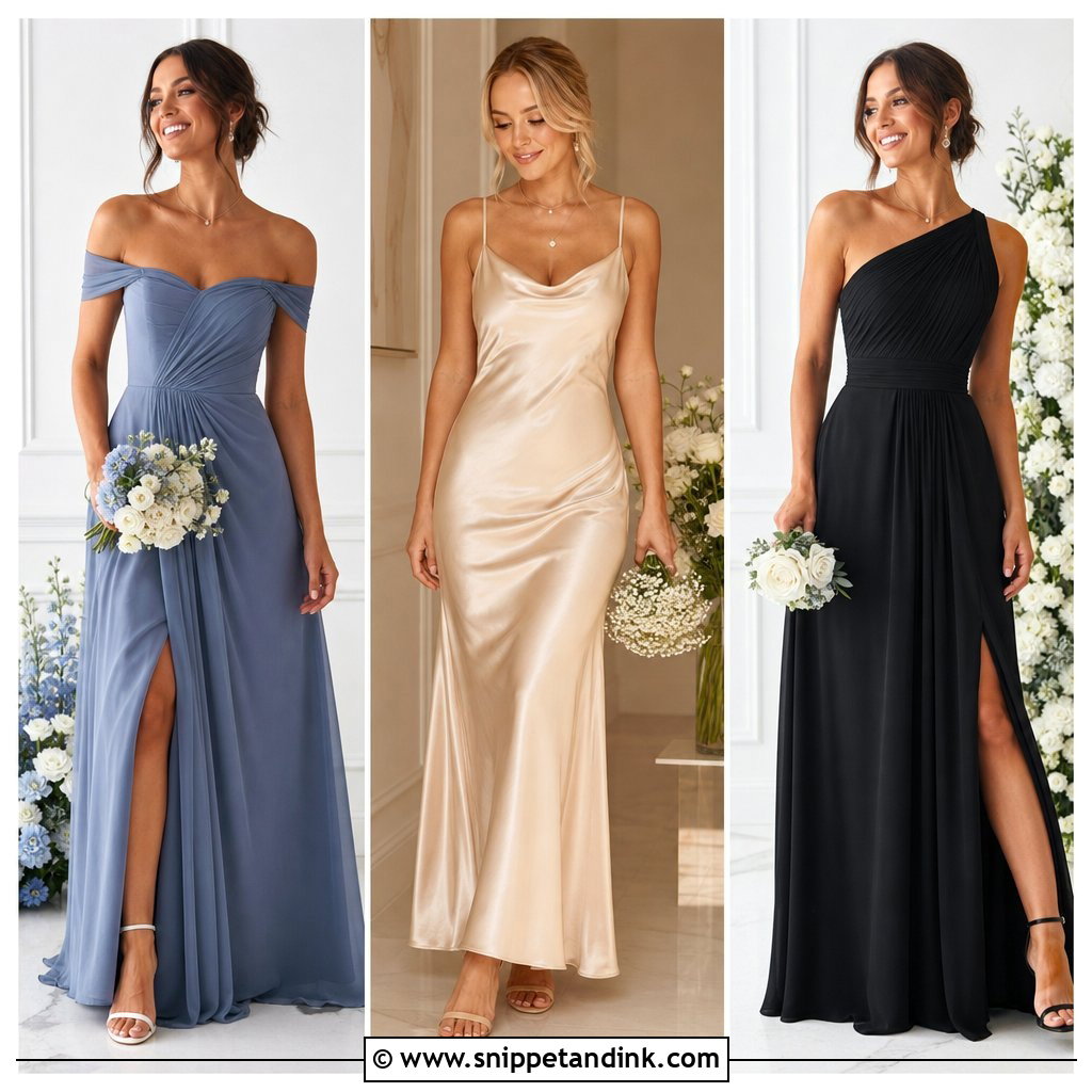
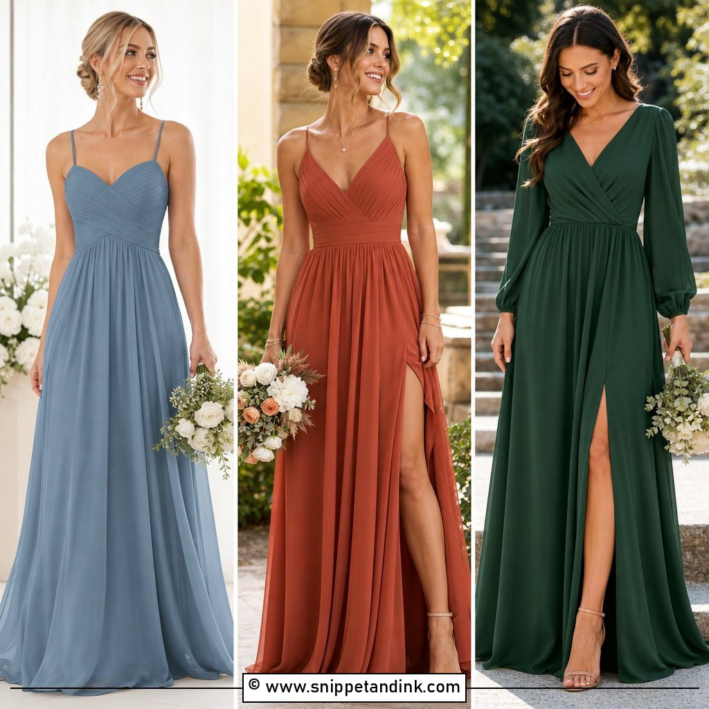
Dusty blue and slate give enough contrast for depth while staying calm. Put lighter dusty blue in chiffon and deeper slate in satin, velvet or the maid of honor’s gown. Silver earrings, soft grey clutches and blue-grey heels keep everything cool-toned, and attendants can mix wrap, one-shoulder and square-neck shapes. White hydrangeas, delphiniums and eucalyptus make natural bouquet partners. Cool blues look fresh by water and in bright ballrooms, but in warm indoor lighting, under tungsten bulbs or candles, dusty blue can drift toward grey-green. I’d check the swatch under the actual reception lighting. The shades also coordinate with navy or light grey suits, linking both sides of the party.
3. Blush And Mauve Bridal Party Dresses
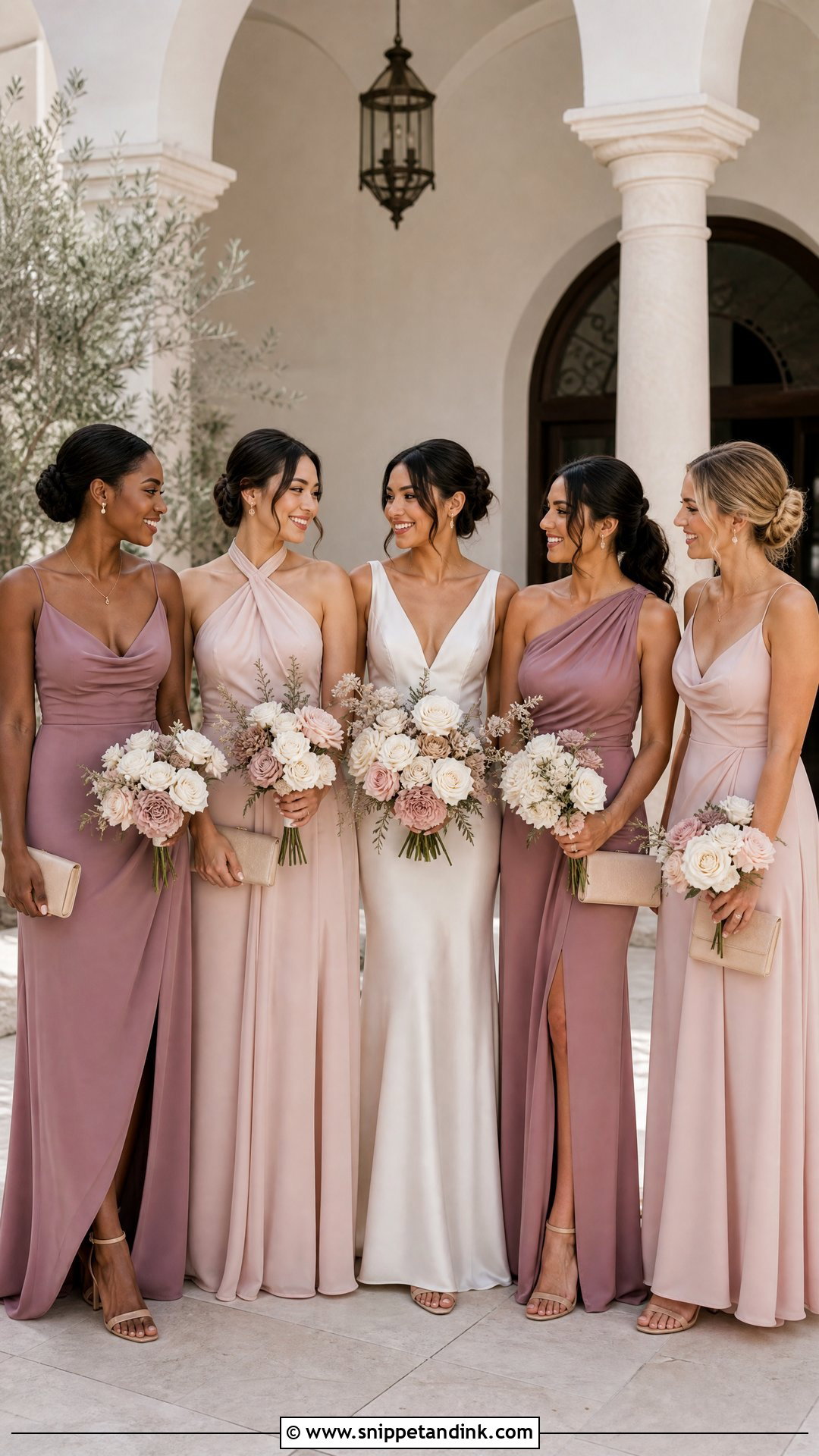
Blush on its own tends to disappear in bright sun; the camera reads it as almost white. Adding mauve fixes that, giving the group depth and keeping the lighter dresses visible. Use pale blush in soft chiffon and medium mauve in satin, crepe or velvet. Rose-gold jewelry, nude heels and compact neutral clutches keep it refined, and avoiding bright pink accessories keeps attention on the dresses. Attendants can choose different cuts as long as one detail repeats, such as a floor-length hem or gathered bodice. Ivory roses, dusty pink blooms and muted greenery suit the bouquets. Blush also flatters most skin tones up close, which matters in the portraits more than people realise.
4. Terracotta And Rust Bridal Party Dresses
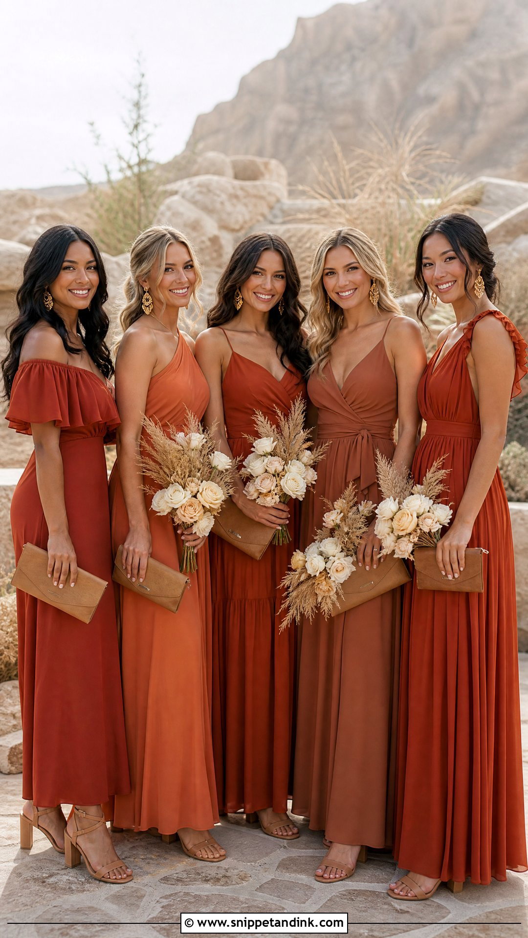
Terracotta and rust give a warm, earthy look that glows against stone, wood, dry grass and autumn leaves. Combine clay-toned chiffon with deeper rust satin rather than forcing one shade on everyone, and add one or two cinnamon dresses in a large group to bridge the jump between them. Tan block heels, brushed-gold earrings and caramel clutches continue the color story, with cream flowers, rust blooms, olive branches and dried accents in the bouquets. Late-afternoon light makes these colors look richer than anything else on this list. Keep the shapes simple, slip dresses, wraps and draped maxis, since the colors already carry the look.
5. Emerald And Forest Green Bridal Party Dresses
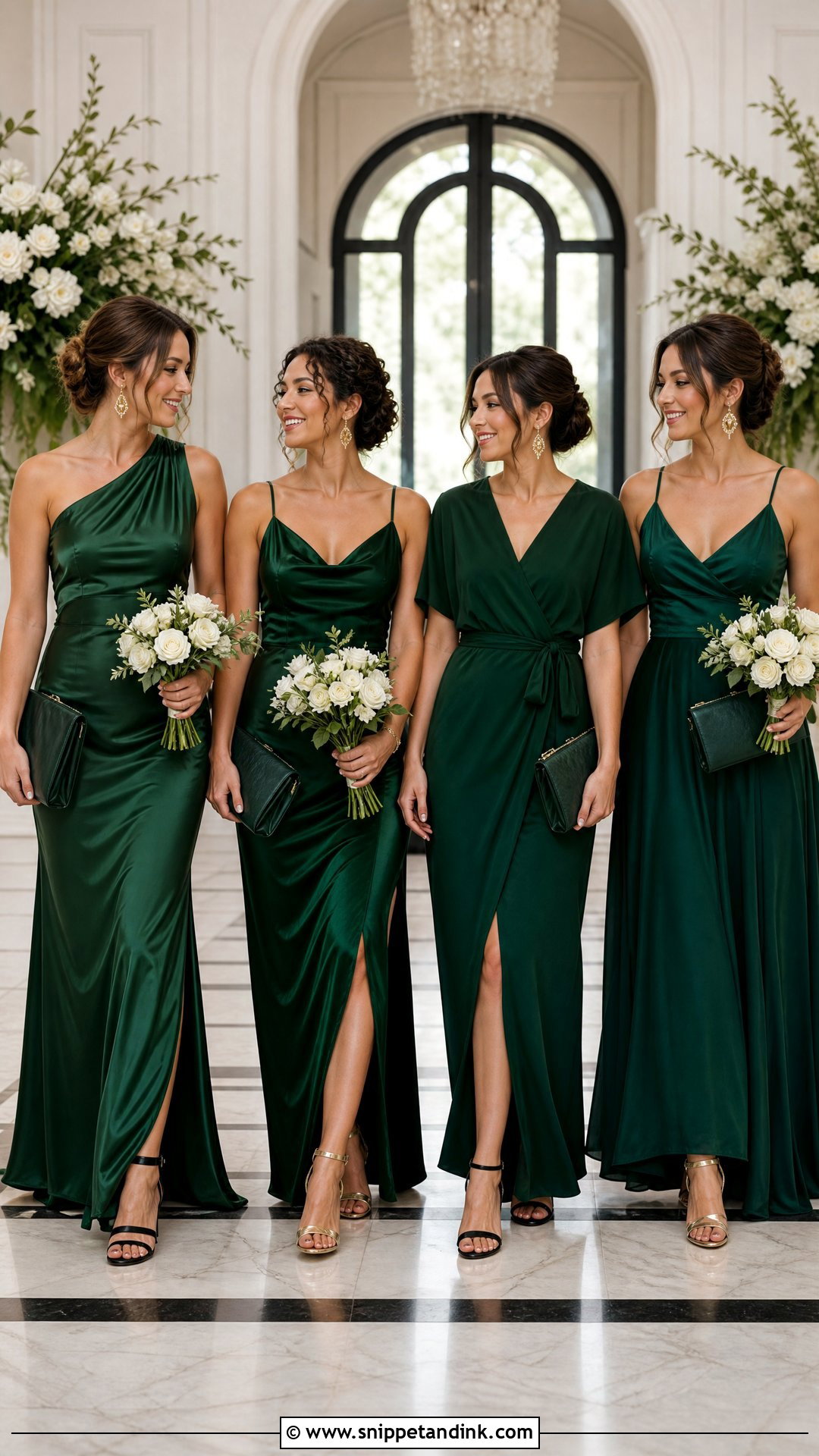
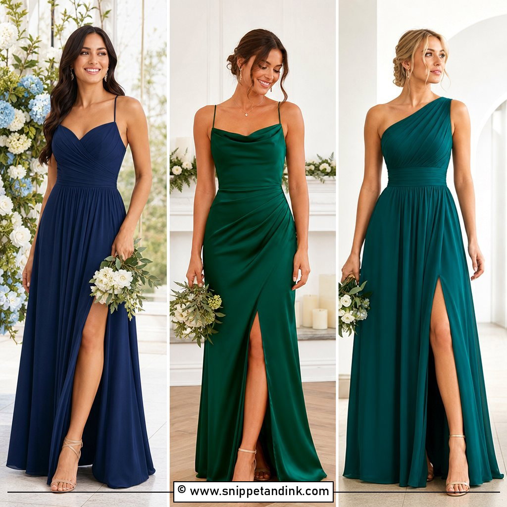
Deep greens look rich and confident, but they need light. Emerald is the brighter jewel tone, forest green the darker anchor; alternate them across the group or keep emerald for the maid of honor. Satin brings out both shades, and velvet suits colder months. Gold drop earrings, black or metallic heels and structured dark green clutches finish the dresses, with white flowers, deep greenery and a touch of burgundy for contrast. In a dim church or a wooded venue, forest green velvet can read almost black on camera, so I’d keep it for venues with good window light or plan for flash. Keep fabric and hem length consistent while necklines vary.
6. Black And Champagne Bridal Party Dresses
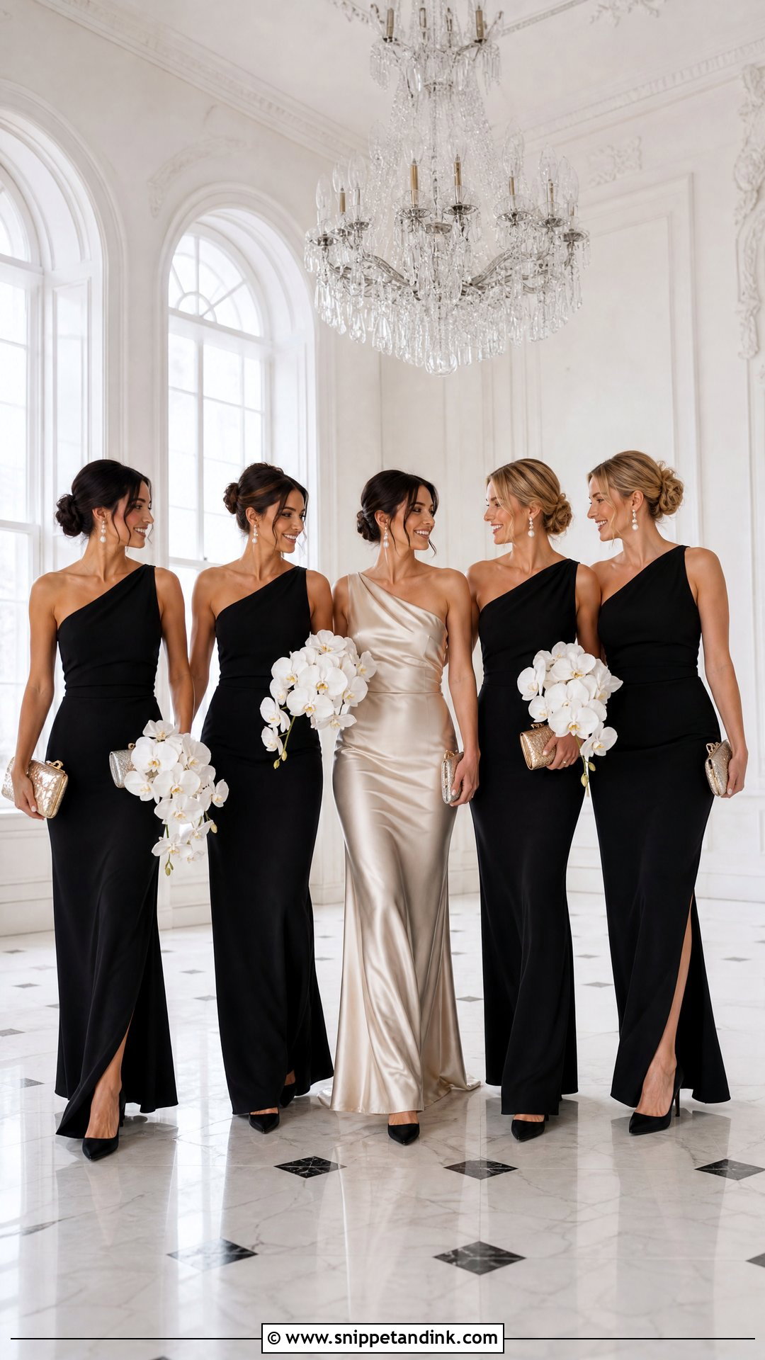
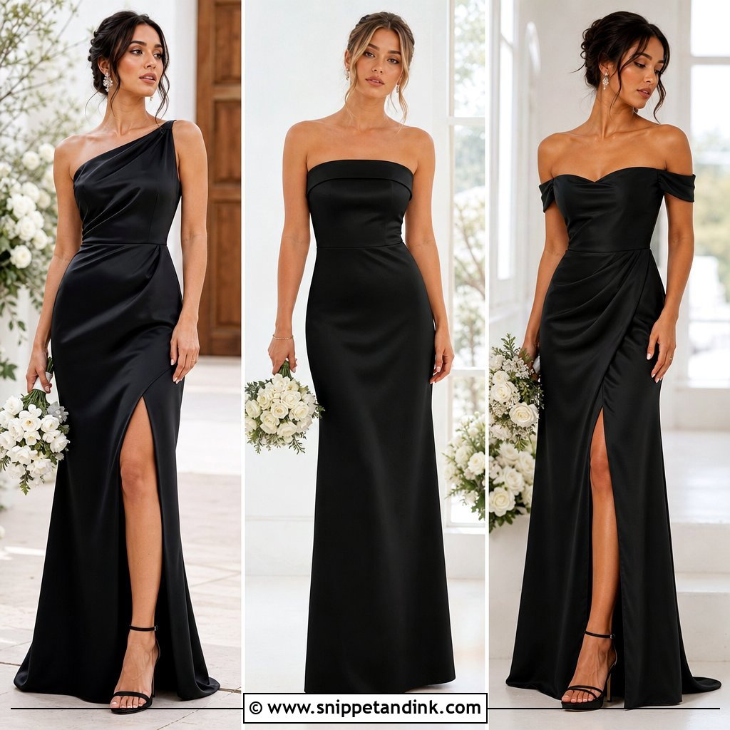
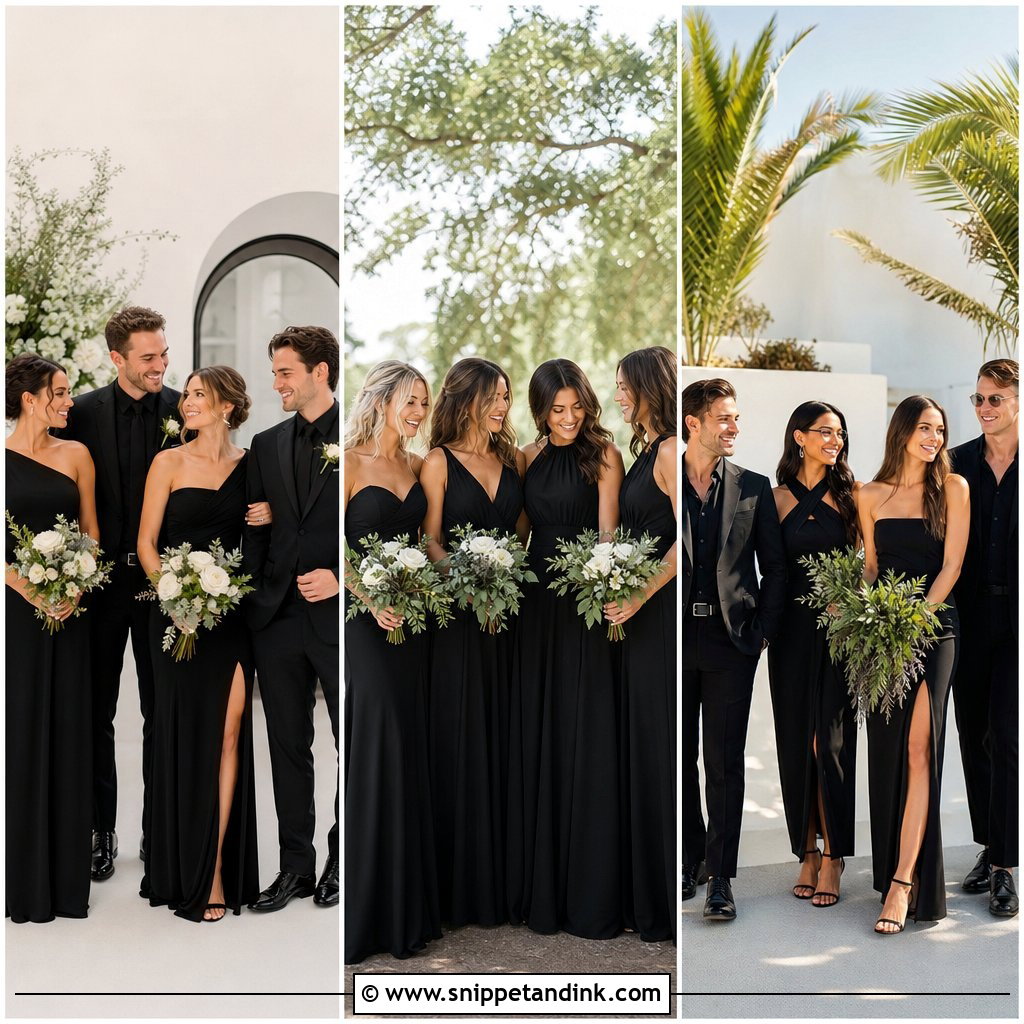
Black and champagne give strong contrast and a formal feel. Put most attendants in floor-length black and the maid of honor in champagne, or mix them evenly for a more editorial line-up. Black crepe with champagne satin is a good pairing because the matte and sheen add depth. Pointed black heels, pearl or crystal earrings and small metallic clutches finish it, with white roses, orchids and restrained greenery. Exposure is the real challenge in this palette. Cameras struggle to hold detail in black fabric and a bright champagne or white gown in the same frame, so I’d keep the champagne a warm, deeper shade rather than near-white. Softer shapes like cowl slips and draped one-shoulder gowns stop the group from looking severe.
7. Navy And Dusty Blue Bridal Party Dresses
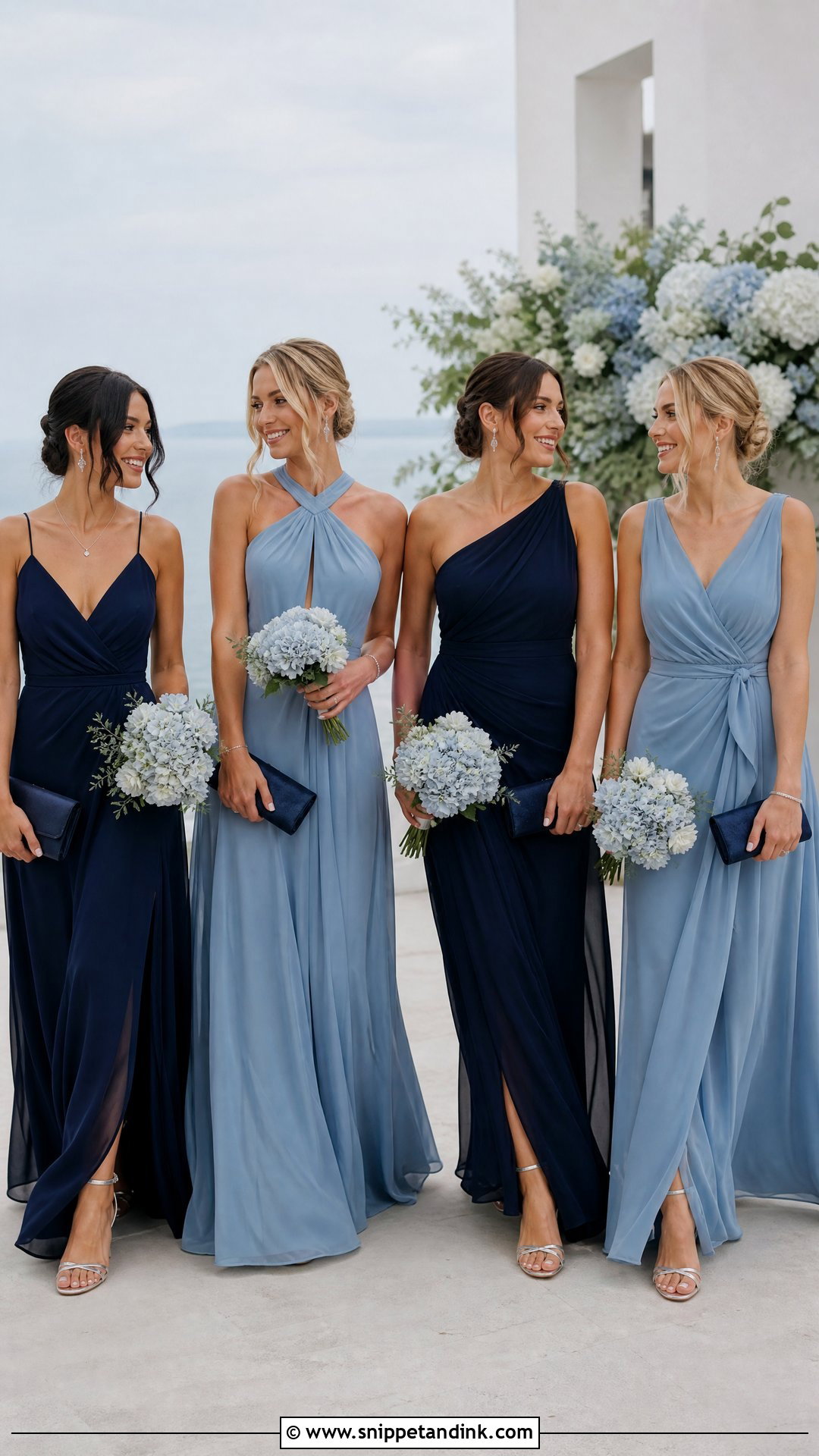
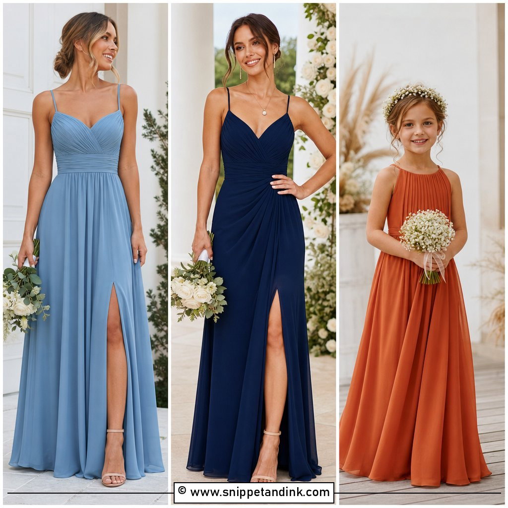
Navy and dusty blue move easily between formal and relaxed weddings. Navy anchors the group and dusty blue keeps it from feeling heavy. Alternate the shades, or keep navy for evening and dusty blue for daytime. Matching fabrics aren’t essential, but one fabric family, matte chiffon or lustrous satin, gives a cleaner result. Silver jewelry, navy clutches and neutral heels add nothing to compete. White roses, pale blue flowers and eucalyptus fill the bouquets. If groomsmen wear navy suits, I’d give them dusty blue ties or pocket squares; navy suits beside navy dresses merge into one dark block in a wide group shot.
8. Lavender And Plum Bridal Party Dresses
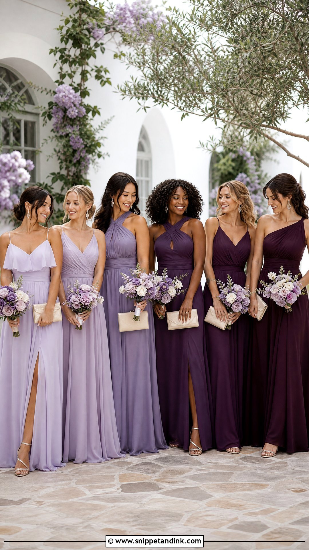
Lavender and plum give you purple without everyone in one shade. Lavender is airy and plum adds depth and formality. A planned gradient, pale at one end to plum at the other, looks deliberate in a group portrait; alternating them feels more relaxed. Silver heels and jewelry suit the cool undertones, nude shoes soften it. Ivory roses, lavender-toned flowers and greenery link the shades. Lavender is one of the colors cameras shift most: in shade it can turn blue, and some purple dyes look pinker in photos than in person. Simple chiffon, satin or matte crepe keeps the colors clear, and similar floor-length hems hold the arrangement together.
9. Butter Yellow And Soft Gold Bridal Party Dresses
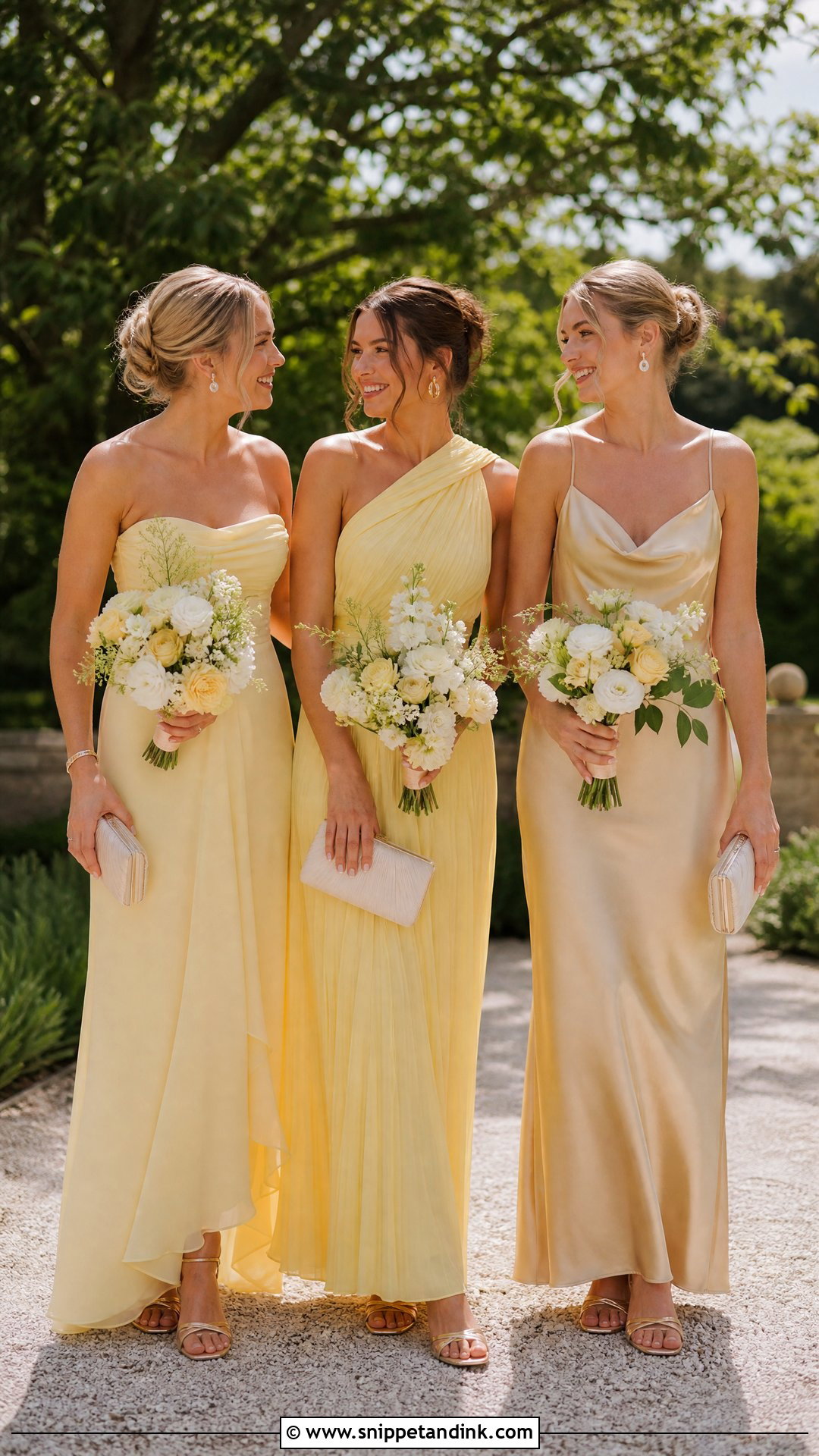
Butter yellow and soft gold make a warm, cheerful palette, but the shade has to be muted. Bright yellow bounces color onto faces and chins, and that cast is hard to correct afterward. Use butter yellow in flowing chiffon and soft gold satin for attendants who’d prefer a warmer neutral. Gold sandals, pearl earrings and cream clutches keep it light, with white daisies, ivory roses, pale yellow blooms and greenery in the bouquets. Yellow varies a lot between fabrics, so order swatches and view them together in daylight and indoor light before anyone buys. Midis suit casual outdoor weddings and floor length a formal one.
10. Peach And Coral Bridal Party Dresses
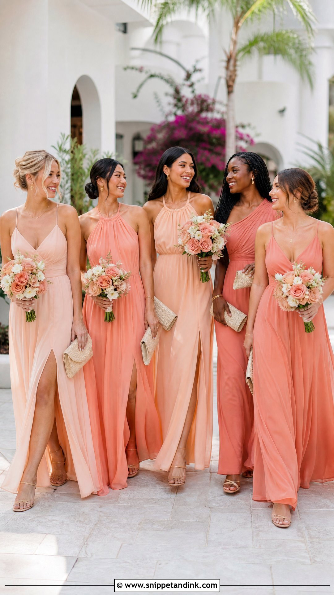
Peach and coral bring warmth without going full orange. Peach is the soft base and coral the contrast; a few mid-tone salmon dresses in between smooth the transition. Chiffon, satin slips and pleated gowns all work, but one repeated fabric gives the most cohesive group. Nude sandals, fine gold jewelry and woven or cream clutches finish it, with white flowers, peach roses, coral blooms and light greenery. Sunny outdoor spaces keep these colors lively. Saturated coral can lose detail in strong midday sun, so I like to shoot this palette in open shade or late in the day. Soft, neutral makeup lets the dresses carry the color.
11. Mocha And Taupe Bridal Party Dresses
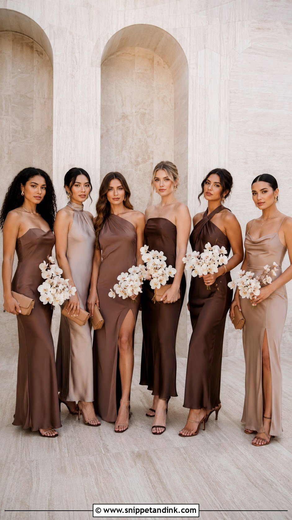
Mocha and taupe make a modern neutral palette with more warmth than grey. Offer a range from light mushroom taupe through beige-brown to deep mocha, so each attendant picks the tone that suits her. Satin adds a subtle shine, crepe and chiffon a softer finish. Chocolate or nude heels, simple gold jewelry and structured tan clutches finish it, with cream roses, white orchids, dried grasses and olive greenery. Neutrals close to skin tone can make a dress and its wearer blend together in photos, so compare each swatch against the person who’ll wear it. Texture from pleats, drapes or cowls adds definition, and keeping every dress in one warm undertone avoids a clash of cool grey and golden beige.
12. Burgundy And Dusty Rose Bridal Party Dresses
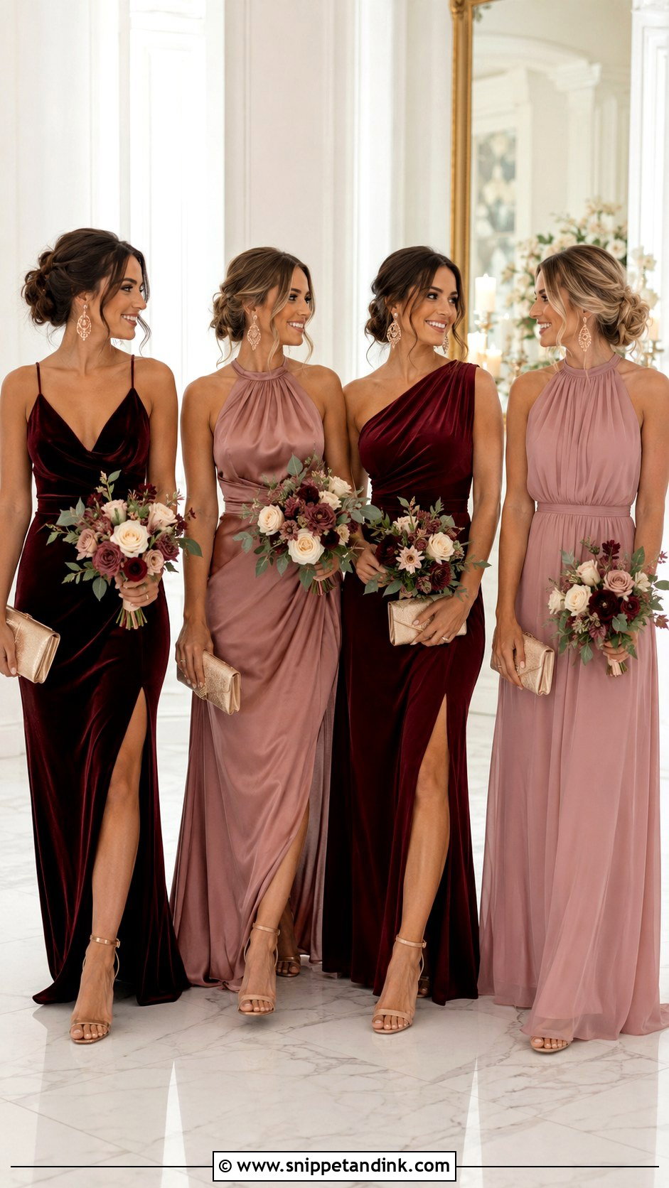
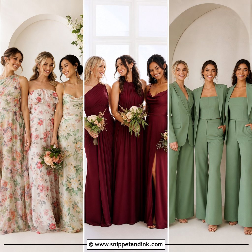
Burgundy and dusty rose have enough contrast to photograph clearly in any light. Burgundy is the strong foundation, dusty rose the softener; alternate them or put most attendants in burgundy with the maid of honor in rose. Velvet and satin bring out burgundy’s richness, while chiffon keeps dusty rose light. Champagne heels, rose-gold jewelry and burgundy or neutral clutches finish it, with cream roses, muted pink blooms, dark red accents and greenery. Deep reds are hard for camera sensors, which can flatten the folds of the fabric into one block of color, so I expose carefully for burgundy satin. Choose lighter fabrics and open necklines in warm months, long sleeves and wraps in cold ones.
13. Eucalyptus And Olive Bridal Party Dresses
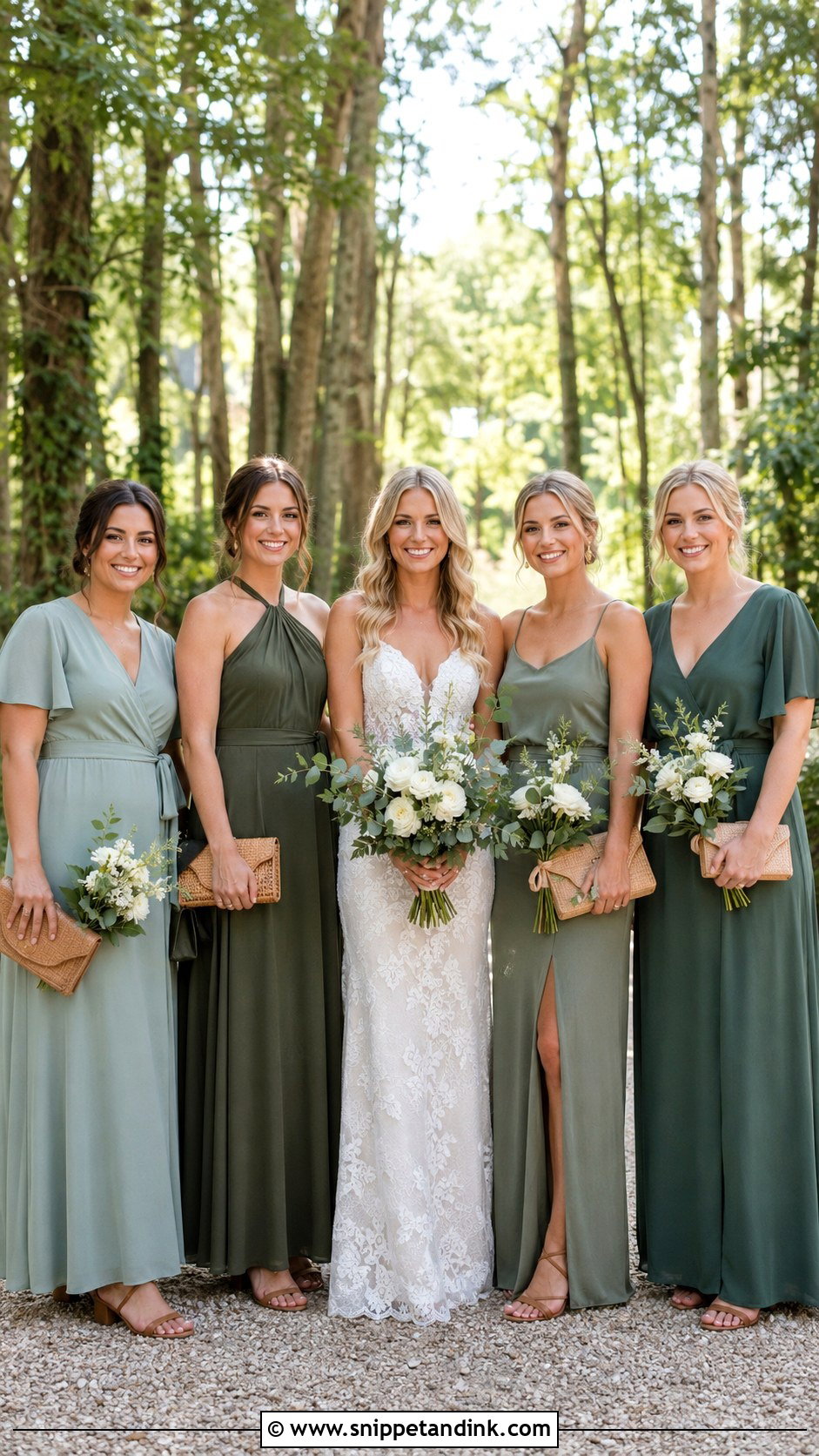
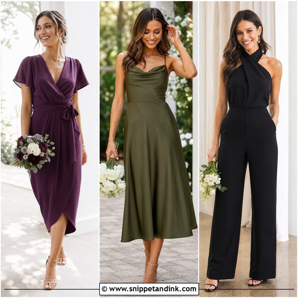
Eucalyptus and olive are quiet, natural greens. Eucalyptus is lighter and cooler; olive brings warmth and depth. Matte chiffon or crepe in both keeps small shade differences from distracting. Tan sandals, small gold hoops and woven neutral clutches complete the outfits, with white flowers, eucalyptus leaves, olive branches and wild greenery in the bouquets. Attendants can choose wraps, halters, flutter sleeves or a tasteful jumpsuit within the palette, with hems kept consistent. One thing to watch in outdoor portraits: green dresses against green trees and lawns can lose their outline, so I look for stone walls, wood or sky as a backdrop. Linen, stone and wood decor suit these greens best.
14. Powder Blue And Lilac Bridal Party Dresses
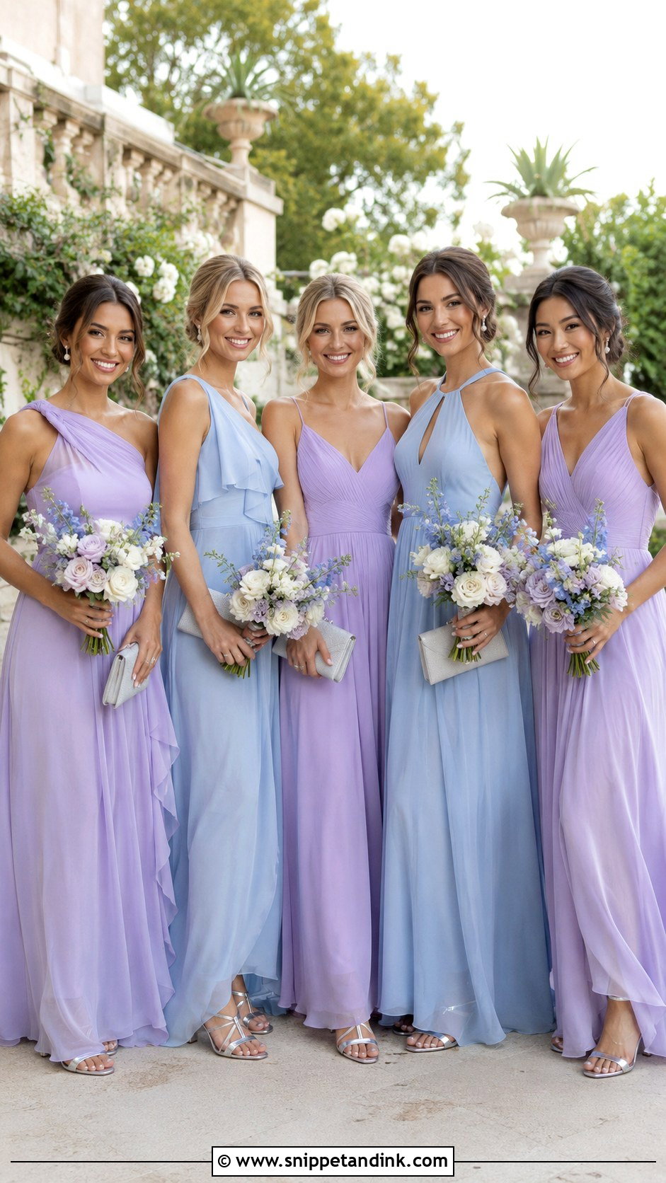
Powder blue and lilac are soft and fresh together. Spread the colors evenly rather than at random, so neither side of the group photo ends up heavier. Chiffon keeps it airy, satin more polished. Silver sandals, pearl earrings and pale grey clutches stay in the cool family, with white roses, lilac blooms, blue delphiniums and eucalyptus in the bouquets. Necklines can vary, square, one-shoulder, halter or wrap, as long as fabric or hem length repeats. Two pastels this close in value can merge into one color in bright sun, so check that the swatches still look distinct when you photograph them together on your phone outdoors.
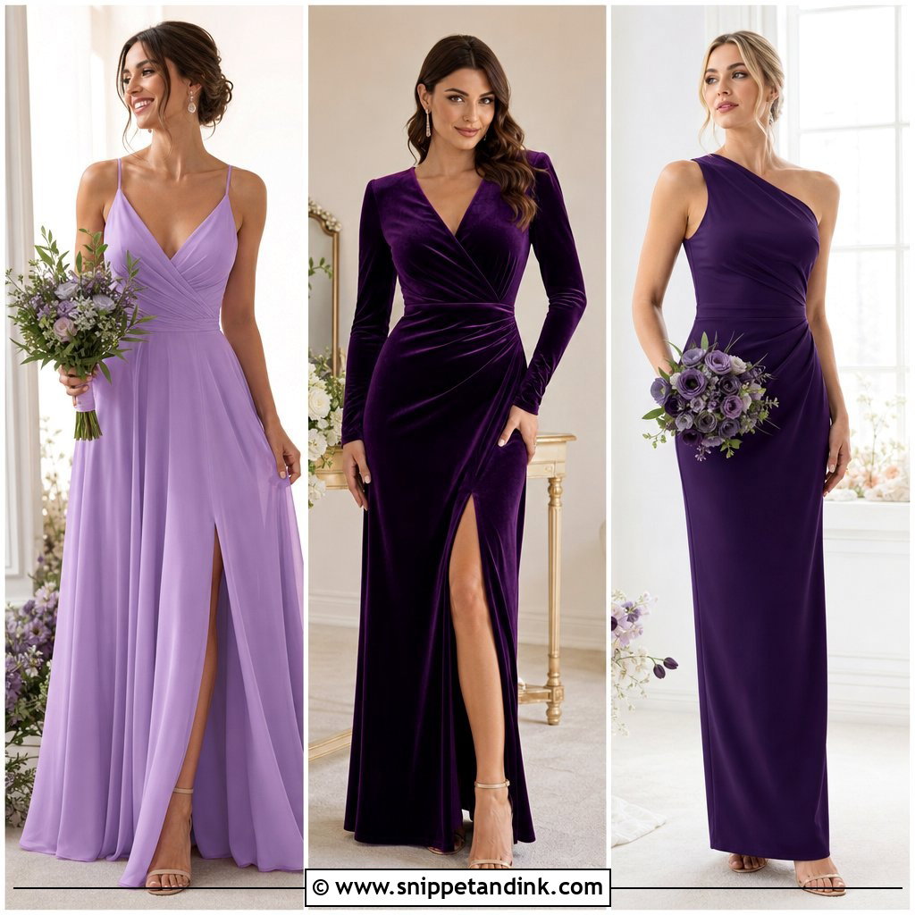
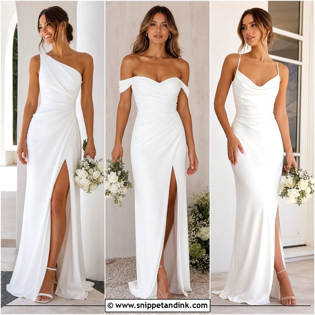
15. Emerald Sapphire And Amethyst Bridal Party Dresses
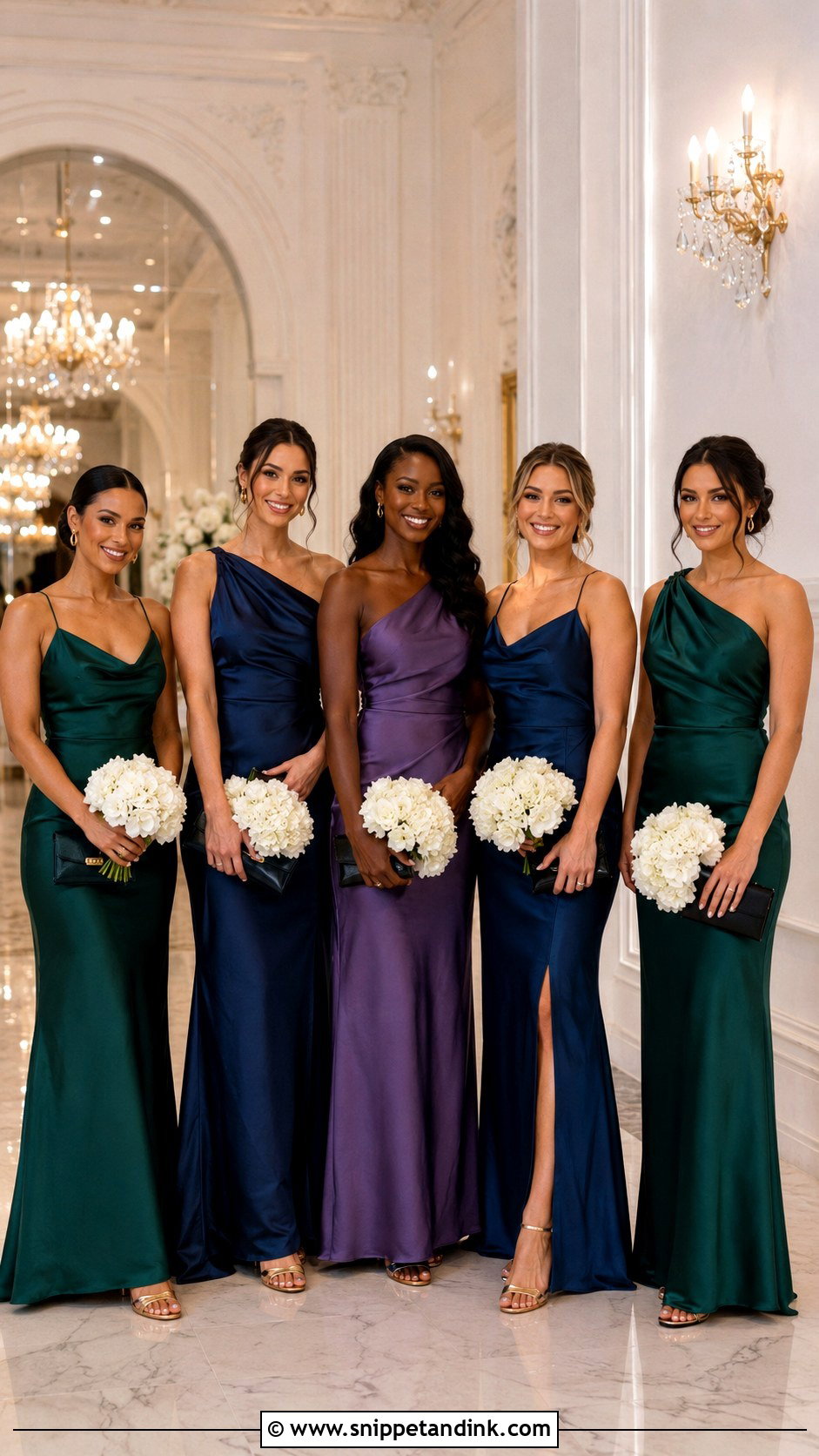
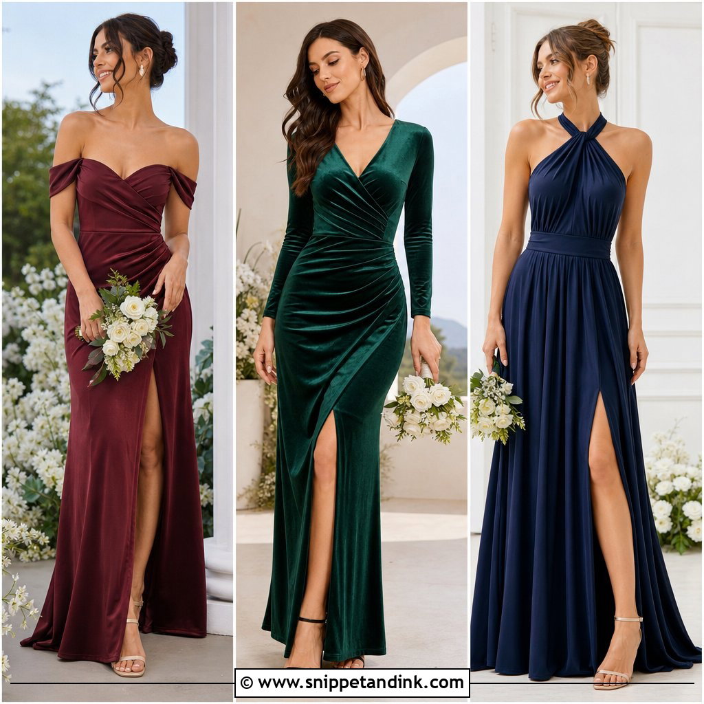
Emerald, sapphire and amethyst make a jewel-toned group that’s hard to forget. These saturated colors only look cohesive in one fabric, satin, velvet or matte crepe, and spread evenly so no color clusters. Gold heels and earrings warm the palette; black accessories sharpen it. Bouquets of white flowers, rich greenery and restrained purple or blue keep the whole thing from tipping into too much color. Clean shapes work best: cowl necks, columns and one-shoulder maxis, with little embellishment. Jewel tones look richest in soft, even light. In harsh sun the satin throws bright highlights, and I’d rather photograph them in shade or indoors by a window.
16. Coral Orange And Fuchsia Bridal Party Dresses
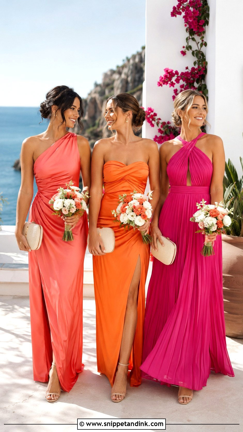
Coral, orange and fuchsia borrow from a bright sunset. Pick one specific shade in each color family and compare every swatch side by side; random pinks and oranges quickly look uneven. Fluid satin, pleated chiffon gowns and simple crepe let the colors carry it, with neutral heels, minimal gold earrings and cream clutches. White flowers, coral roses, pink blooms and glossy greenery connect all three. Spread the colors across the group instead of clustering them. Fuchsia is the color I see clip most often on camera, losing all texture in bright light, so a slightly deeper or dustier pink is kinder. A printed maid-of-honor dress in all three shades links the solids neatly.
17. Blush Lavender And Blue Bridal Party Dresses
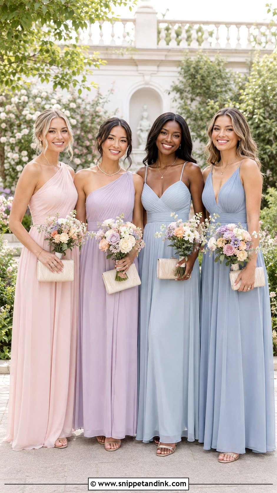
Blush, lavender and soft blue make a mismatched pastel group that still looks organised, provided the three shades share the same muted intensity. One brighter dress pulls the eye in every photo. Chiffon gives each color the same light finish. Nude or silver sandals, fine pearl jewelry and pale neutral clutches complete the looks, and bouquets should repeat all three tones with pink roses, lavender and blue flowers and white fillers. Send attendants a visual palette and approved dress examples instead of color names, because retailers label pastels very differently. Varied necklines add personality; the same floor length and similar bouquet sizes hold the group together.
18. Floral And Solid Bridal Party Dresses
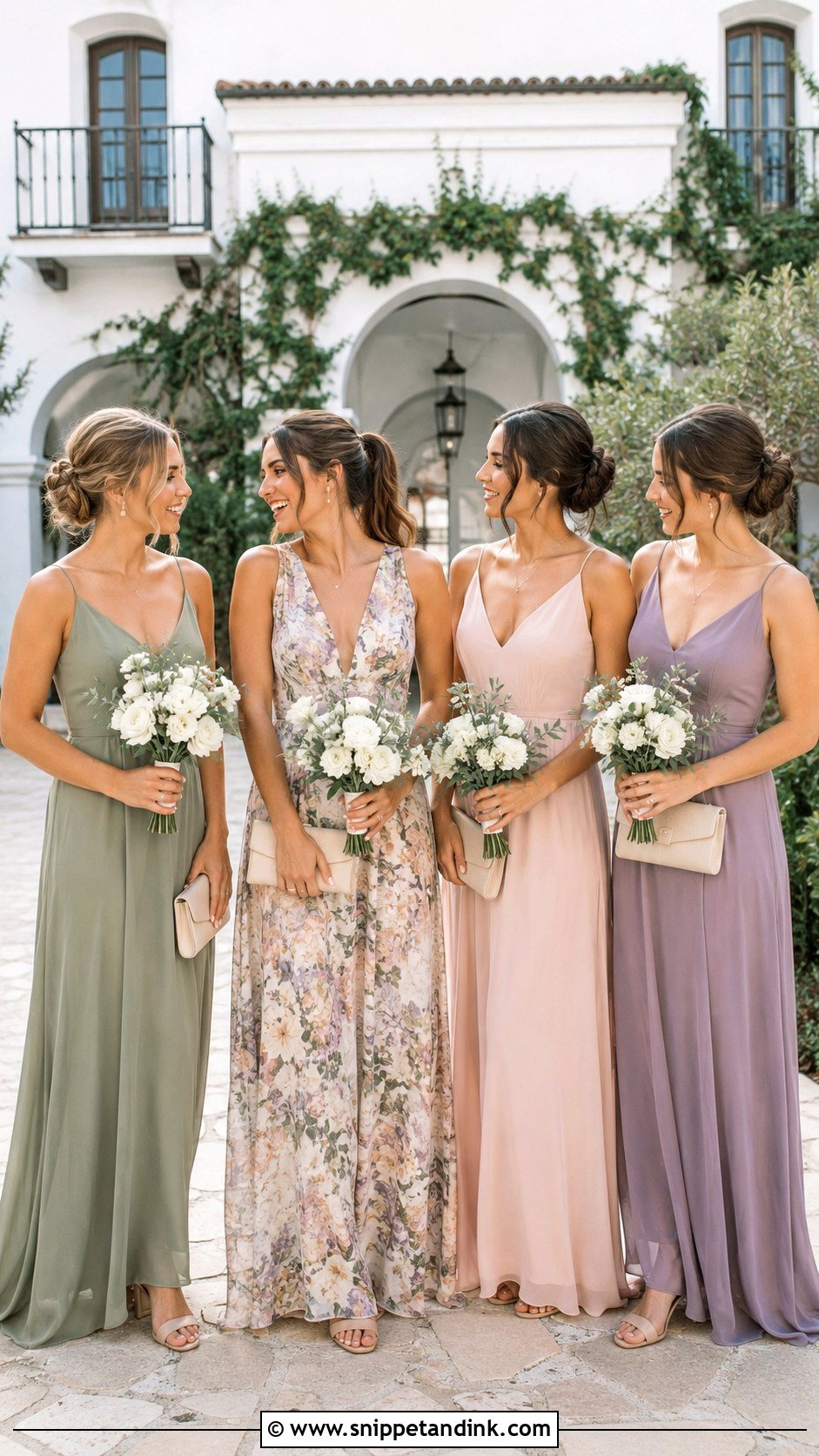
Florals mixed with solids look personal and layered when the print sets the rules. Start with one floral print containing three or four clearly defined colors, then match solids to colors in that exact pattern; a print with sage, blush, lavender and cream can guide the whole group. Put the print on the maid of honor or on two bridesmaids spaced evenly among the solids. Matching formality and hem length matters more than matching fabric. Neutral heels, simple jewelry and solid clutches keep it calm, with white flowers and greenery in the bouquets. Small, busy prints can shimmer oddly in digital photos, so I’d favor a print with medium-sized flowers.
19. Champagne And Copper Bridal Party Dresses
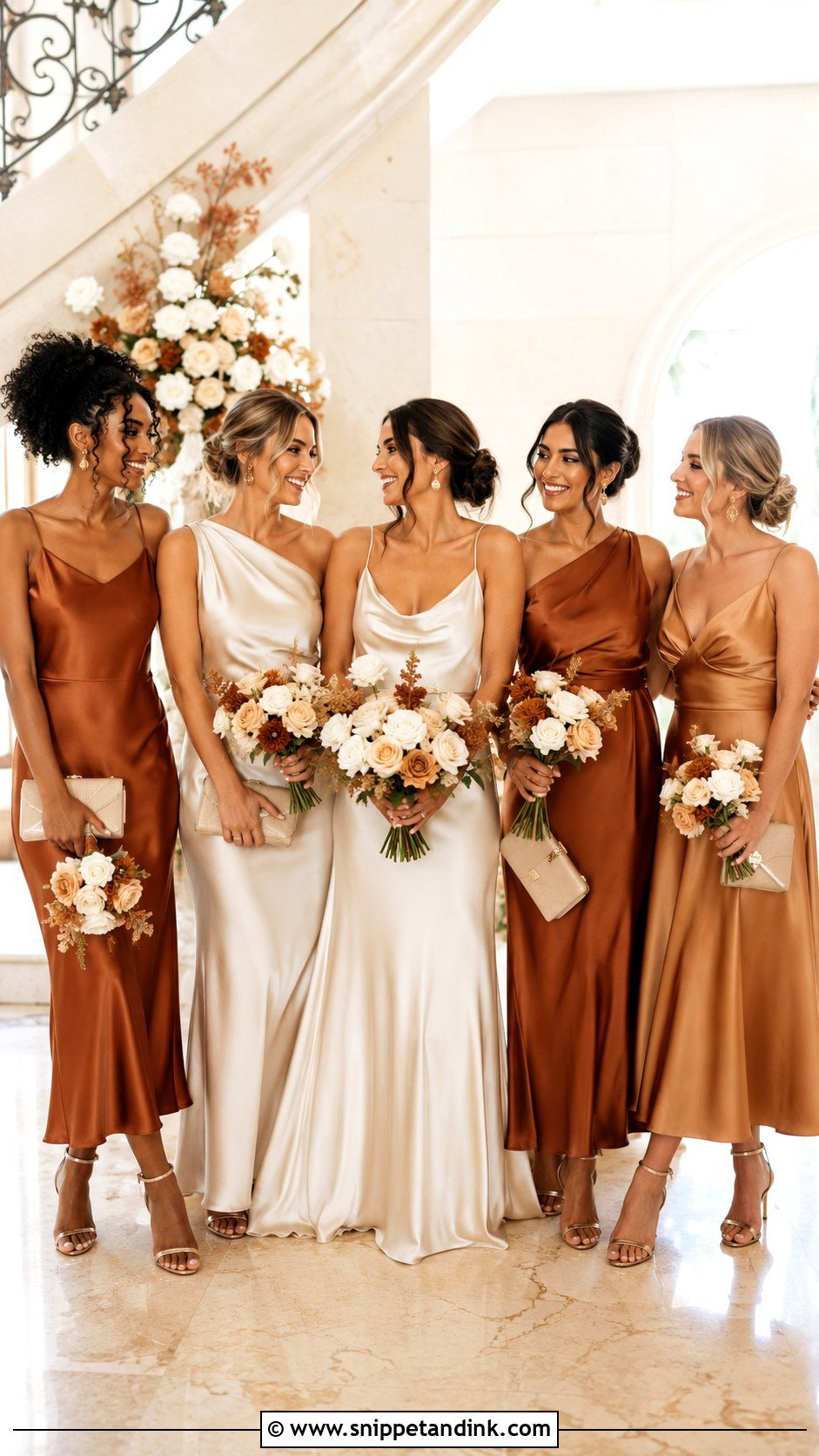
Champagne and copper feel luxurious without any beading. Champagne satin is the light base and copper adds depth; use them evenly or keep copper for the maid of honor. Bronze sandals, gold earrings and warm beige clutches finish it, with ivory roses, cream flowers, rust accents and eucalyptus to balance the shine. Both colors shift a lot with lighting: copper can look brown indoors and orange at sunset. I’d compare swatches at the venue at the time of the ceremony before ordering. Reflective satin also shows every pull and crease, so simple cowl slips, draped one-shoulder gowns and clean A-lines are the safest shapes.
20. Silver Gray And Charcoal Bridal Party Dresses
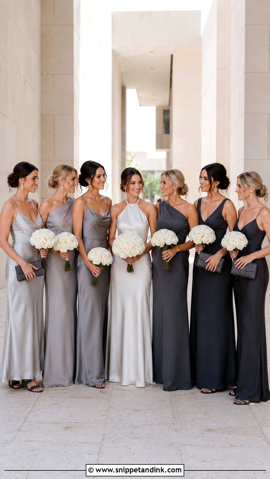
Silver grey and charcoal are a softer alternative to black that still feels formal. A controlled gradient from pale silver through mid-grey to deep charcoal looks clean in a line-up. Satin lifts the silver tones; matte crepe keeps charcoal modern. Black or silver heels, crystal earrings and compact charcoal clutches finish the outfits, with white roses, orchids and eucalyptus for crisp contrast. Keep fabric finish and floor-length hems consistent if silhouettes vary. The palette pairs easily with black, navy, or gray suits, but add a little contrast with silver ties, white pocket squares or small green boutonnieres. Without it, an all-grey wedding party looks like a black-and-white photo in color.
Ordering the Line-Up So the Colors Read on Purpose
The same eight dresses can look planned or random depending on where everyone stands. Before the formal portraits, I arrange the group by color first and height second, then make small swaps.
Gradients
For a light-to-dark palette, run it symmetrically: darkest shades nearest the bride on both sides, fading outward, or the reverse. A gradient that runs from one end of the row to the other makes one side of the picture look heavy.
Two or three colors
Alternate them, and mirror the pattern on each side of the couple. If the numbers are uneven, put the odd color closest to the bride, where it reads as an accent rather than a mistake. The maid of honor’s standout shade belongs next to the bride for the same reason.
Giving Each Attendant a Shade That Suits Her Skin
The most flattering bridal parties I photograph let each person pick a shade within the palette, rather than assigning one by role. Very pale, icy shades can wash out fair skin, while deep jewel tones and rich earth colors glow on deeper complexions. Warm undertones usually look best in coral, rust, mocha and champagne; cool undertones in dusty blue, lavender and silver grey.
To avoid putting anyone on the spot, I’d send the whole palette and ask everyone to hold the swatches near her face in daylight and pick her own. You get a better group photo and nobody feels singled out.
Repeat One Thing Across the Group and Let the Rest Vary
A good palette looks cohesive and still lets every attendant feel comfortable. Start with the venue, the season and the wedding colors, then compare physical swatches in the light you’ll actually have before anyone orders. Mix shades, silhouettes and textures as much as you like, as long as one thing repeats: the fabric, the hem length, the jewelry, the shoes or the bouquets. Sage and champagne stay quiet; jewel tones and sunset colors make themselves seen. Above all, send clear color references and approved options so nobody has to guess, and the group photos will take care of themselves.
You'll Like These Ideas:


Leave a Reply