
Wedding nails with initials are a small, private detail that only really shows when someone takes your hand. A single letter, a shared monogram, the date, or the first initial of a new surname can turn an ordinary bridal set into something you’ll notice every time you look down at the ring. Lettering fits almost any base: milky nails, French tips, chrome, pearls, lace, florals, short clean sets. You can tuck one letter onto a ring finger or make the initials the main event in gold foil, script or raised gel. I’ve written each of the twenty designs below the way I’d talk a bride through it at the desk, including where the letter sits and what makes it readable.
Whose Initial, and in Which Order?
Before we talk colour, settle the letter itself, because it’s the part brides most often change their minds about in the chair. There are three common choices. A single initial is usually your first name or the first letter of the surname you’ll share. A couple’s pair puts both first initials together, often with a small heart or ampersand between them. A traditional monogram uses three letters, with the shared surname initial larger and in the middle, the bride’s first initial on the left and the partner’s on the right.
If you aren’t changing your name, or you’re both keeping your own, a pair of first initials avoids the question entirely. A three-letter monogram also needs a wider nail to stay readable, so on short nails I’d use two letters at most.
Letters that are hard to paint small
Some letters survive miniaturising better than others. Simple shapes like I, L, J, C and O stay crisp at a few millimetres. Busy letters such as M, W, B, R and anything with a looping script capital tend to fill in. If your initial is one of the tricky ones, choose a clean print font or let it be slightly larger and sit alone on the nail.
1. Milky White Wedding Nails With Initials
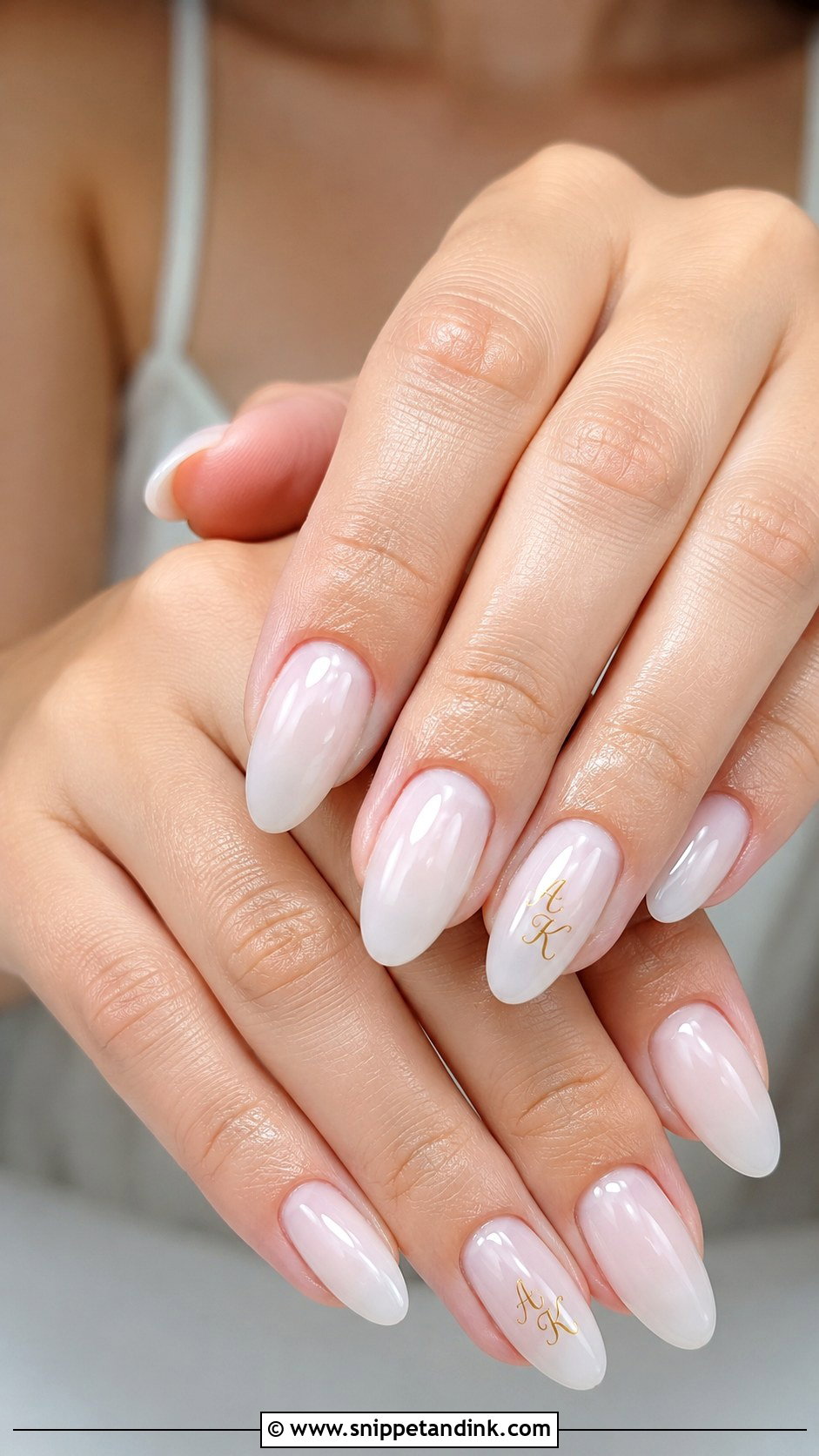
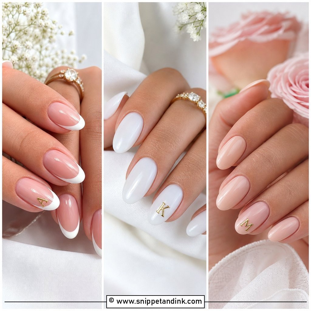
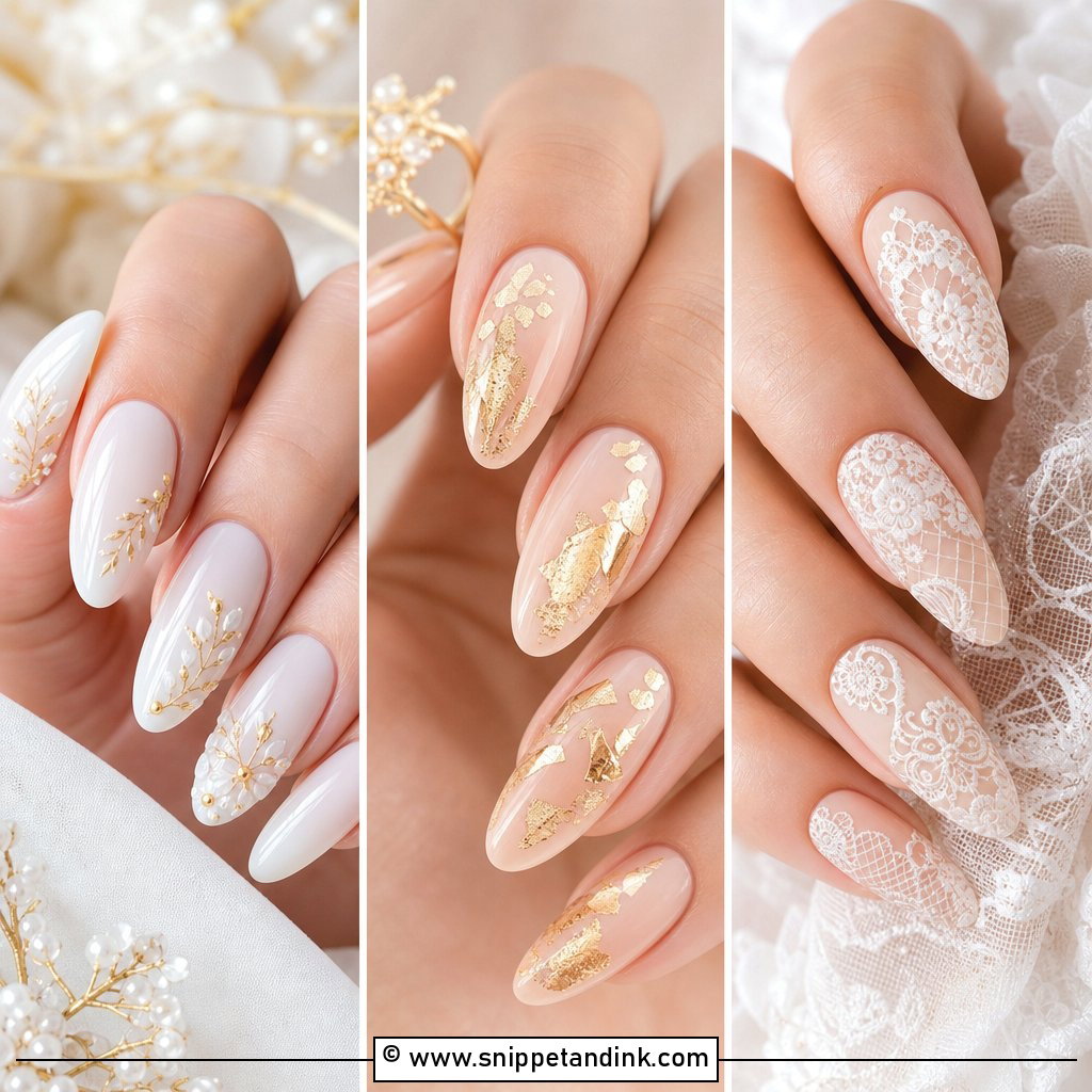
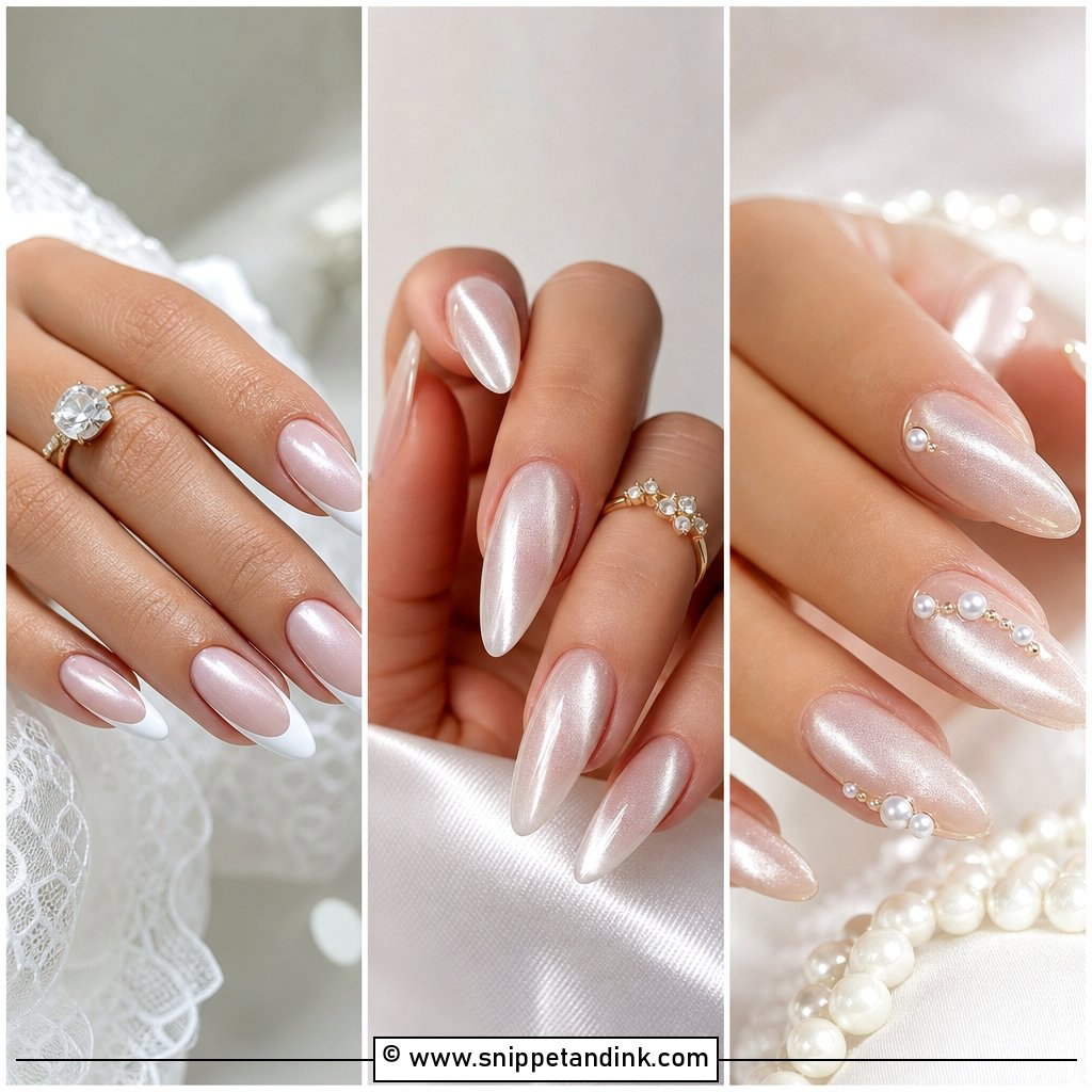
Milky white is the base I’d start most first-time lettering clients on. It’s semi-sheer, so it glows rather than looking flat, and both gold and soft white letters show up against it. One tiny initial on the ring finger is enough. Almond, oval and short squoval all suit it. If you want a little more, a dot, small heart or the date beside the letter works, but keep everything thin and centred on the nail. A letter set slightly off-centre looks like an accident in close-ups. Since the base is so quiet, this set also looks fine back at work the week after.
2. French Tip Wedding Nails With Initials
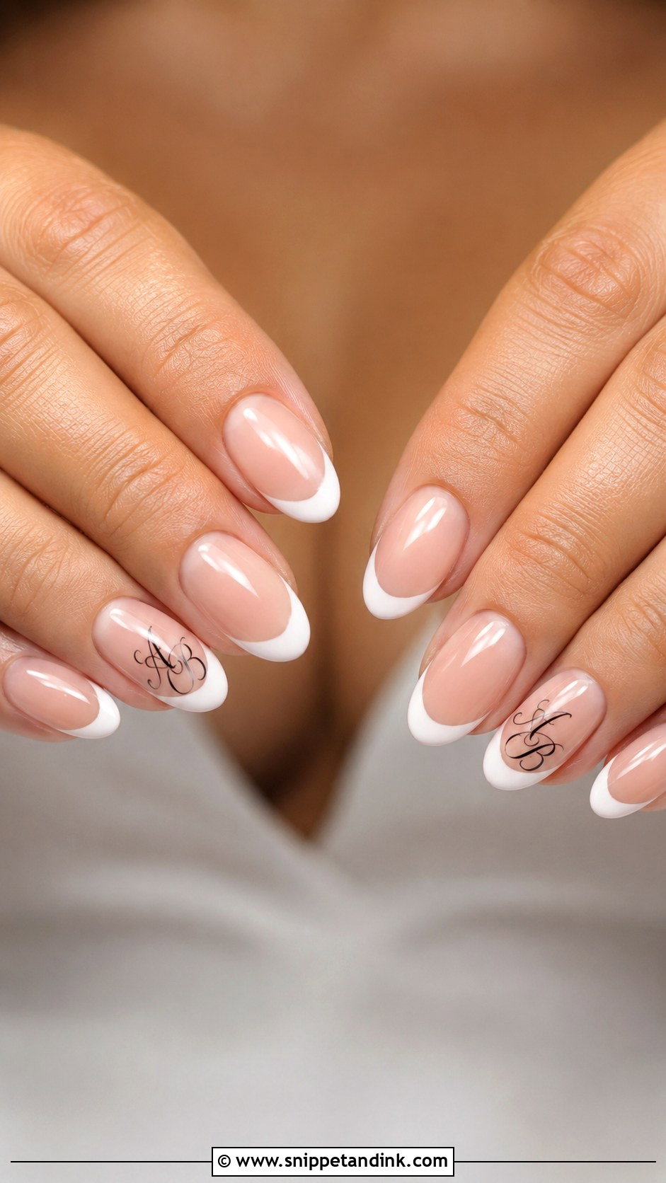
A French already looks finished on its own, which is exactly why the lettering here should be delicate. I’d put one letter on a ring finger, or one partner’s initial on each hand if you like symmetry. Fine script in black, gold or white suits it best. Almond and oval keep the French traditional; square gives it a sharper, modern edge. Placement is the part people don’t think about: the letter has to sit on the pink part of the nail, below the smile line, or the white tip swallows it.
3. Chrome Wedding Nails With Initials
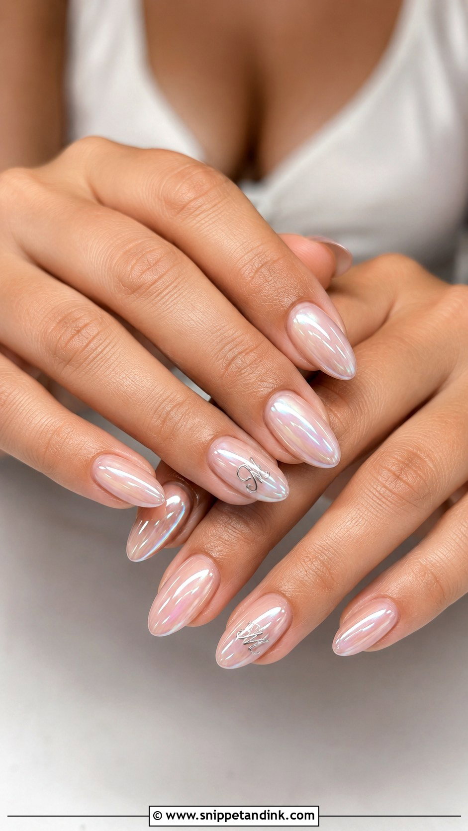
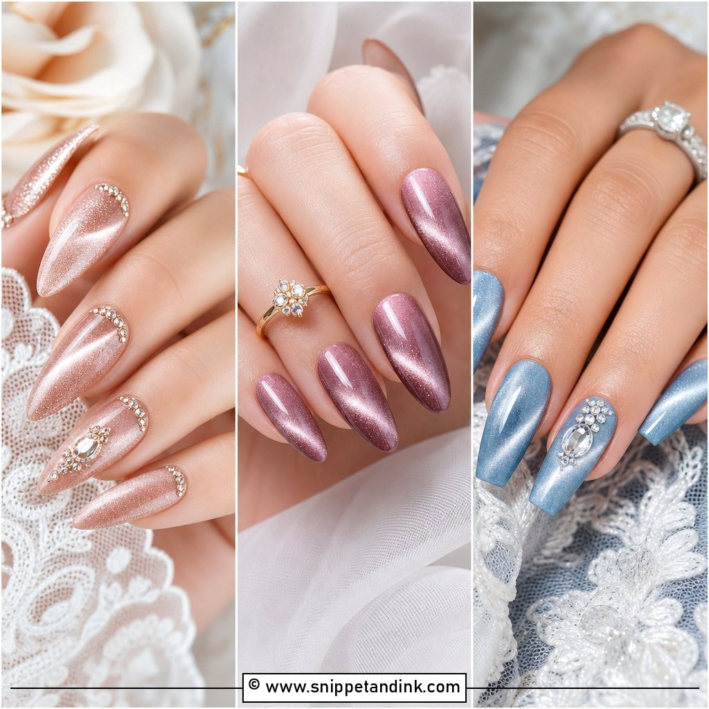
Chrome wedding nails with initials can still look bridal if the colour underneath stays soft. Pearl chrome over sheer pink, nude or milky white gives that glazed finish. The catch is that chrome powder sits on top of the gel, so I paint the letter after the chrome is sealed, in white gel, silver foil or a few tiny rhinestones, and then cap it. Painting before the chrome hides the letter under a reflective film. Keep the chrome sheer rather than full metal. Almond and coffin show the shine well, and short oval is perfectly fine too.
4. Nude Wedding Nails With Initials
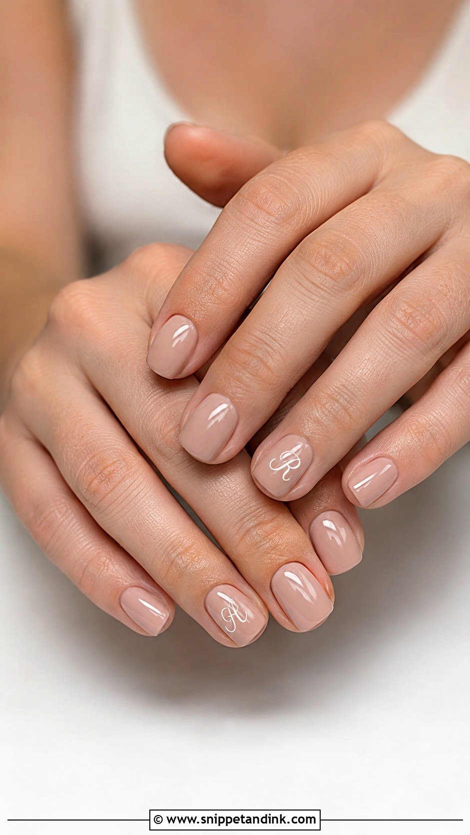
Everything hinges on the shade. A nude that matches your skin (beige, peach, caramel, soft pink or cocoa) makes the fingers look longer; one that’s a step too pale looks chalky in photos, particularly on deeper skin. I swatch two or three on the actual nail before deciding. Once the base is right, a thin initial in white, gold or deep brown on one accent nail is plenty. It suits brides who never usually wear art. Gloss keeps it classic, while a soft matte reads more modern. Bridesmaids can wear the same idea when they want a nod to the couple without matching the bride.
5. Pearl Wedding Nails With Initials
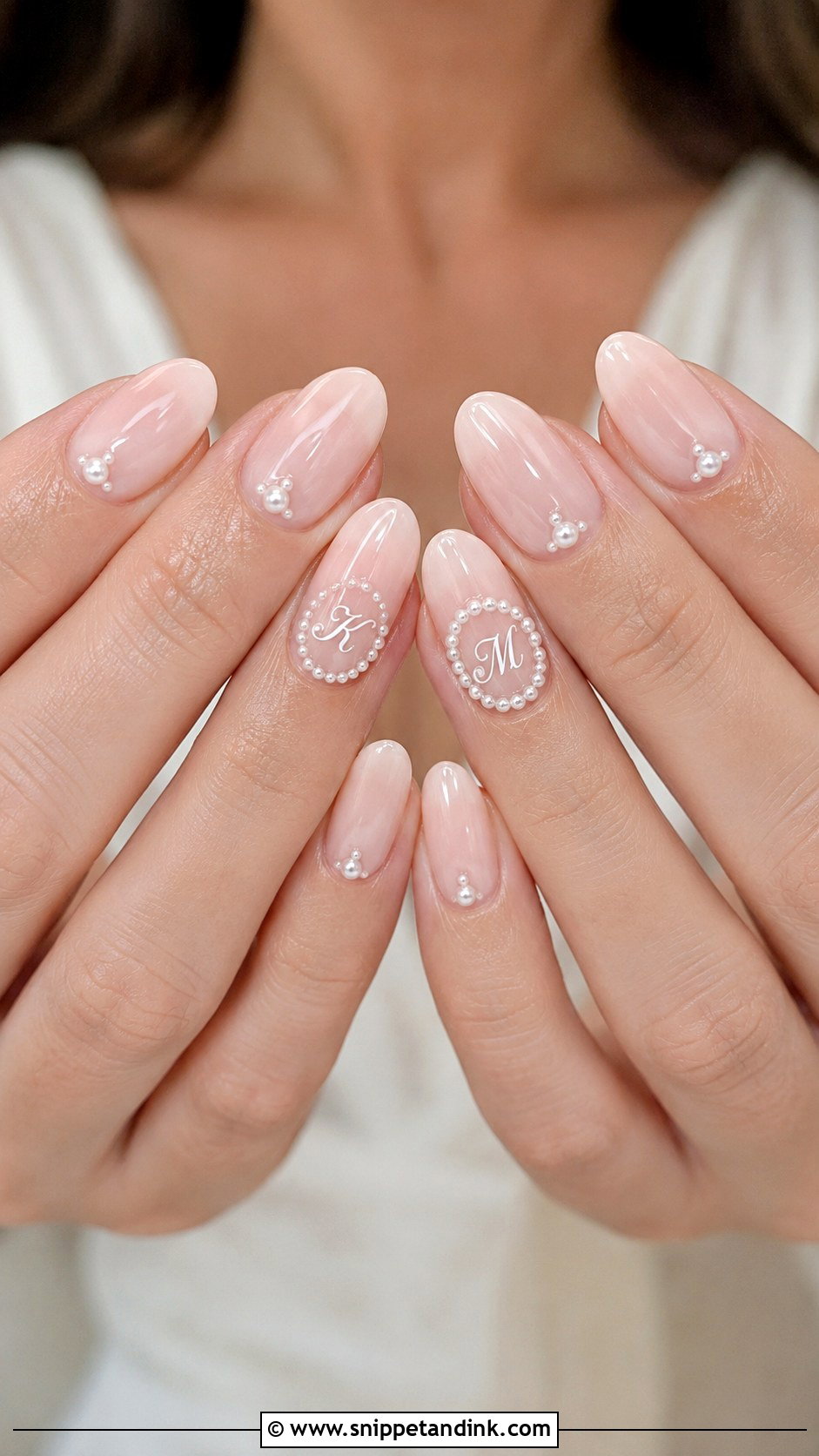
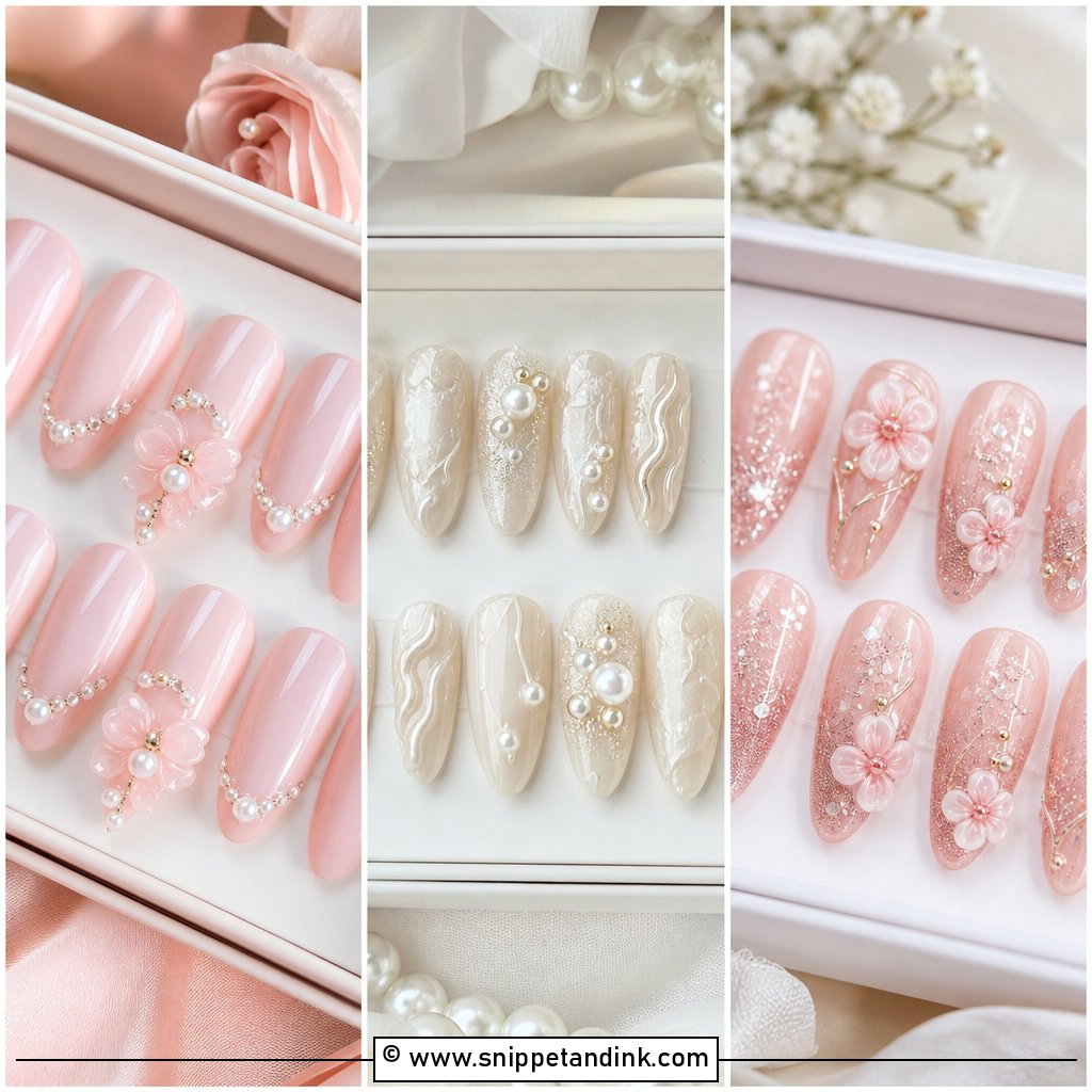
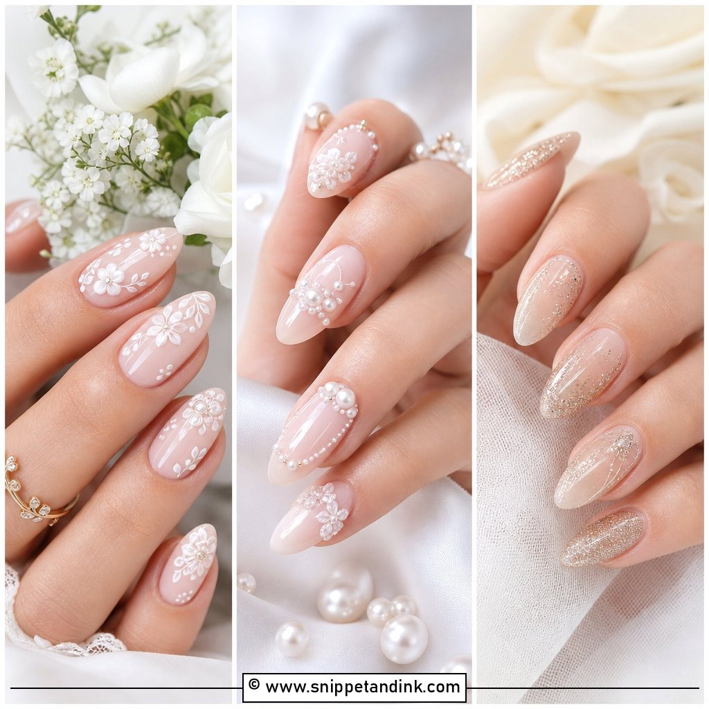
Pearl wedding nails with initials have dimension without needing glitter. I start with sheer pink or milky white, place tiny pearls near the cuticle or along one accent nail, and frame the letter on the ring finger with micro pearls. Oval and almond suit the round shape of the pearls. The lettering has to be slimmer than you’d think, because pearls pull the eye first. I keep the pearls flat-backed and small; anything domed catches on lace and is the first thing to come off during the reception. For a cleaner set, pearls on two nails and the initial on a third.
6. Blush Pink Wedding Nails With Initials
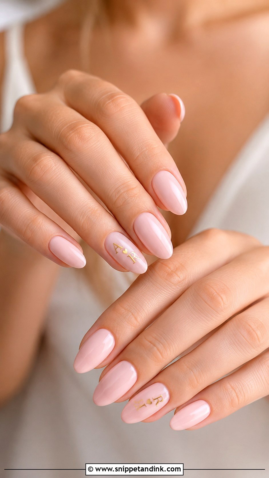
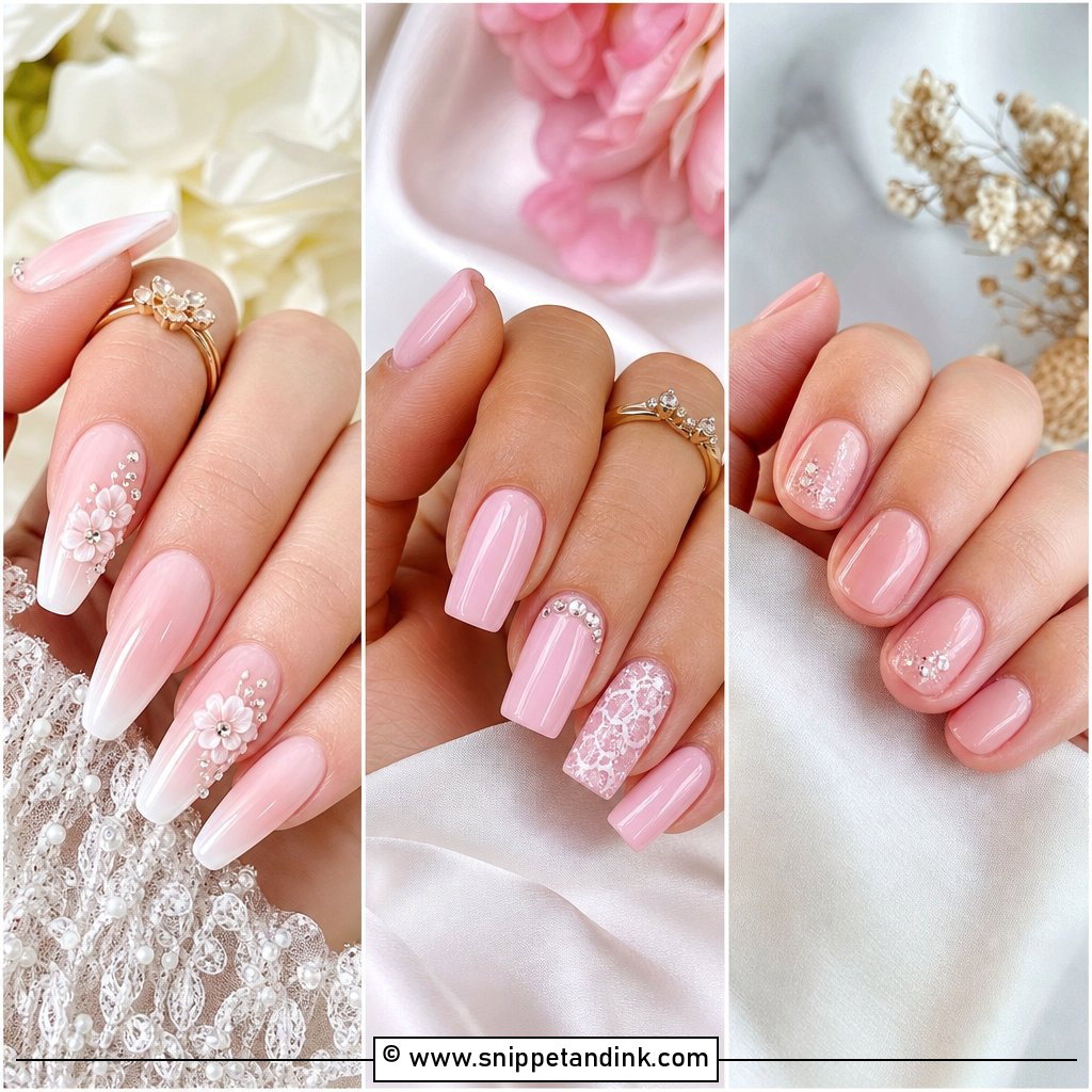
Blush pink is warmer than nude and still soft, so it sits easily next to almost any dress. White script gives a faint, delicate letter; metallic gold is the one to pick if you want it seen from across a table. A single initial on the ring finger is the bridal version, while both initials with a small heart lean more sentimental. If your palette includes pink, mauve, rose or champagne, this ties in neatly. It wears well on short natural nails, longer gel extensions and overlays alike. The one thing I check is that the pink doesn’t look too cool next to a warm ivory gown.
7. Ombre Wedding Nails With Initials
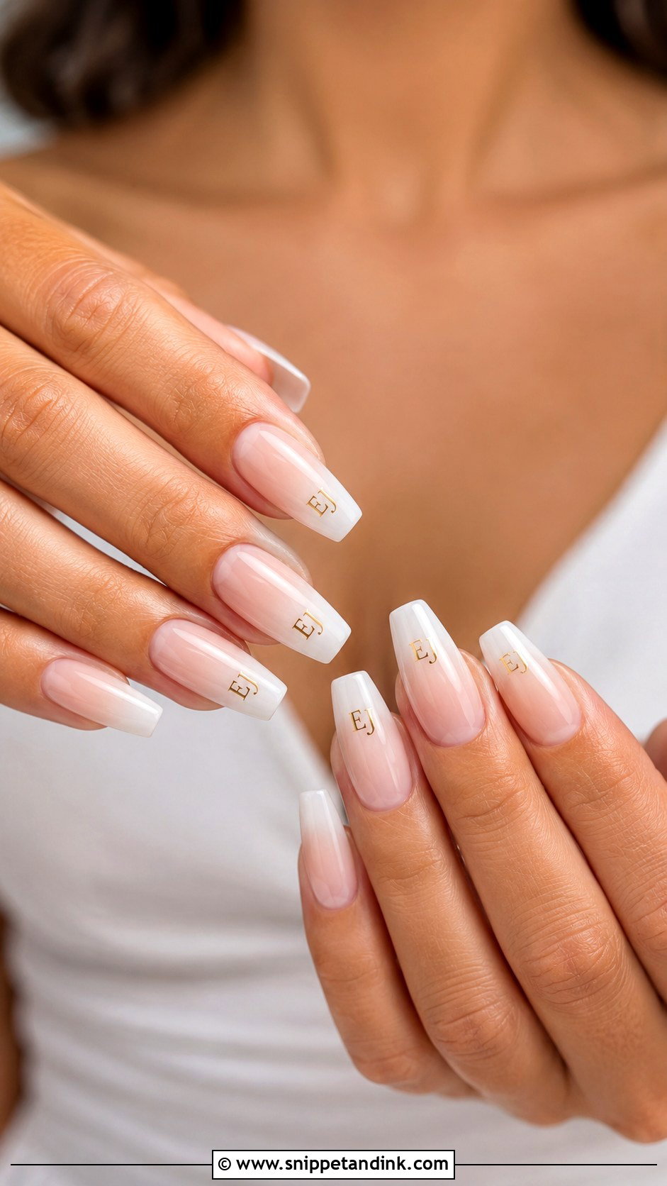
On an ombre, the letter has to go on the lightest part of the nail or it simply disappears into the fade. A nude-to-white or pink-to-milky gradient gives you movement without busy art. White, silver or gold script all work as long as the font is thin. Almond and coffin give the gradient room to travel, which also leaves a clear patch for lettering. A sheer shimmer top adds glow, but go easy, since shimmer layered over lettering softens its edges.
8. Lace Wedding Nails With Initials
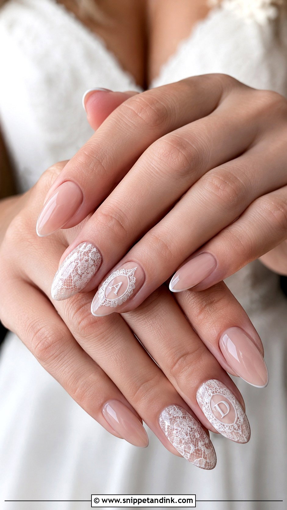
Lace art and lettering both need fine-brush time, so I’d book a longer slot for this one. On a sheer nude or pale pink base, thin white lines build a lace pattern across one or two nails. The initial goes on a separate accent or inside a tiny lace frame, never woven into the lace itself, where it becomes unreadable. Airy, slightly see-through lace looks closer to real fabric than solid white lines. Oval, almond and soft square all suit it. Bring a close-up of your sleeves or bodice so the pattern actually echoes the dress.
9. Gold Initial Wedding Nails
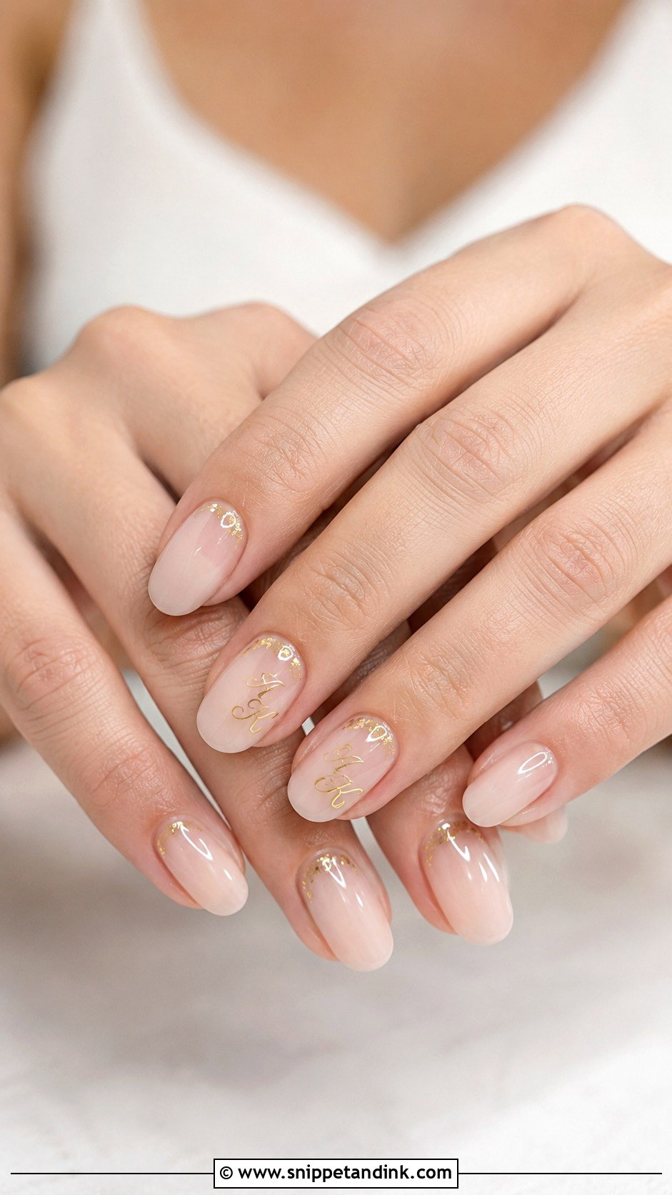
Gold lettering gives warmth and reads clearly on a nude, milky, blush or sheer white base. There are three ways to do it: hand-painted script, a metallic decal, or raised gold gel for a 3D letter. Raised gel looks the richest but is also the one most likely to catch on fabric, so I keep it low and capped. Use gold on one or two nails rather than across the set; a few foil flecks near the cuticle can tie the others in. It makes most sense if your ring, earrings or hair accessories are gold too.
10. Silver Initial Wedding Nails
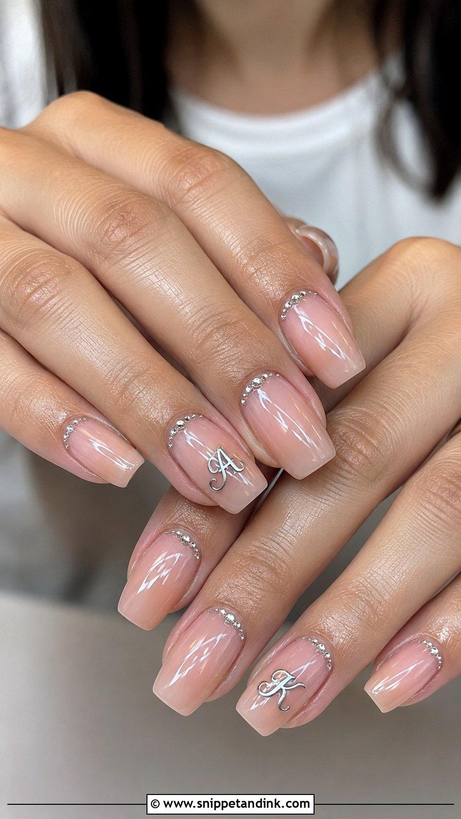
Silver lettering suits white metals, crystal details and cooler bridal tones. I’d put it on a soft pink, sheer grey-nude or milky base and paint the letters in silver chrome gel, fine glitter or small metallic decals. Gloss suits silver because it lets the metal catch the light gently. A few crystals near the letter or along the cuticle add sparkle, though crystals beside fine lettering can crowd it, so I’d keep them on a different finger. One initial on the ring finger, the rest kept simple. Winter weddings and modern gowns are where this set feels most at home.
11. Short Wedding Nails With Initials
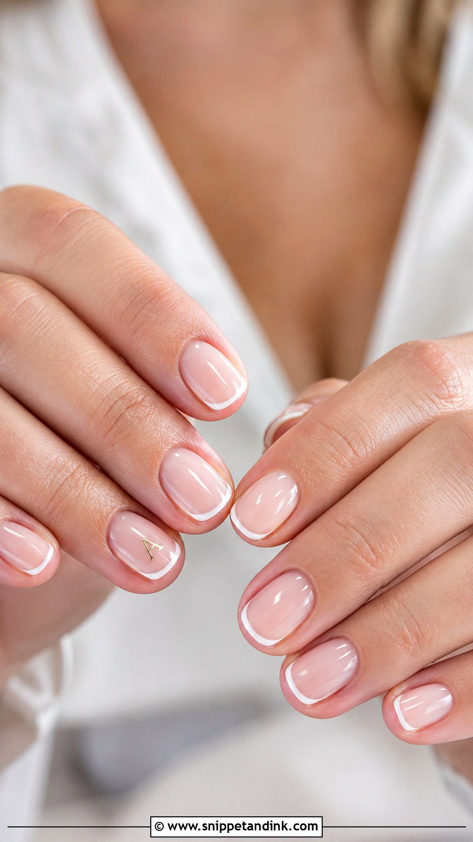
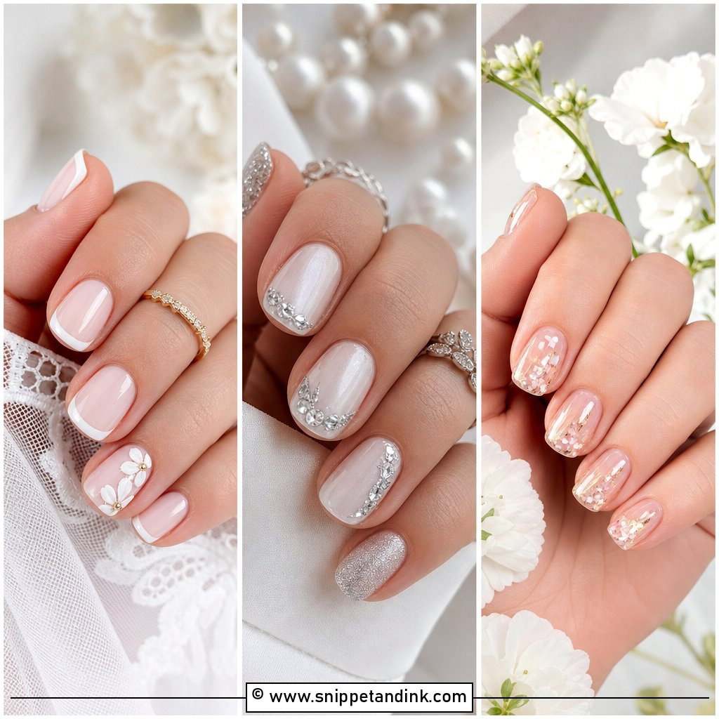
Short nails have less room, so scale is everything. On a sheer nude, pale pink or milky base I place a tiny initial in the centre or lower corner of one nail. Short squoval and rounded shapes are comfortable and suit natural nails. A micro French can make the nail bed look longer without extensions. Skip big letters, heavy stones or thick art, which swamp a small nail. I’d also choose a simple print letter over an elaborate script at this size: curly capitals turn into a smudge once they’re under three or four millimetres tall.
12. Almond Wedding Nails With Initials
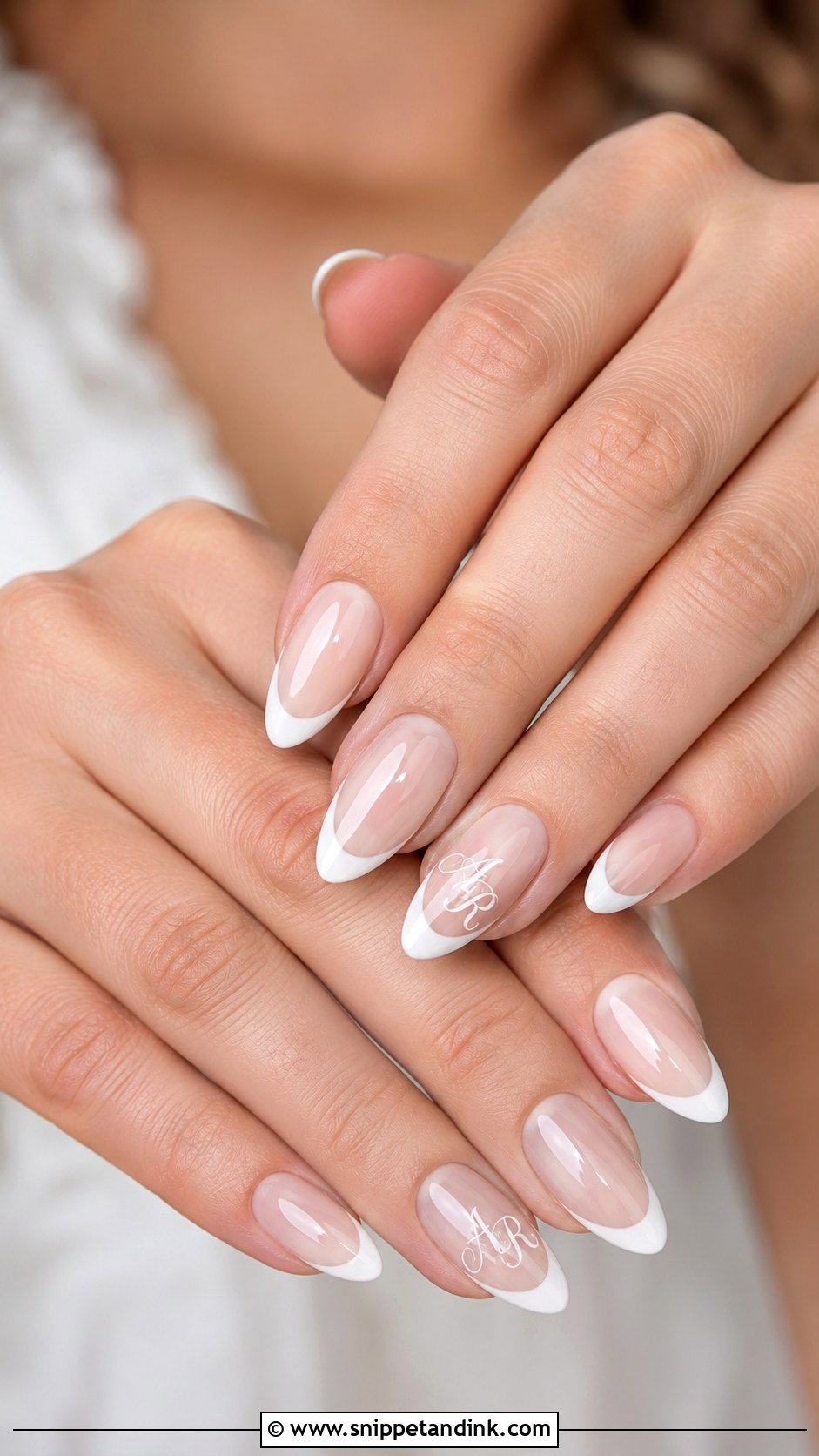
Almond wedding nails with initials work because the taper lengthens the fingers and gives the letter a natural frame. Fine script, pearl chrome, soft French tips and tiny florals all sit well on the shape. I place the initial on the ring finger, a little below the centre, where the nail is widest. A nude or milky base with a thin gold or white letter is the classic version. Almond also suits brides who want a bit of length without the sharp point of a stiletto, and it looks tidy beside a bouquet stem in close-ups.
13. Square Wedding Nails With Initials
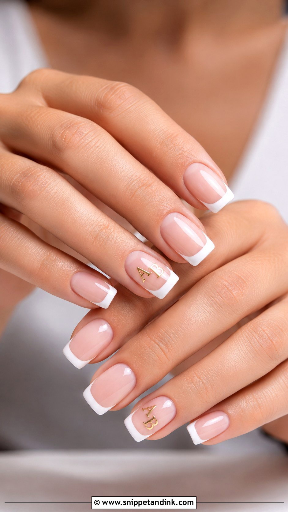
Square tips give lettering the widest surface of any shape, which makes block initials look crisp. A pale pink base, thin white tips and one small initial in black, gold or silver is the sharp version. If corners bother you, I’ll soften them into squoval; sharp square corners also chip first and catch on tights. Keep the design minimal. A centred letter or tiny monogram on the ring finger looks smart without shouting. It’s a good set for anyone who likes symmetry.
14. Floral Wedding Nails With Initials
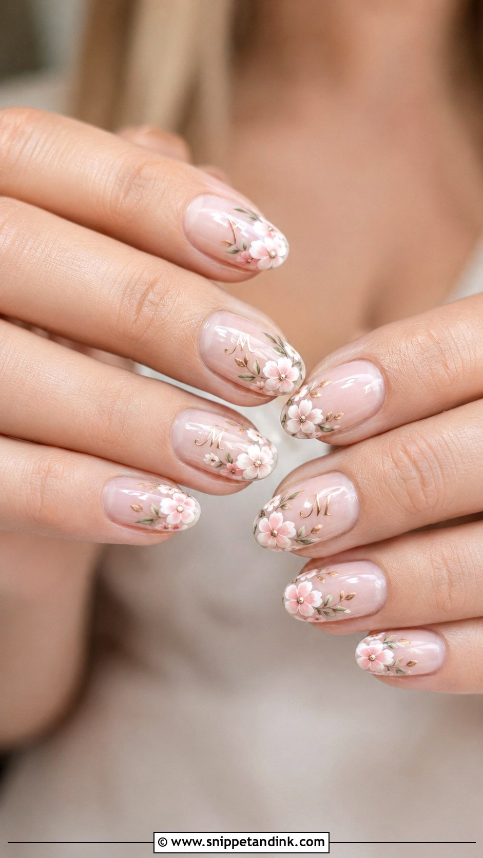
Tiny painted flowers let the manicure echo your bouquet. On nude, sheer pink or milky white, I add small blooms to one or two nails and set the initial beside a flower or on its own accent nail, which reads more cleanly. White petals, blush roses, blue flowers or greenery all work with a fine brush. The flowers have to stay smaller than the letter, otherwise the eye lands on the bloom and the initial gets lost. Garden ceremonies and spring weddings suit it, and it never pulls attention away from the ring.
15. Glitter Wedding Nails With Initials
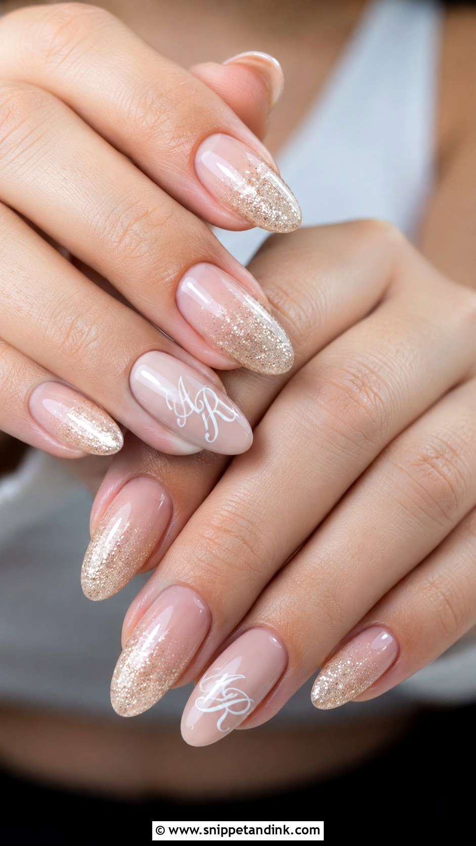
Glitter and lettering compete, so the sparkle has to be controlled. I’d choose fine shimmer, a glitter fade or a thin glitter French tip over chunky pieces. A sheer nude or blush base keeps it bridal. Paint the letter on a plain accent nail so it’s easy to read; lettering directly over glitter looks bumpy and broken in close-ups. A fine glitter outline around the initial is a nicer way to add shine. Silver, champagne and rose gold glitter all suit a wedding.
16. Matte Wedding Nails With Initials
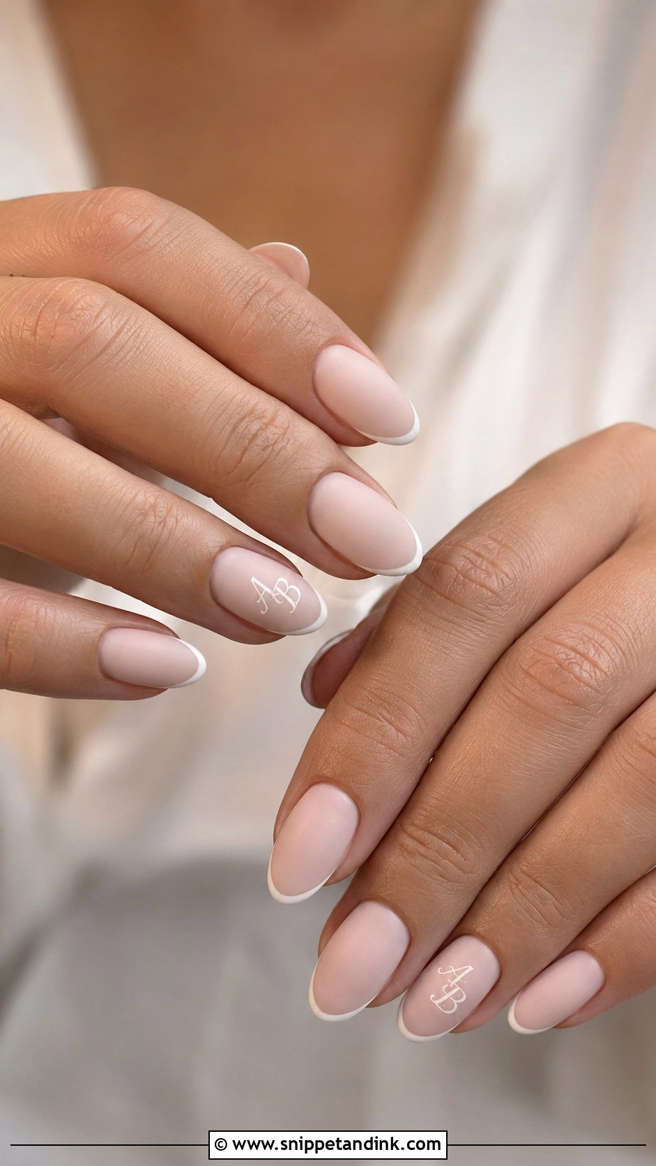
Matte wedding nails with initials swap shine for a soft, velvety surface, and that flat background makes a glossy letter stand out. I paint the initial in glossy white, gold or black gel over the matte top for contrast. A matte French tip or one glossy accent nail mixes the textures nicely. The prep has to be immaculate, since matte shows every ridge and lifted cuticle. It also picks up foundation and hand cream, so carry a lint-free wipe for photos. Oval, almond and square all suit it.
17. White Wedding Nails With Initials
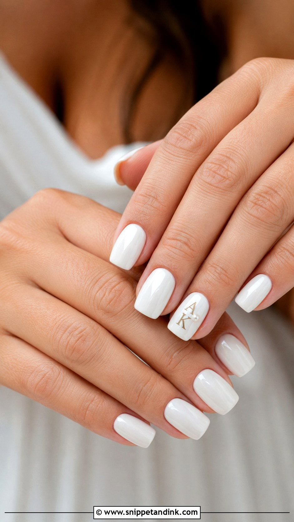
Flat opaque white can look harsh, so I usually soften it to a creamy, sheer or off-white base. Initials in gold, silver or pale nude keep it refined. A thin French outline, a tiny pearl or a small heart adds a personal note. If you want the initial to stand out, put it on a glossy accent nail. Do hold the white against your dress before choosing; a bright white nail beside an ivory gown can make the gown look yellow in photos.
18. Something Blue Wedding Nails With Initials
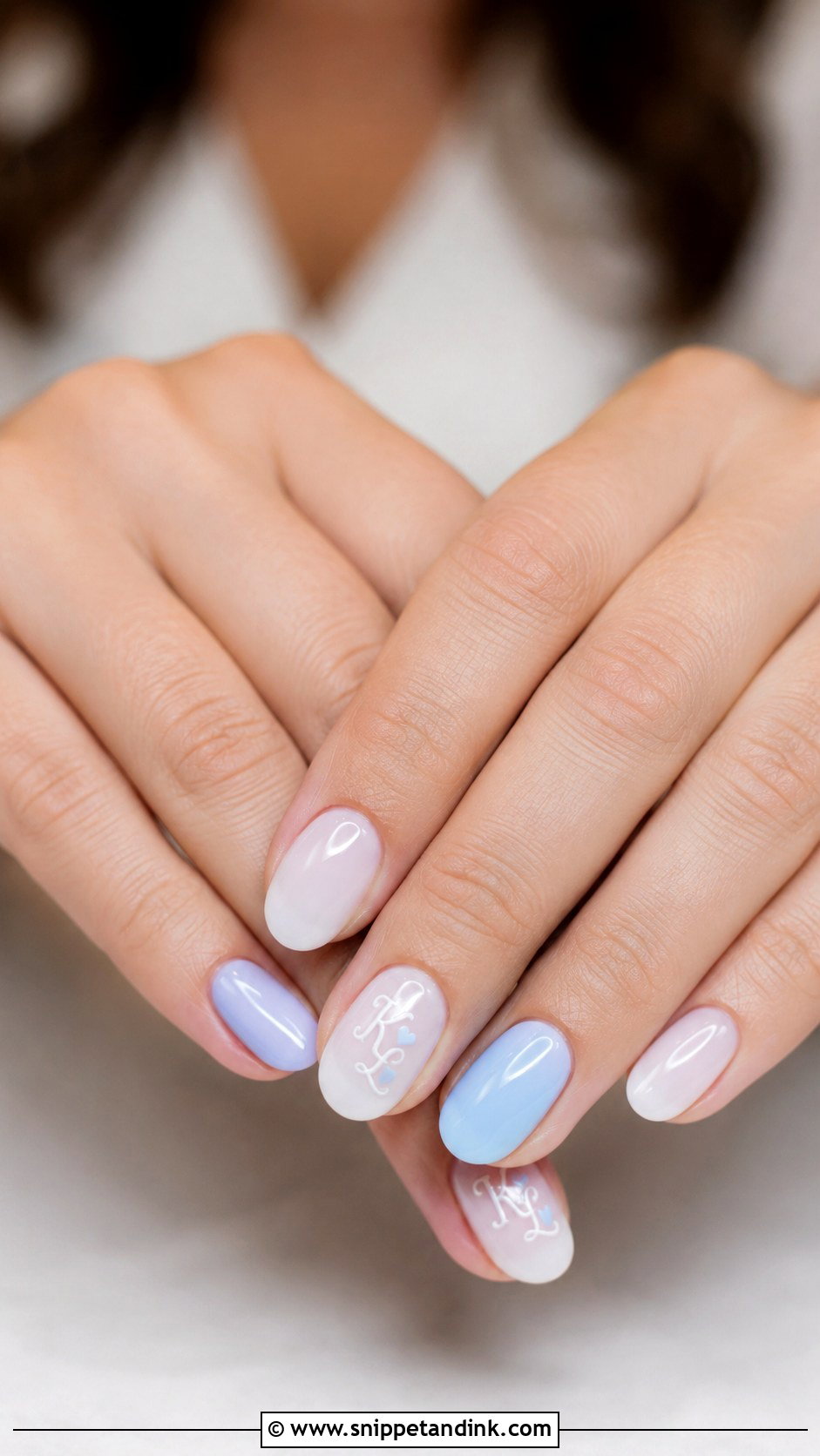
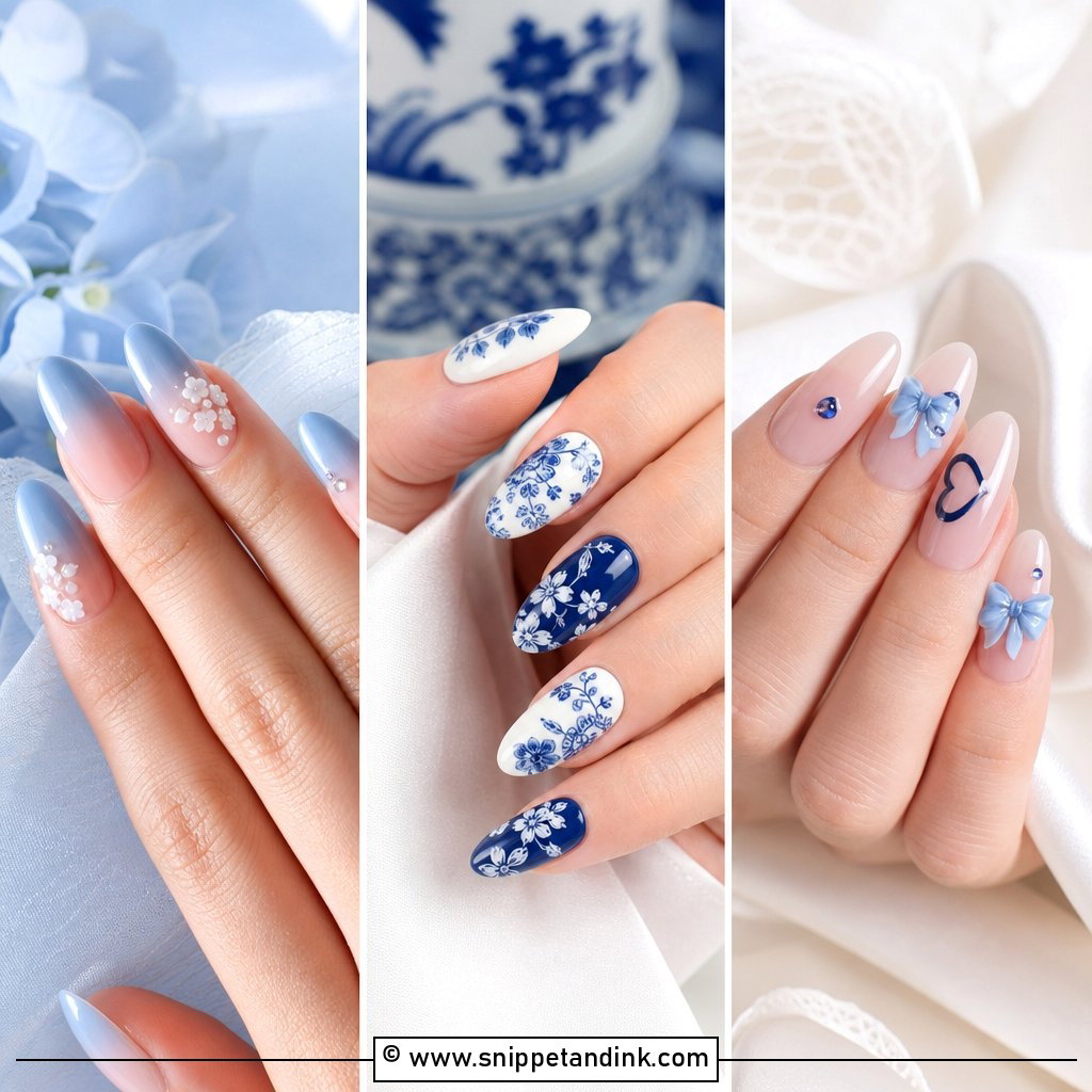
This is a tidy way to carry the something blue tradition without a garter. Keep it soft: tiny blue initials on a milky base, or one pale blue accent nail with white lettering. Powder blue, baby blue and blue-grey look the most bridal. If you’d rather the set read neutral, hide the blue on one ring finger only. A small heart, dot or floral beside the letter is enough. Navy lettering is easier to read than pale blue at small sizes, so that’s my go-to if legibility matters more than softness.
19. Minimal Wedding Nails With Initials
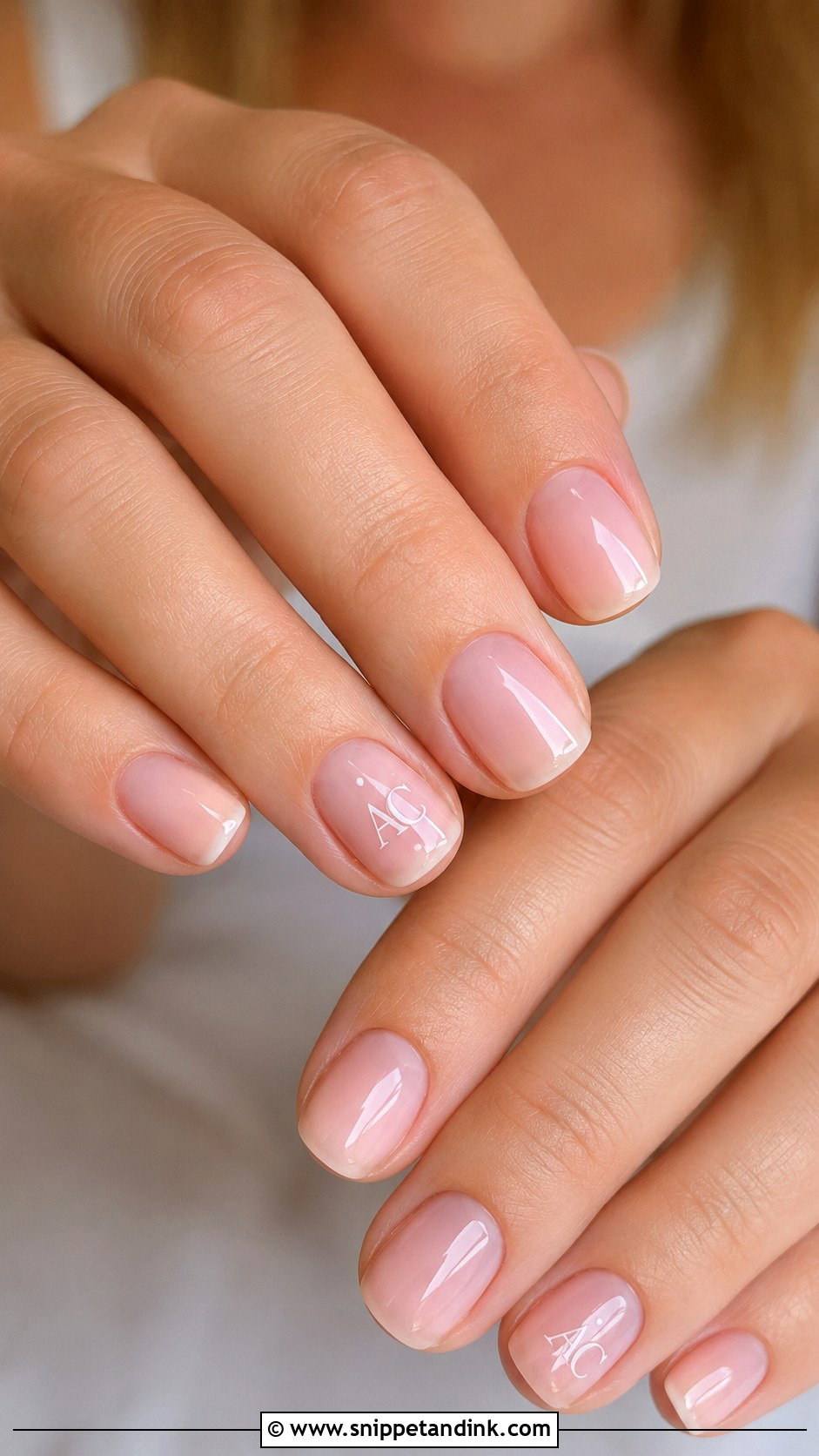
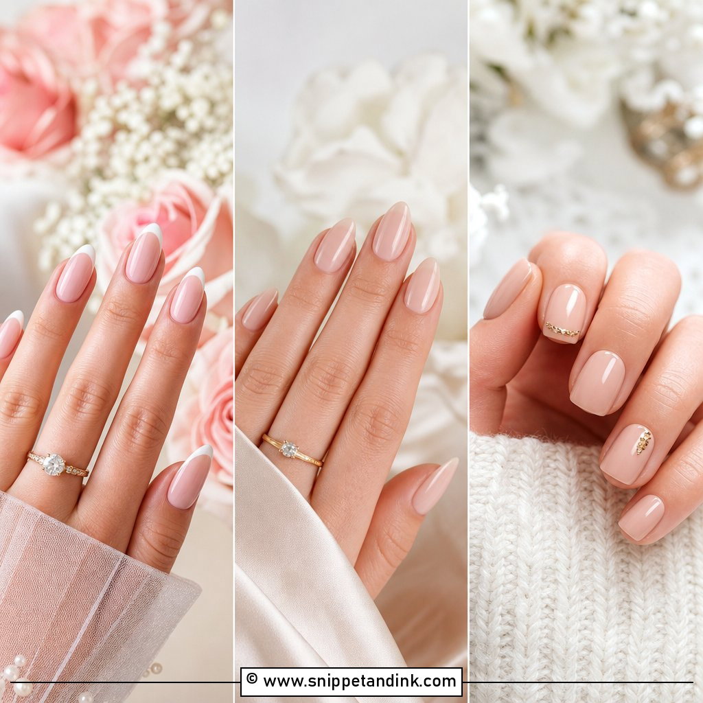
Minimal sets are where lettering looks most deliberate. A sheer pink, clear nude or natural beige base with one small letter neatly placed on the ring finger. Simple font, thin lines, very few extras. A dot, micro heart or ultra-fine French is all it needs. Short and natural nails suit it because it doesn’t rely on length. With nothing else competing, the ring stays the hero in every hand shot.
20. Wedding Date And Initials Nails
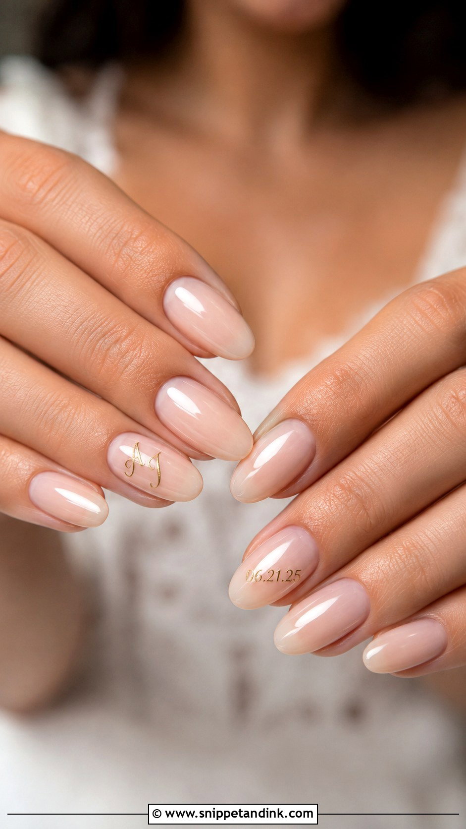
Putting the date and initials on the same set works best when they’re split: initials on one ring finger, the date on the other. A nude, milky or blush base keeps tiny text readable. Fine white, gold or black lettering depends on how subtle you want it. Roman numerals look more decorative, plain numbers cleaner. Numbers are harder to paint small than letters, because a 6, 8 and 9 close up into blobs if the line is even slightly thick. Book an artist who is confident with micro lettering and ask to see photos of her small text. Done well, the set turns into a keepsake from the day.
Hand-Painted, Stamped or Decal Lettering for a Wedding Week
There are three ways to get a letter onto a nail, and they behave differently. Hand-painted gel with a fine liner brush gives the most personal result and lets me adjust size and slant to your nail, but it depends entirely on the artist’s steady hand and takes longer. Water-slide decals and stickers are consistent and quick, and they’re useful for very detailed script; the edges must be fully sealed under top gel or they lift within days. Stamping plates give clean letters, though the font choice is limited to whatever the plate carries.
Whichever method you pick, think about which way the letter faces. In most ring shots the hand is held fingers down or angled toward the camera, so I paint the letter to read correctly from the viewer’s side, not yours. Tell your artist if you’d rather read it yourself when you look down.
- Book the set one to three days out so the letters are fresh and there’s no growth gap at the cuticle
- Write the exact spelling, letters and date format on paper and hand it over; don’t rely on saying it aloud
- Check every letter before the top gel goes on, since a mistake is easy to wipe at that stage and much harder after curing
A Letter Small Enough to Stay Yours
Initials carry something private into a very photographed moment. Milky white, a French, soft chrome, pearls, florals or the date: the right one is the set that still feels like you a week later. Keep the lettering small, match its colour to your jewelry and dress, and try it at a trial if you can. That’s when you find out the font is too curly, the letter sits too high, or the base swallows the colour. Long almond or short natural, a well-placed initial is the detail you’ll keep looking at.
You'll Like These Ideas:


Leave a Reply