
A flavor sign is the smallest piece of stationery I design for a wedding, and one of the most read. Guests stop at the cake table, look at the tiers and want to know what’s inside. A good sign answers that in a few seconds, helps people pick a slice, and makes the display look planned in photos. Acrylic, paper, wood, mirror, chalkboard and illustrated signs all work, as long as the material suits the venue and the flavors stay legible. A tier-by-tier layout helps most when every layer has its own filling. Here are twenty approaches, each with the readability notes I’d give a couple during proofing.
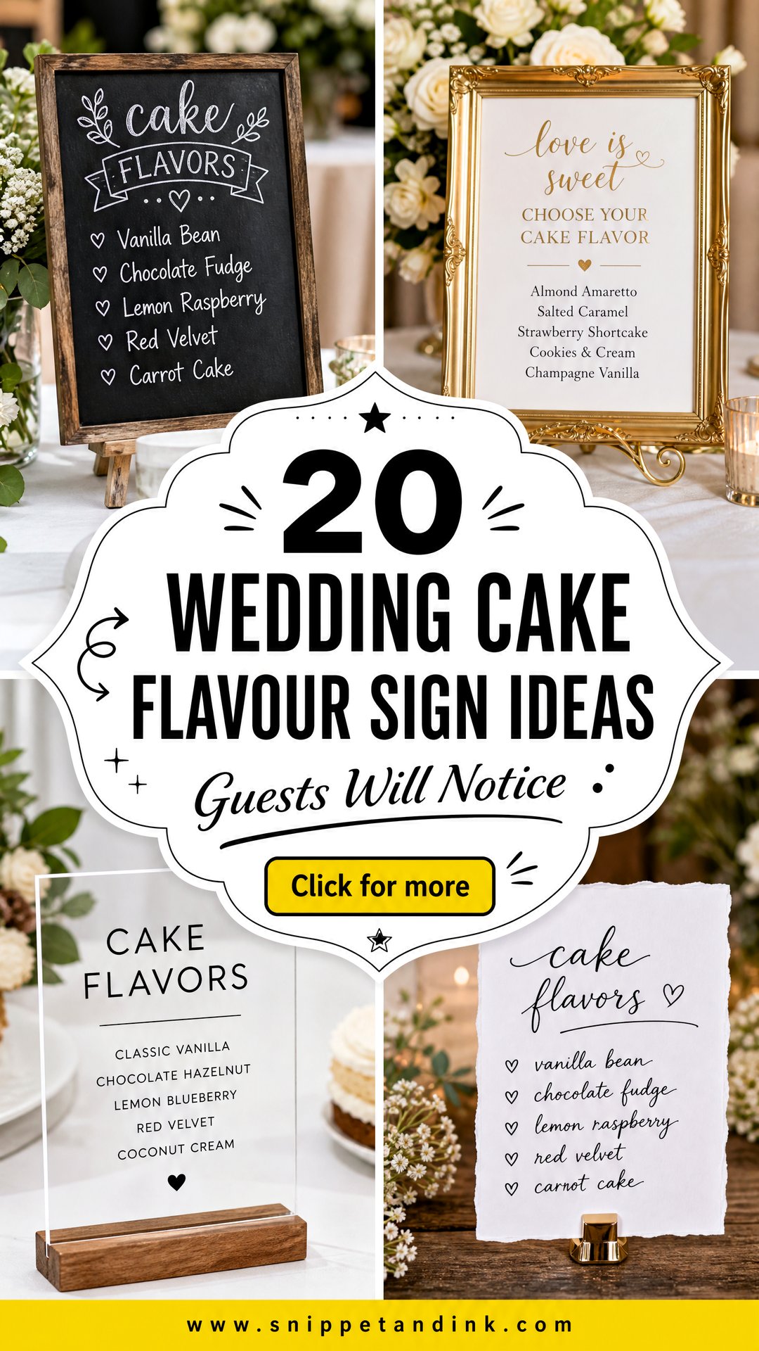
Writing the Flavor List Before Anyone Picks a Font
I ask couples to send me the wording before we talk about design, because the length of the text decides the layout. A good flavor line has three parts at most: the sponge, the filling and, if it’s different from the outside, the frosting. “Lemon sponge, raspberry jam, vanilla buttercream” fits on one or two lines. A paragraph about the inspiration doesn’t.
- Use the same order as the cake, top tier first.
- Drop words guests don’t need, like “delicious” or “homemade.”
- Flag nuts, alcohol and anything else your caterer wants guests to know, in plain words.
- Keep the title short. “Cake” or “The Cake” is plenty.
1. Acrylic Wedding Cake Flavor Sign
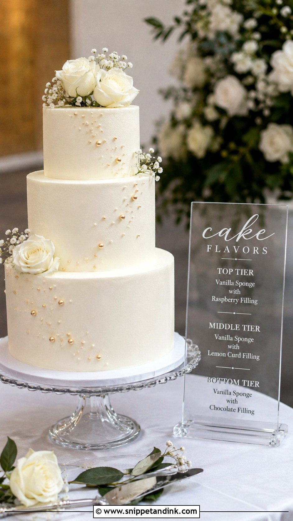
Clear acrylic is the sign I’m asked for most, and the one that most often turns out hard to read. White lettering on clear acrylic disappears against a white cake behind it, so I either add a frosted panel behind the text or switch to black or gold printing. List each tier from top to bottom, for example lemon raspberry, vanilla bean, chocolate ganache and almond cream, in a plain font, and keep script for a short title like “Cake Menu.” A small stand at the front corner of the table keeps it out of the cake photos.
2. Wooden Wedding Cake Flavor Sign
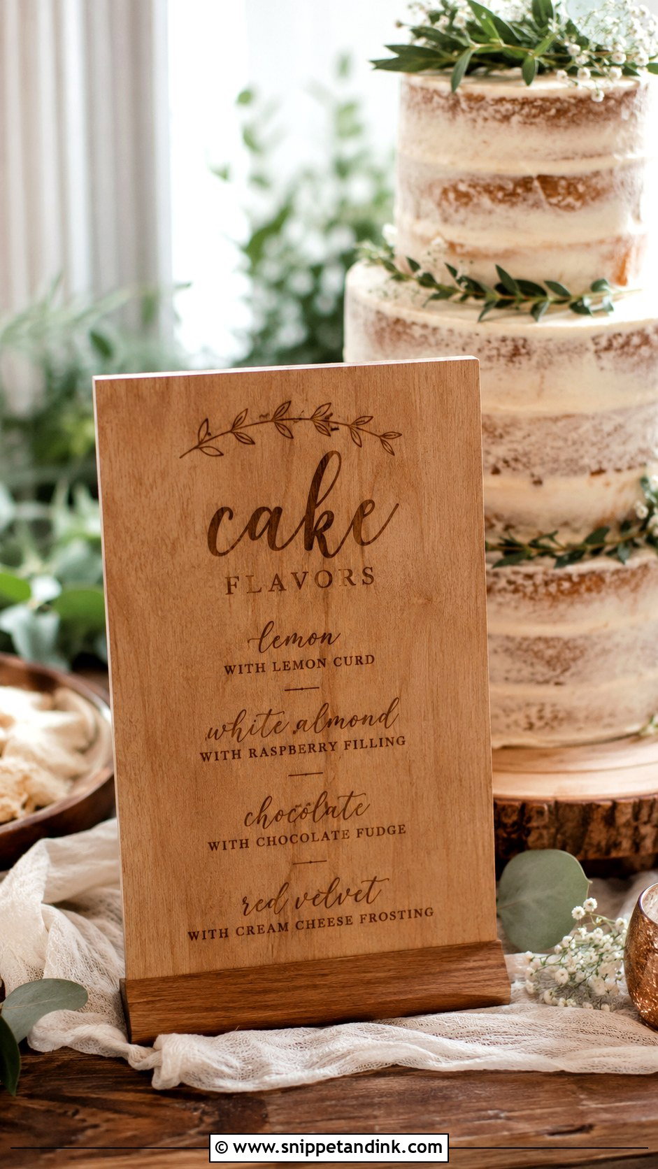
Wood brings warmth to barns, gardens and outdoor receptions, and it sits well beside textured buttercream, greenery and dried flowers. Engraving lasts and becomes a keepsake; UV printing on wood costs less and handles color. My favorite layout is a simple tiered cake outline with each flavor written inside its layer, so guests match the sign to the cake at a glance. Dark lettering on pale wood is the most legible. If the table is full of candles, florals, or linen runners, raise the sign on a small easel so it doesn’t sink into the arrangement.
3. Mirror Wedding Cake Flavor Sign
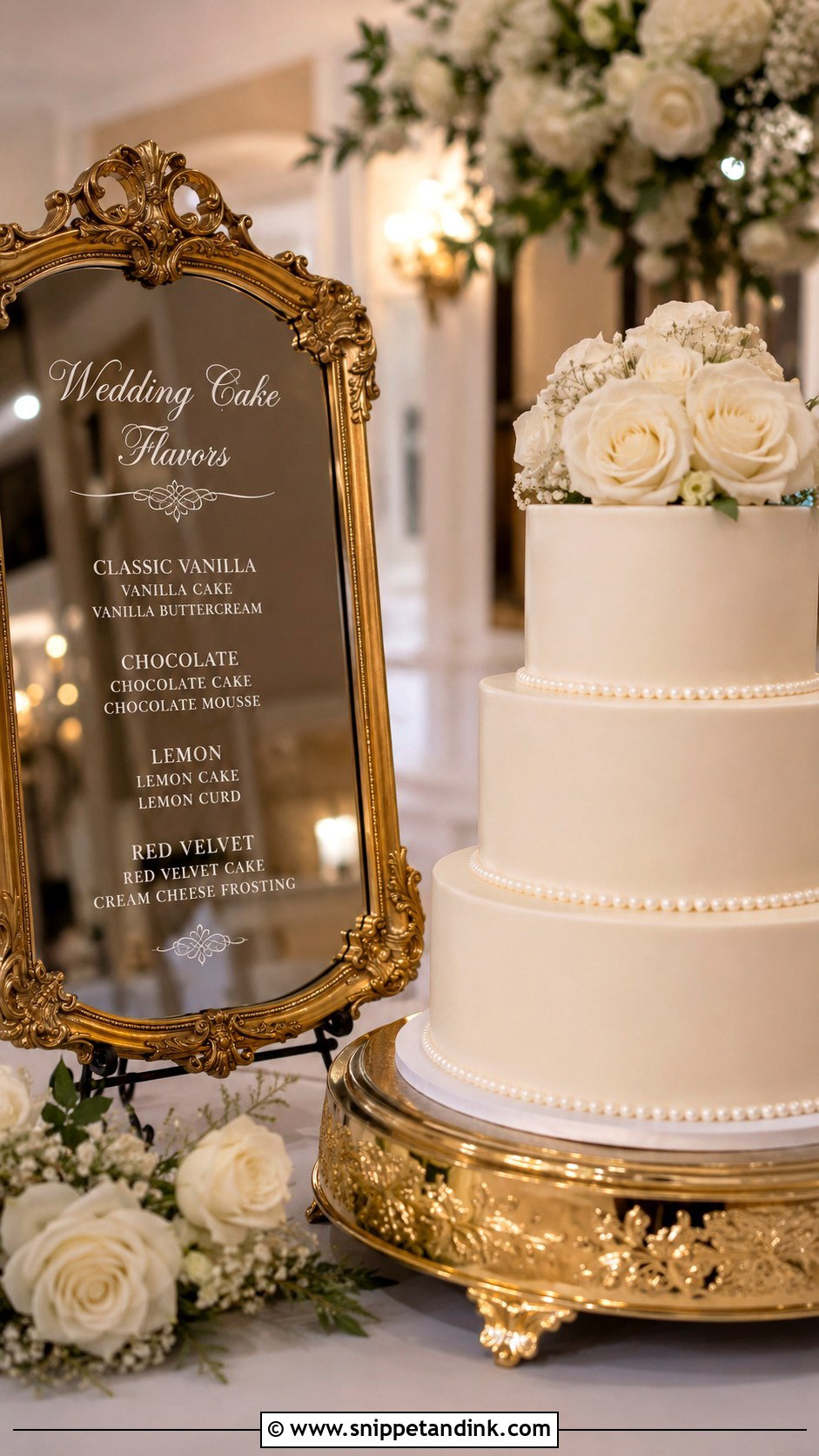
Mirror signs look dressy in ballrooms and at black-tie receptions, next to smooth fondant, pearl piping and white roses. They’re also the hardest material to read. In a dim room, thin lettering vanishes, and the mirror reflects whatever’s opposite, which may be a cluttered table or the bar. I specify bold white or gold vinyl and angle the sign so it reflects a wall or the ceiling. A short title, a neat flavor list and a small easel or gold frame are all it needs.
4. Chalkboard Wedding Cake Flavor Sign
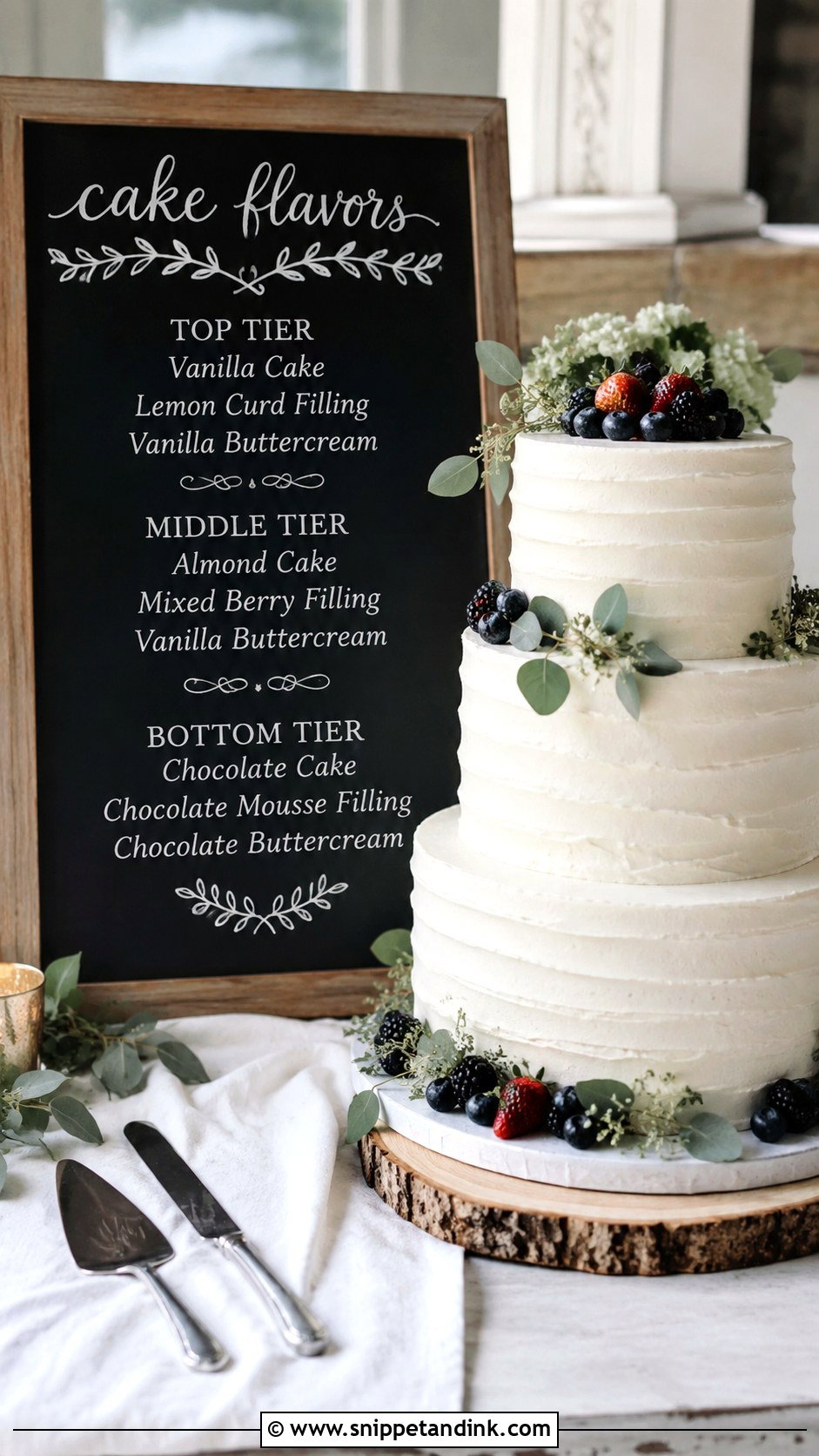
Chalkboard is relaxed and suits farmhouse venues, backyard weddings and dessert bar setups. White on black reads well from a distance. Real chalk smudges the moment someone brushes past, though, so for anything handwritten I use a chalk marker, or I print a chalkboard-style design on matte card for a crisper finish. Keep the wording short, since small chalk lettering gets messy. Labels like “Top Tier,” “Middle Tier” and “Bottom Tier” before each flavor make it scannable.
5. Watercolor Wedding Cake Flavor Sign
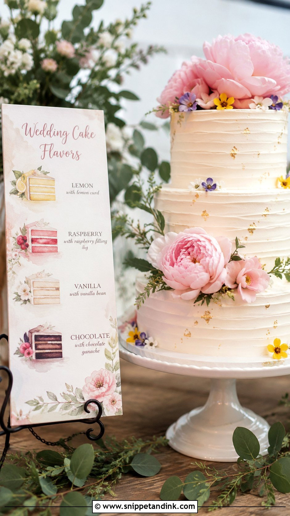
Watercolor suits pastel flowers, garden weddings and soft floral stationery. The artwork can be a painted cake, loose blooms, fruit or simply a wash of color behind the list. The common problem is a wash that’s too strong under the text. I keep the painting pale where the words sit and print the flavors in a dark ink with enough weight to stand out. Matching the paint colors to your flowers ties it together, and a scanned painting can be printed at several sizes.
6. Minimalist Wedding Cake Flavor Sign
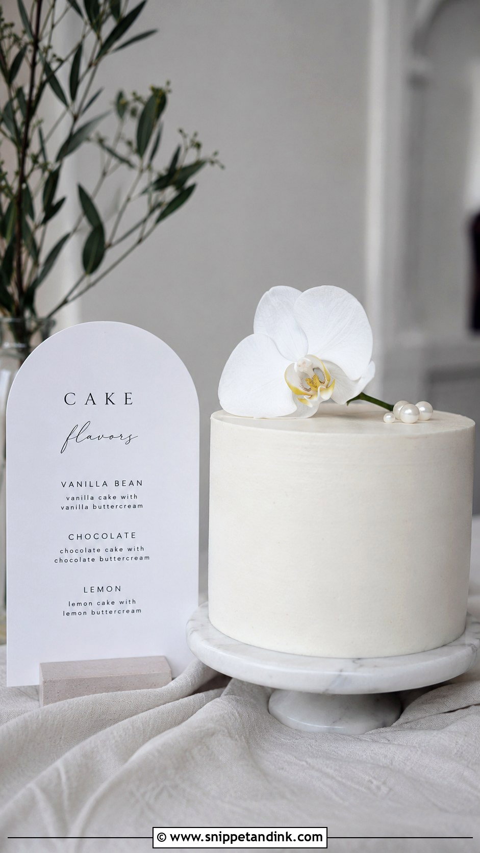
Minimal signs let the cake do the talking: clean type, plenty of white space, no artwork. They suit modern cakes and monochrome decor. Size depends on how close guests get. A 5×7 card works on a small table where people stand right next to it; an 8×10 or larger is better if they read it from a step or two away. List flavors in tier order, top to bottom, and keep fillings to short phrases. With so little on the page, spacing becomes the design, so I adjust line spacing more carefully on these than on anything decorated.
7. Floral Wedding Cake Flavor Sign
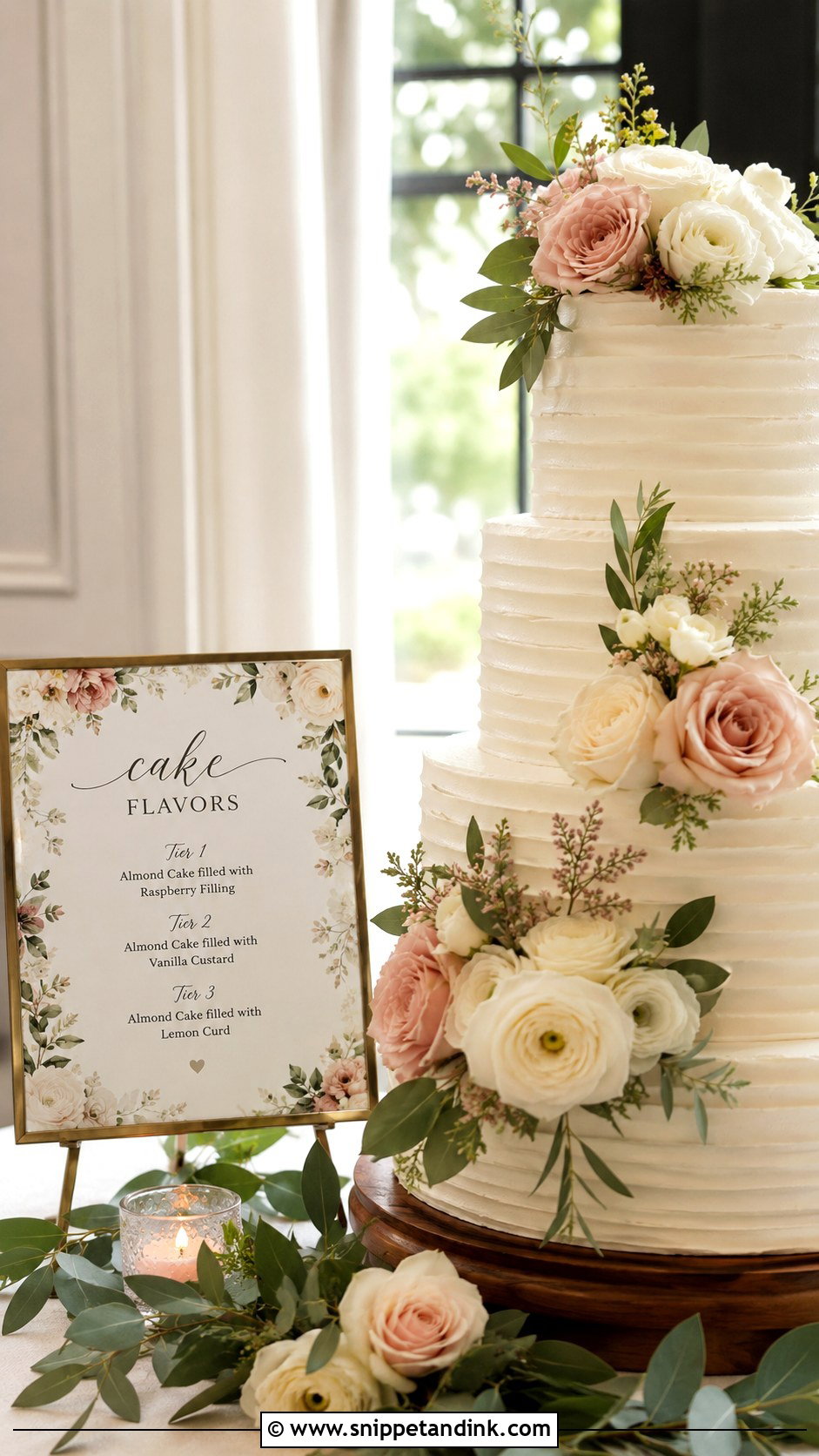
A floral sign links the cake table to the bouquet and centerpieces, with printed roses, peonies, wildflowers, orchids or greenery. It gives a cake table more presence in a big room. Borders, corner clusters or a small botanical motif at the top all work. If the flowers are colorful, I keep them to the edges and the text area plain, so the flavors stay readable in a dark, simple font. Real flowers round the cake stand finish the look.
8. Tiered Wedding Cake Flavor Sign
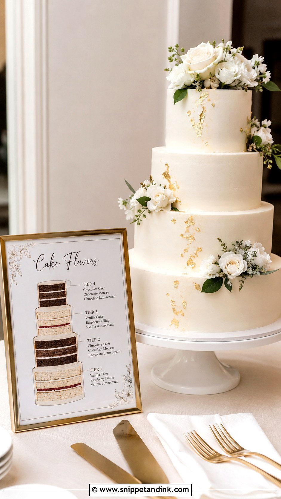
This is the clearest layout for a cake with different flavors in each tier. Instead of a list, it shows a simple drawing of the cake with each tier labeled, so guests see straight away which one is almond, chocolate, lemon or red velvet. It helps most when slices are served at a dessert station and people can choose. The drawing doesn’t need to be an exact replica, but the number of tiers and their order must match. I ask the baker to confirm the order in writing before I send anything to print.
9. Printable Wedding Cake Flavor Sign
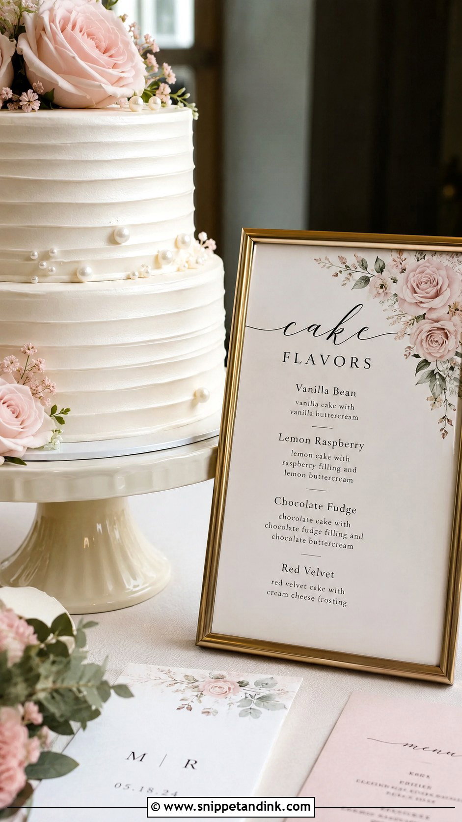
Printables are the budget route, and they match menus, seating charts and table numbers easily. Many can be edited at home and printed at a local print shop. Choose a template with generous spacing and room for fillings, because cramming text into a design made for shorter flavor names is where printables go wrong. Print a second copy for a wide table or a separate serving area. Use a heavy matte card to cut glare in photos, and a simple frame makes even an inexpensive print look finished.
10. Calligraphy Wedding Cake Flavor Sign
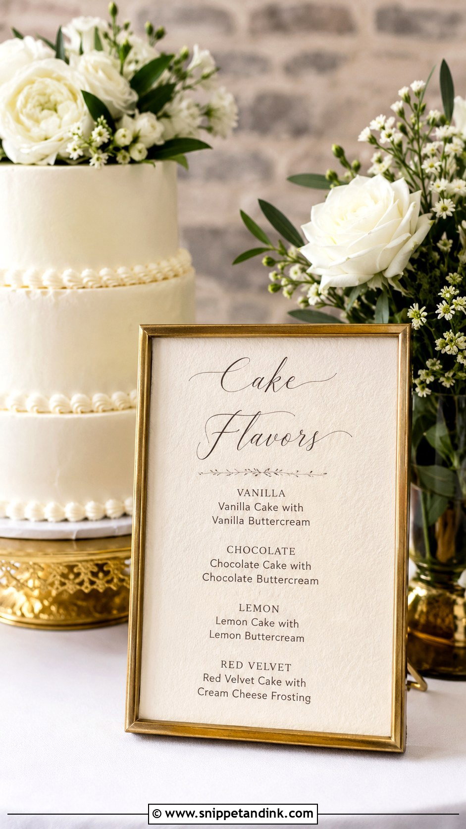
Calligraphy is personal and romantic, but it isn’t a reading font. I use it for the heading, something like “Our Cake Flavors” or “Let Them Eat Cake,” and set the flavor names in a clean serif or sans serif underneath. Guests shouldn’t have to decode a flourish to find out if a tier has nuts. It works on acrylic, handmade paper, mirror, vellum or framed card. If a flavor name is long, I shorten the description and keep only the filling detail that matters.
11. Gold Frame Wedding Cake Flavor Sign
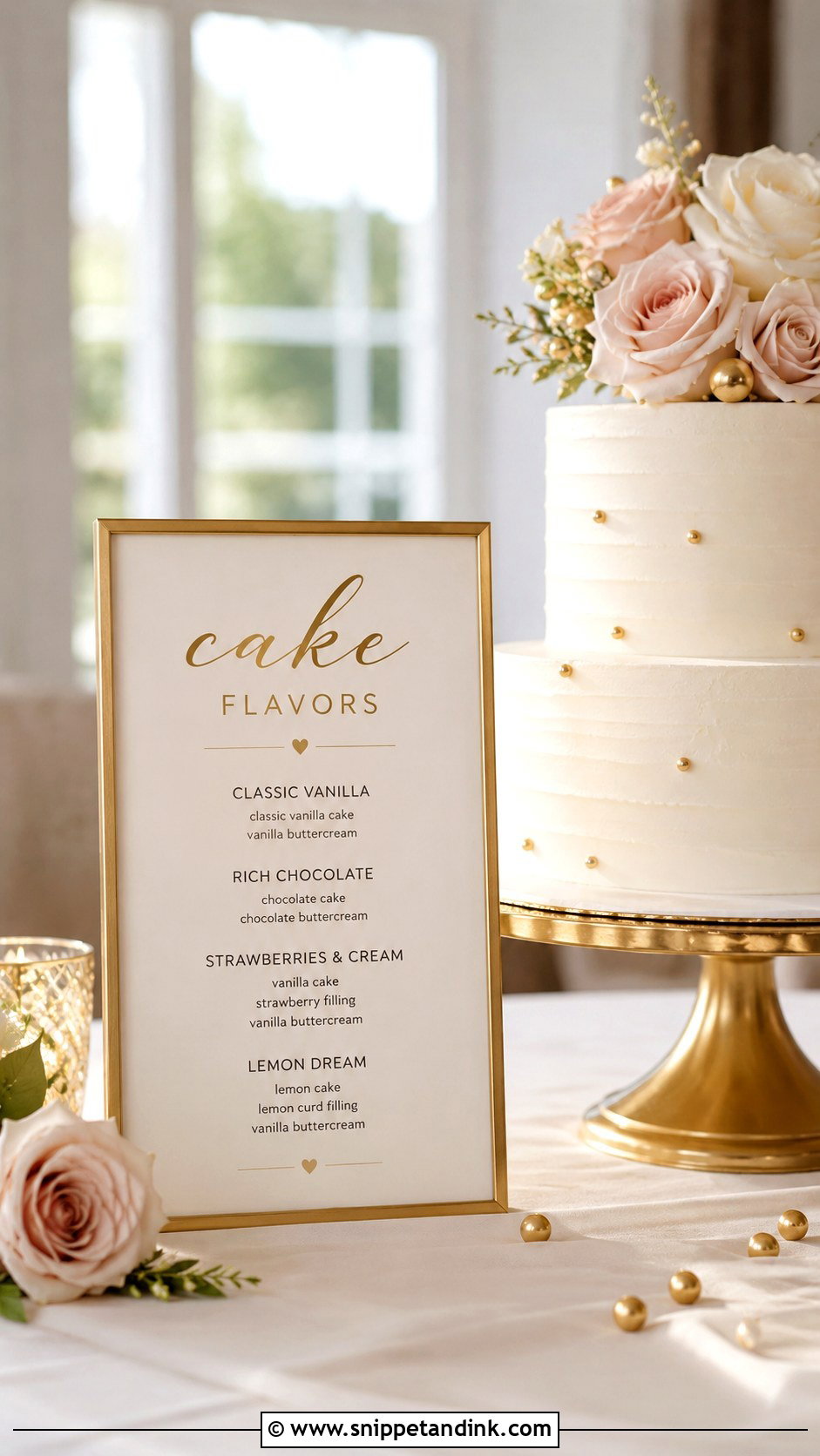
A gold frame makes a printed card look finished without a custom material. Vintage, slim metal or ornate baroque frames each set a different mood. Gold sits well with ivory cakes, blush flowers, greenery and candlelight. A thin frame with plain black text reads modern; a curved frame with floral artwork reads romantic. The frame also keeps paper flat and upright. Watch the scale: a large ornate frame next to a two-tier cake makes the cake look smaller.
12. Black And White Wedding Cake Flavor Sign
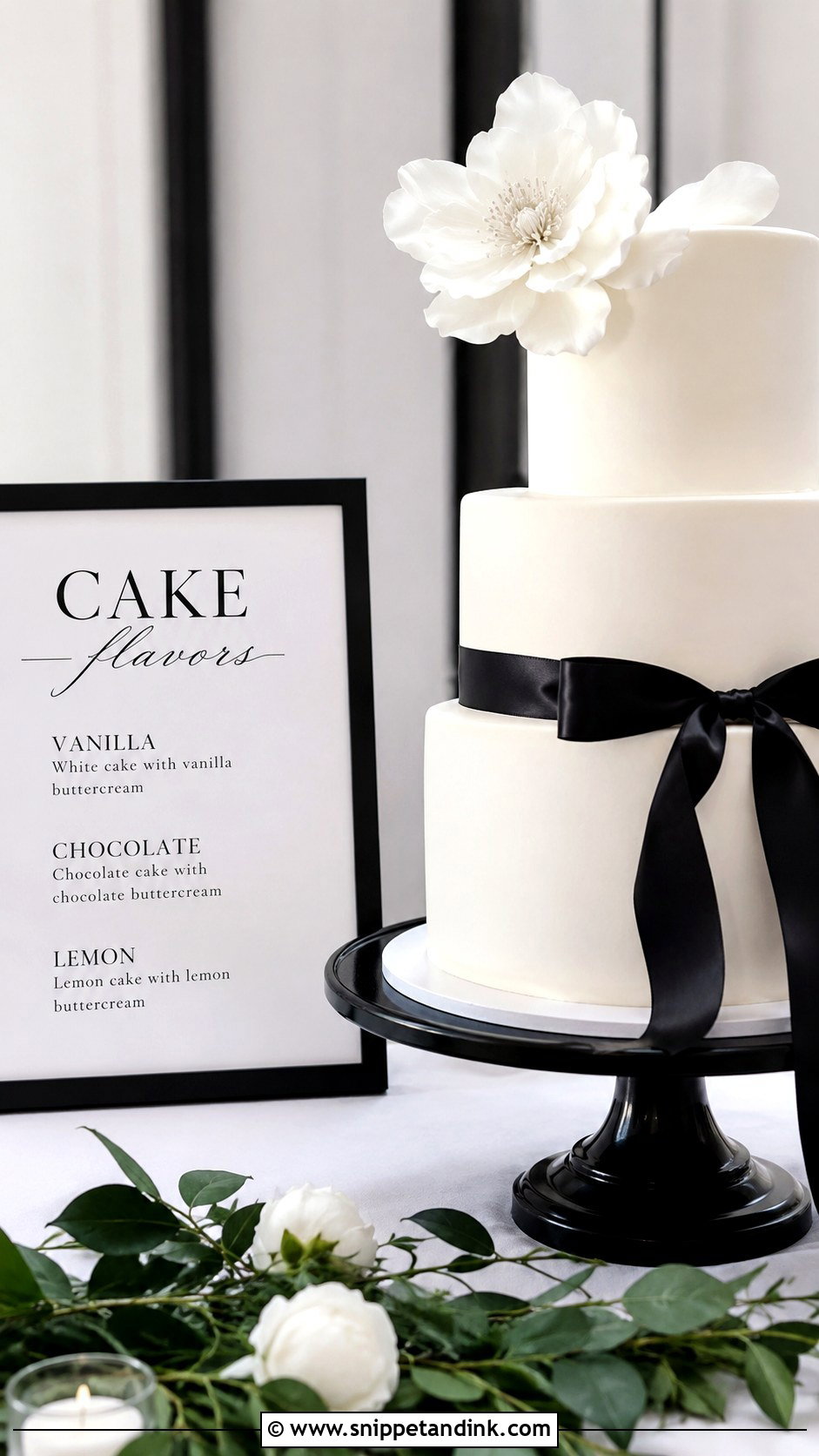
Black and white is the most legible combination there is, which is why I default to it when a cake table is in a busy spot where guests pass quickly. Black type on white feels clean; white on black is more dramatic but needs a slightly heavier font so the letters don’t thin out. Keep it uncluttered. It pairs with white buttercream, black ribbon, pearls or monochrome flowers, and a slim black frame or acrylic stand completes it.
13. Rustic Wedding Cake Flavor Sign
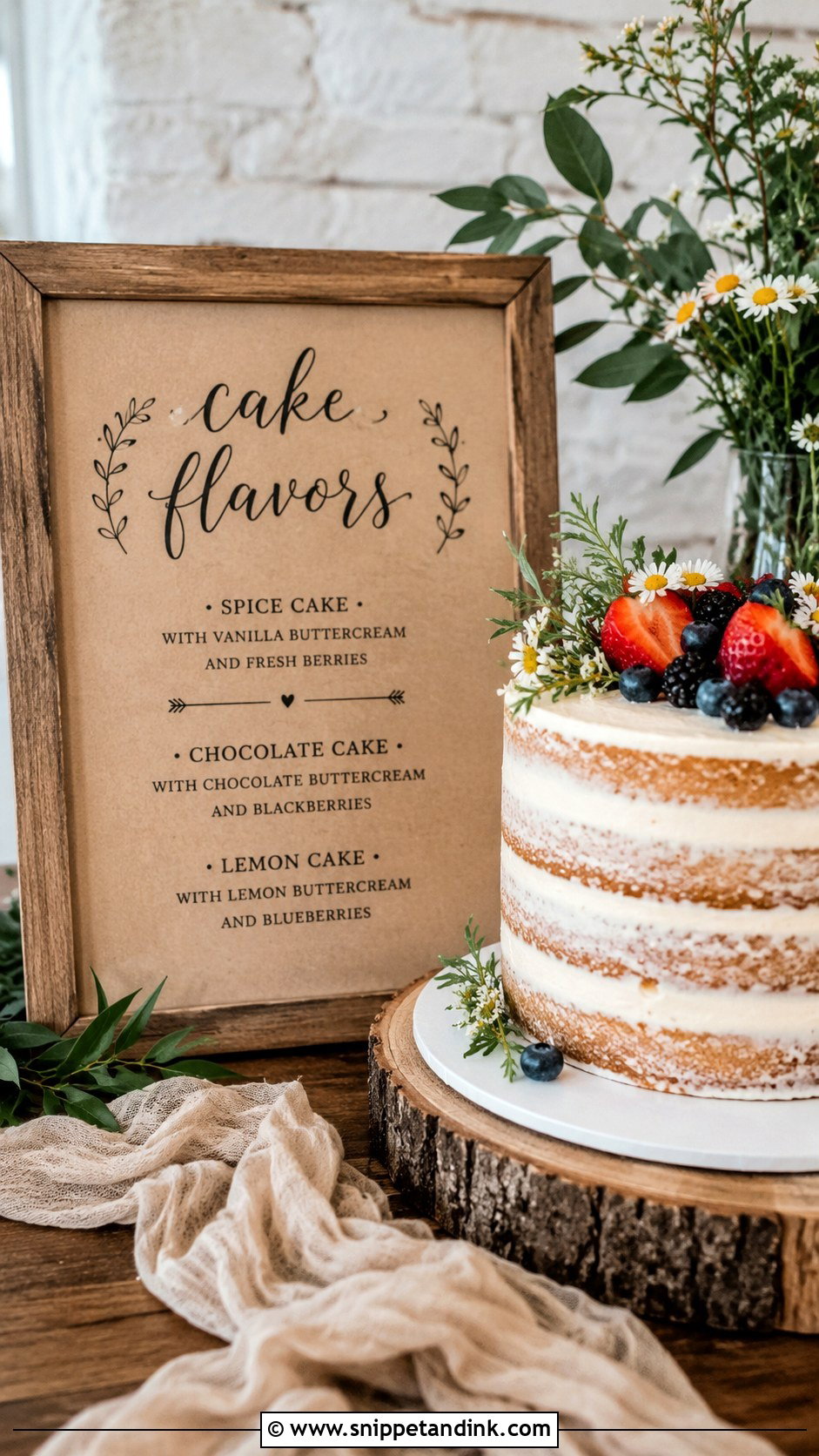
Rustic signs use kraft paper, woodgrain, linen, twine, greenery and handwritten-style fonts, and they suit naked and semi-naked cakes, buttercream ridges, berries and wildflower decorations. Rustic still needs to be tidy. A clear title and one flavor per line keep it readable. Outdoors, wind is the real enemy of a paper sign, so I use a heavy frame, a weighted stand or a sign mounted on board. Small sprigs of greenery nearby are fine; just don’t let them cover the words.
14. Modern Wedding Cake Flavor Sign
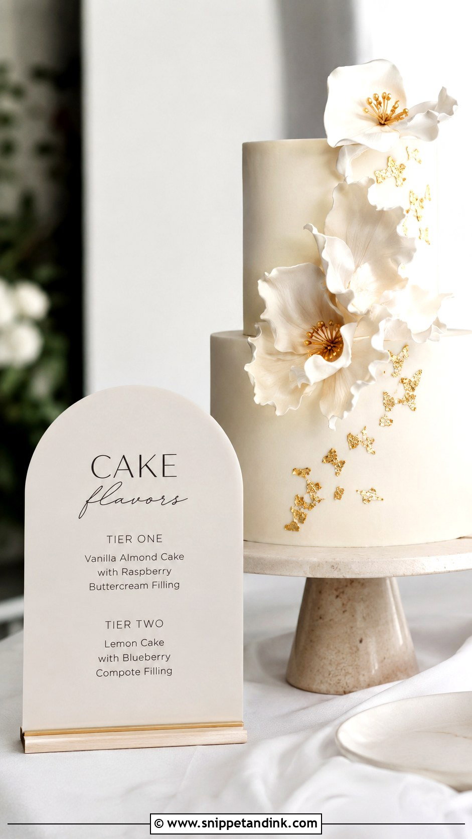
Modern signs depend on layout: arched acrylic, square card, simple type or a neutral color block behind the list. They suit smooth cakes, pressed flowers and sculptural blooms. Keep the wording direct. Three tiers means three flavors. If there are cupcakes too, add a short section underneath rather than squeezing them in alongside. I check alignment closely on these, because in a spare design a line that’s a few millimetres off is very noticeable.
15. Vintage Wedding Cake Flavor Sign
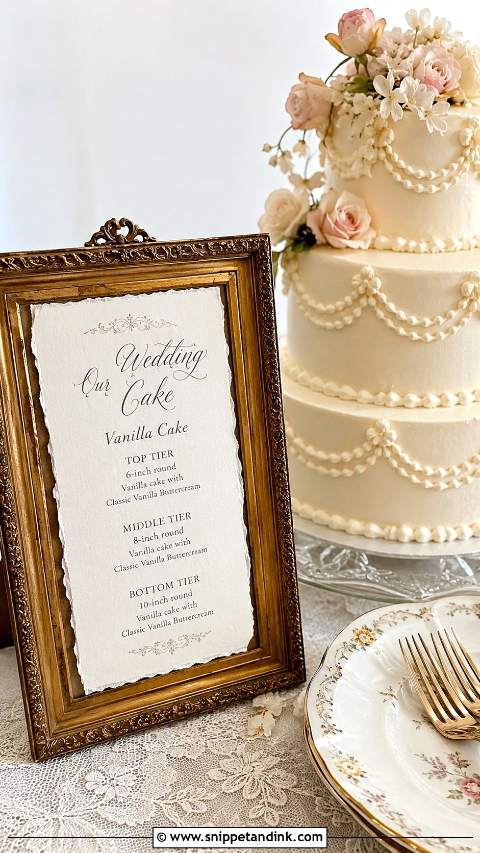
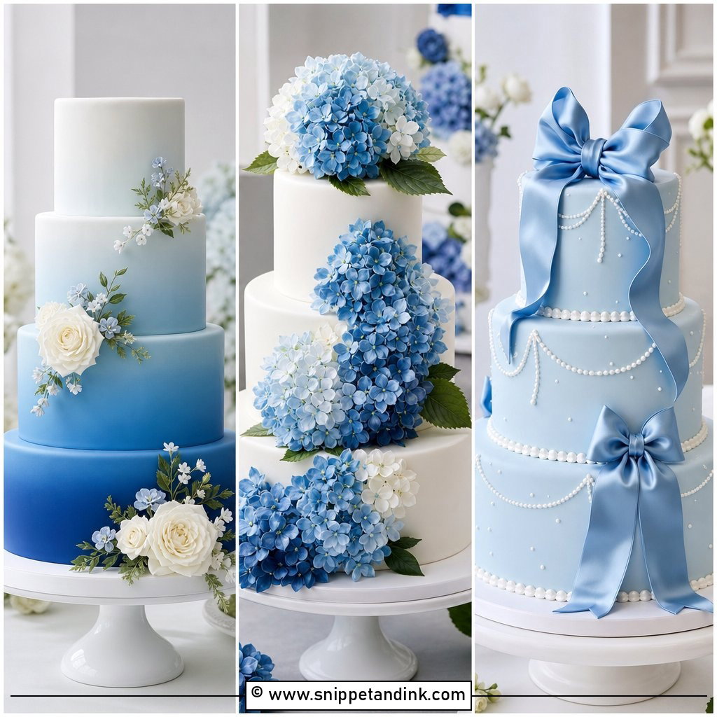
Vintage signs suit receptions with antique frames, lace linens and classic china. Deckled paper, ornate frames, muted floral artwork and old-style serifs give the feel, and it pairs naturally with piped buttercream, Lambeth borders, sugar flowers and pearls. Faded effects are where these go wrong, because a distressed texture behind small text makes it unreadable. I keep the aging to the border and the flavor list crisp. A plain “Wedding Cake Flavors” at the top and a centered list below is enough.
16. Greenery Wedding Cake Flavor Sign
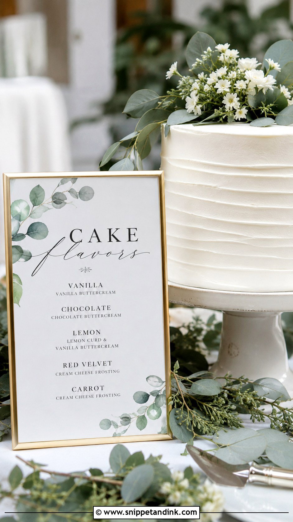
Greenery is a softer alternative to a floral sign when you don’t want strong color: eucalyptus, olive leaves, ferns or a botanical border. It fits garden weddings, outdoor receptions and neutral palettes. A white or cream background with dark green or black lettering keeps it clear. Place it close to the cake, within arm’s reach of the stand, so the sign and the cake read as one display rather than two separate things.
17. Dessert Table Wedding Cake Flavor Sign
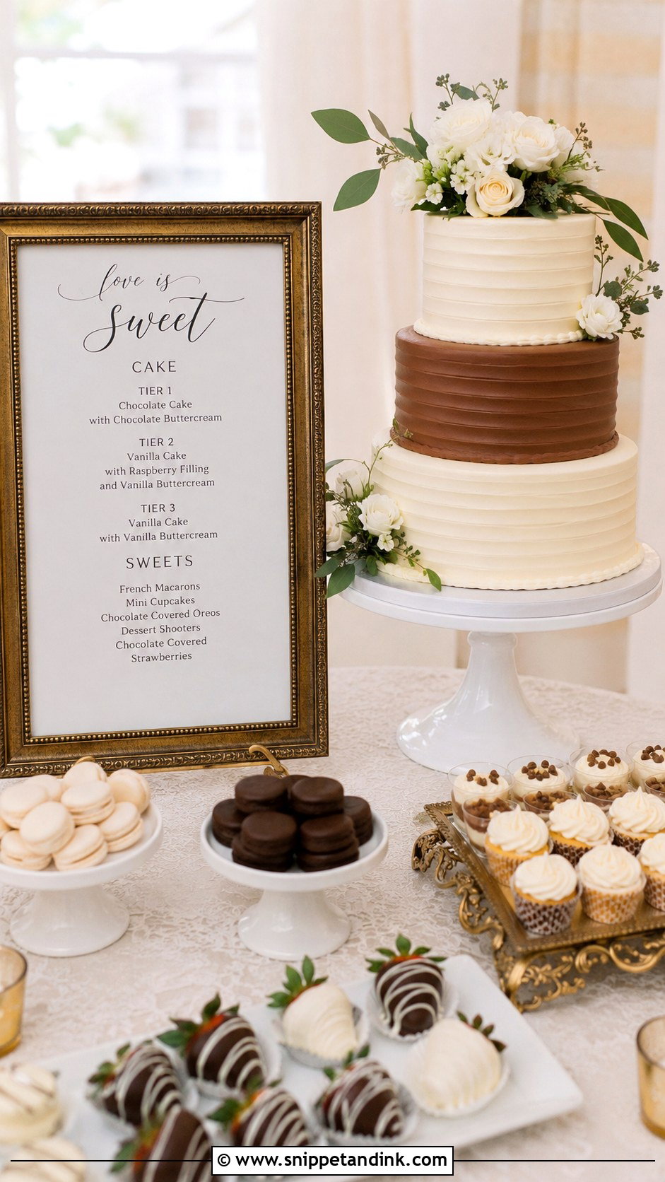
When the cake shares a table with cupcakes, mini tarts, cookies, macarons or cake pops, one larger sign can explain the full dessert spread instead of a dozen tiny labels. I put the cake flavors at the top and a short menu by category underneath. People read this sign while queuing, so it can be bigger and slightly more detailed. If there are allergy-friendly options, word them exactly as your caterer approves; I never write “nut-free” on a sign unless the kitchen has confirmed it.
18. Cupcake Wedding Cake Flavor Sign
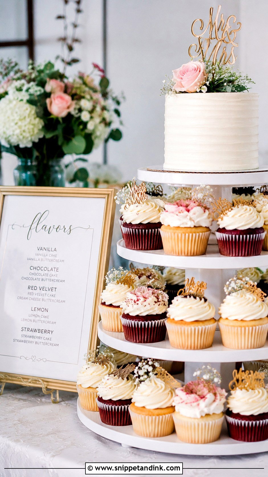
When couples serve a small cutting cake with cupcakes, the cupcakes are what guests actually choose between, so the sign has to sit by the cupcake stand, not just the cake. Several flavors read best in columns or a list with small icons. If the wrappers look alike, add tiny labels to the tiers of the stand as well. Vanilla bean, chocolate, lemon, strawberry and red velvet listed clearly help people take the one they want, and fewer half-eaten cupcakes get left behind.
19. Handwritten Wedding Cake Flavor Sign
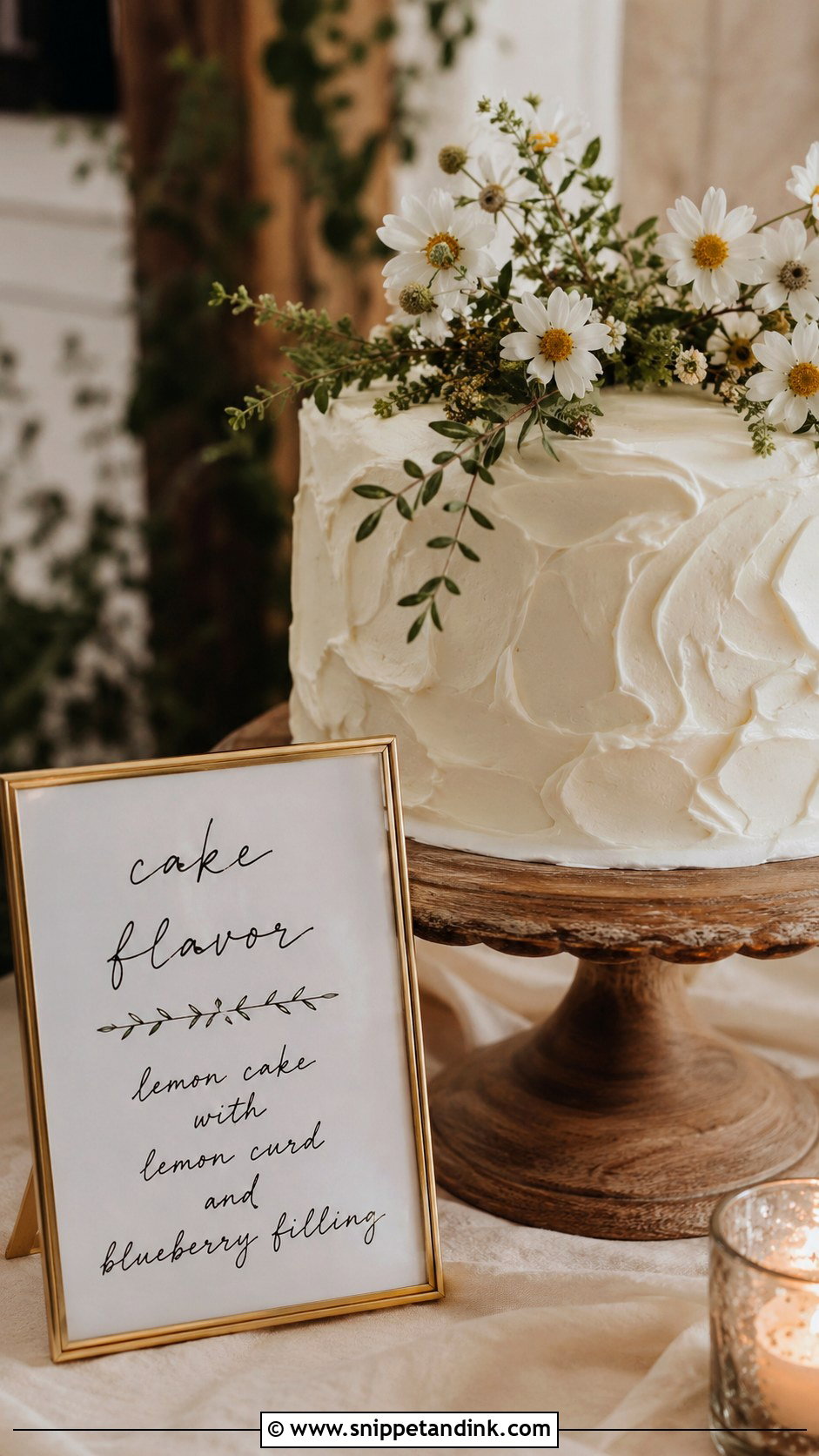
Handwriting feels personal at an intimate or backyard wedding, on handmade paper, a small chalkboard, a framed card or a wooden plaque. Write larger than feels natural, since handwriting shrinks fast with distance. Draft it in pencil first, or ask a friend with good lettering. Keep the wording minimal. I’d also suggest writing two copies, because a spilled drink an hour before the reception happens more often than anyone plans for.
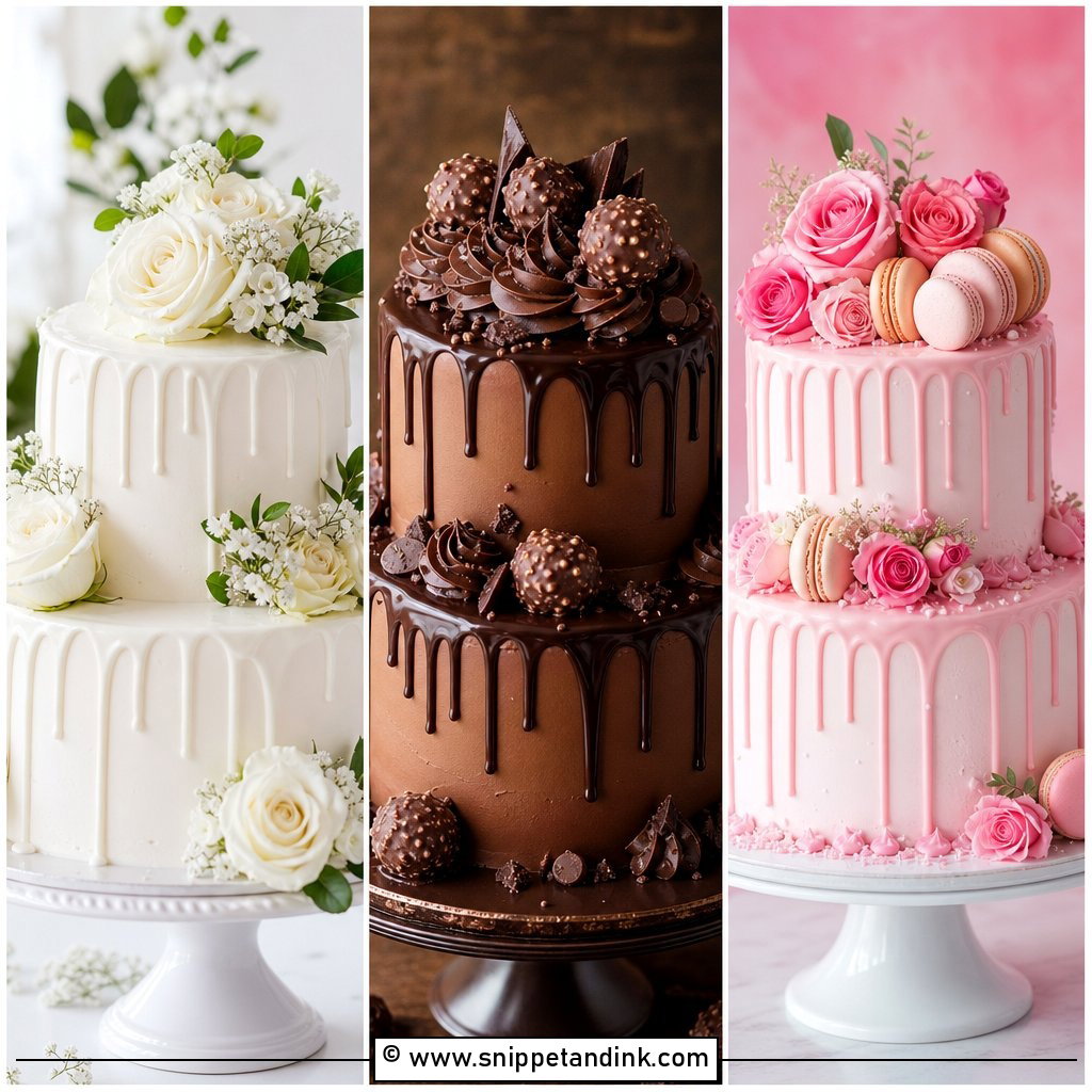
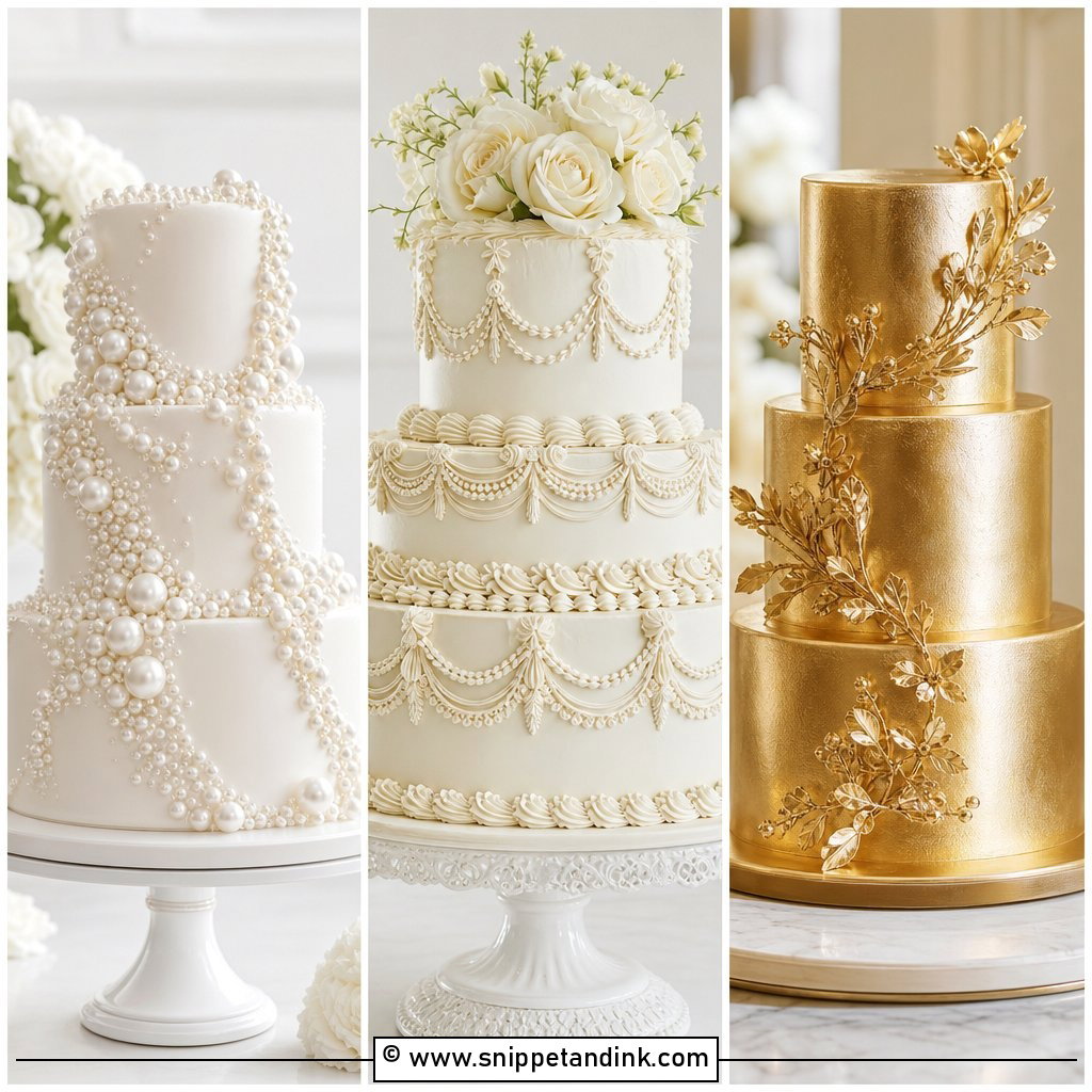
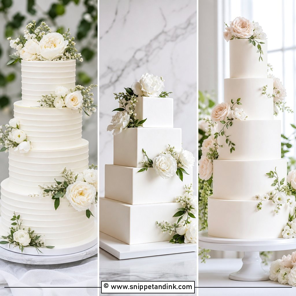
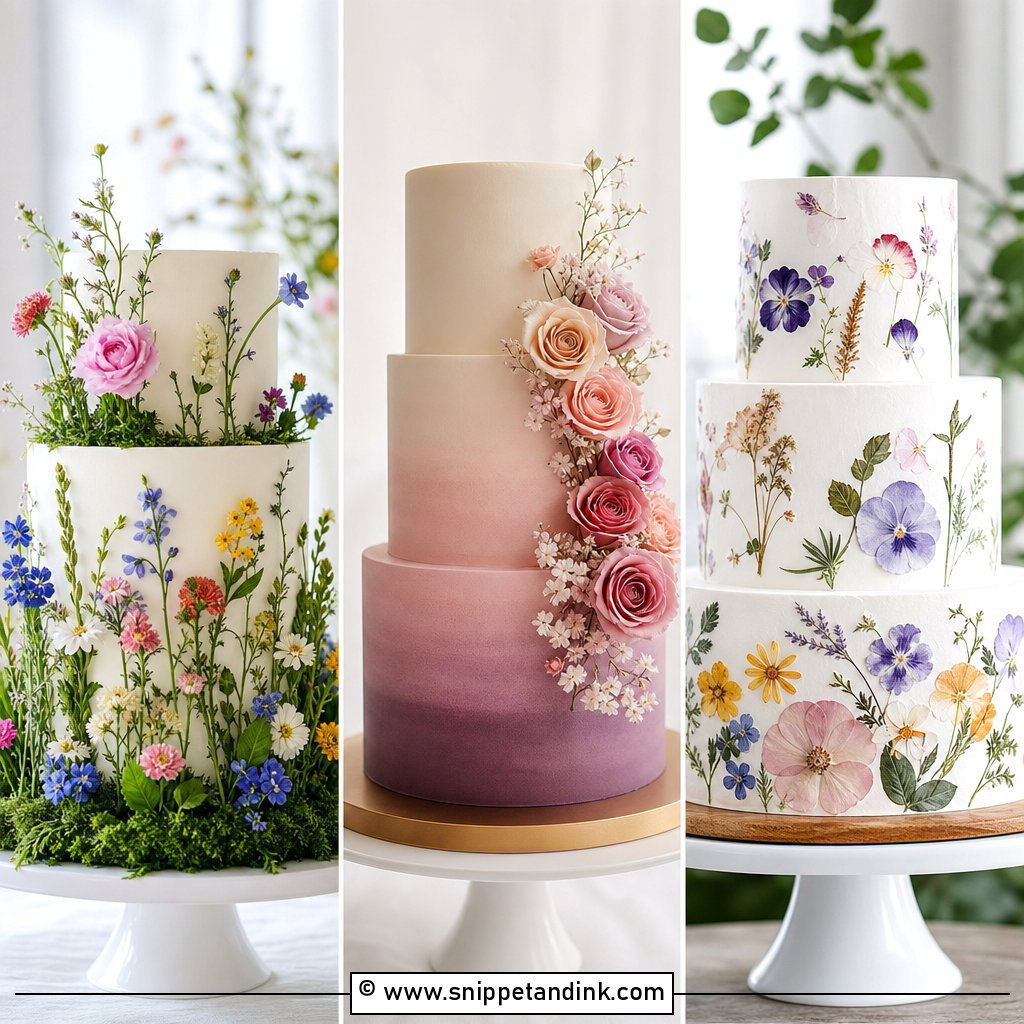
20. Custom Illustrated Wedding Cake Flavor Sign
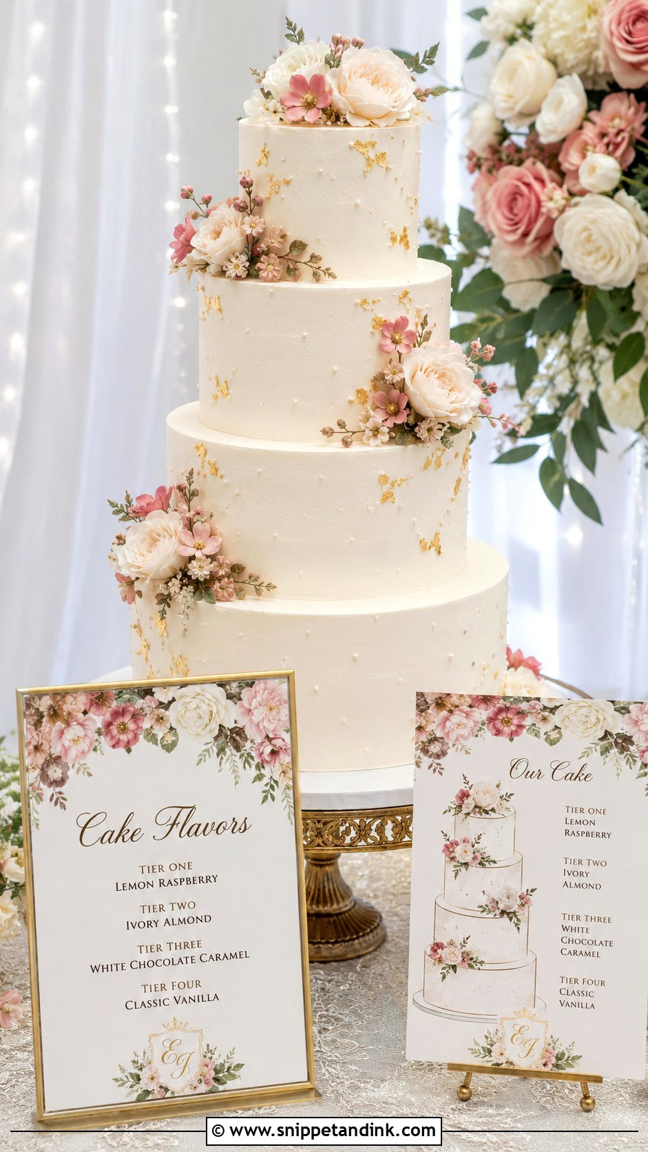
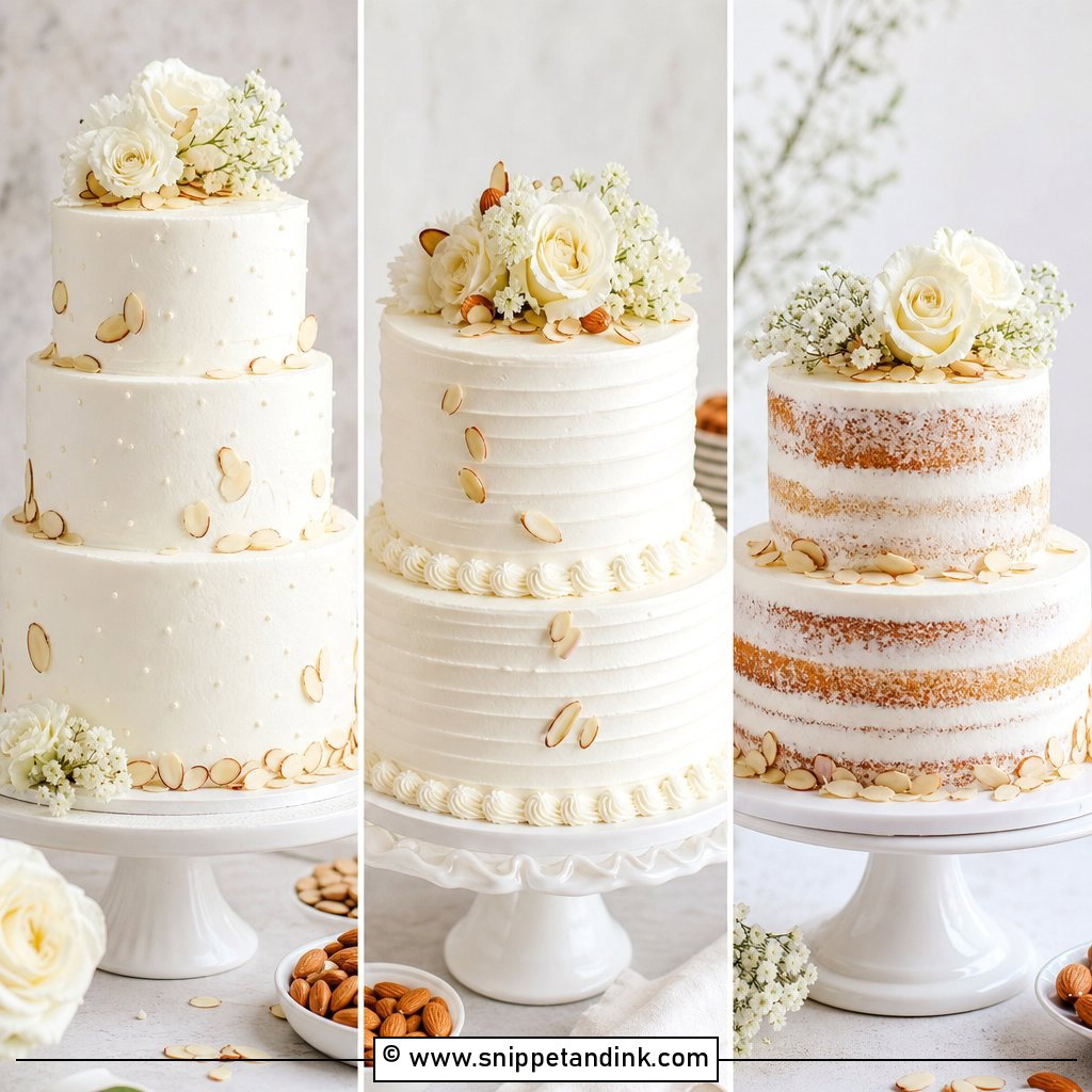
An illustrated sign can be drawn from your real cake, with its tiers, flowers, piping, ribbon and colors, each tier labeled with its flavor. It’s especially good for a cake with a meaningful design, and many couples frame it afterwards. Keep the illustration style clean so it doesn’t compete with the real thing on the table. Accuracy is everything here. I don’t finalize the drawing until the baker has sent the final sketch, because tiers and fillings often change after the tasting.
Type Size That Reads From Where Guests Actually Stand
Most people read a cake sign from about an arm’s length to a couple of steps away. On an 8×10 sign, I set flavor names no smaller than roughly 24 point and the title larger, and I test it by printing a draft at full size and reading it from across a room. Thin, high-contrast fonts look elegant on screen but break up in candlelight. If a sign looks slightly too plain on your laptop, it’s usually right on the table.
Proofing Against the Baker’s Final Order
Flavors change after tastings more often than couples expect: a filling gets swapped, a tier is added, the order is reversed for stability. I print signs only after the baker has confirmed the final order, usually in the last couple of weeks. Then give the sign to whoever sets the cake table, the coordinator or the baker, with a note saying which side faces guests. It’s an easy item to leave in a box in the car.
One honest point: at many receptions, the cake is cut in the kitchen and slices go out on plates, so guests never choose a tier. In that case, the sign is still worth having for the photos and for anyone with allergies, but it can be smaller, and the caterer should know which plates are which.
Readable First, Pretty Second
A flavor sign is small, but it changes how the dessert table works. Guests like knowing what they’re choosing, especially when every tier has a different cake, filling or frosting. Acrylic, wood, mirror, watercolor, calligraphy or a simple printable card can all suit your style. Check legibility before anything else, then match the material and colors to the table. Keep the wording short, put the sign where people actually stand, and confirm the tier order with your baker before printing.
You'll Like These Ideas:


Leave a Reply