
A two tone cake gives you color without turning the dessert table into a second flower display. Most of the decisions happen before anyone picks up a piping bag: which shade goes on which tier, whether the darker color will be buttercream or fondant, and how the seam between them gets finished. Below are the pairings couples ask me about most, with what I watch for when I actually make each one, from a stark black base to a soft peach that can turn orange under the wrong lights.
Which Color Goes on the Bottom Tier?
This is the first question I ask at a consultation, and it changes the whole cake. A darker or stronger color on the base makes the cake look grounded and stable, which is why most of the cakes below put the deeper shade underneath. Flip it and the cake looks lighter at the bottom and heavier on top. That can be striking on a tall, slim cake, but it can make a short two-tier look top heavy.
Proportion matters as much as order. An even split between two tiers reads graphic and modern. One small accent tier in color on an otherwise white cake reads softer, and it costs less dye, which helps with flavor.
What to bring to the tasting
- A physical swatch: a ribbon, napkin or bridesmaid fabric offcut. Phone screens shift color far too much to match from.
- A rough guest count, so the baker can work out tier sizes before talking about which tier carries which shade.
- The time of day and type of lighting at the reception, because the same mix looks different under daylight and candles.
- Any flavor limits. If someone hates the taste of strong dye, deep shades should be done in fondant or ganache.
1. Black And White Two Tone Wedding Cake
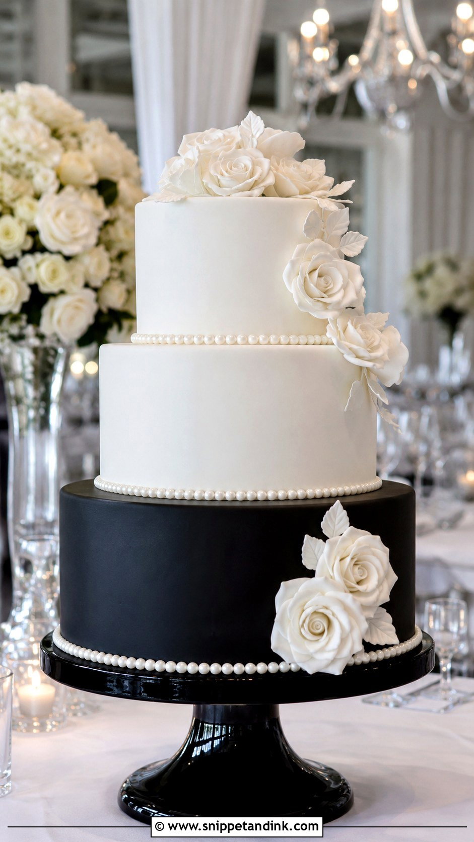
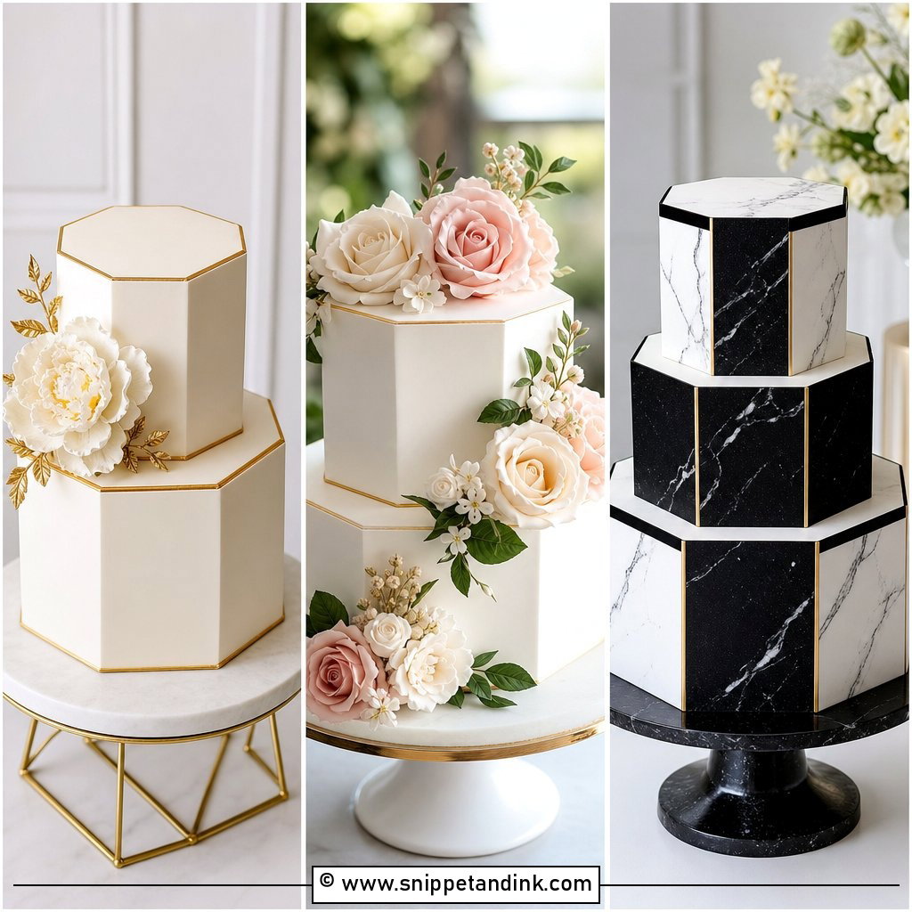
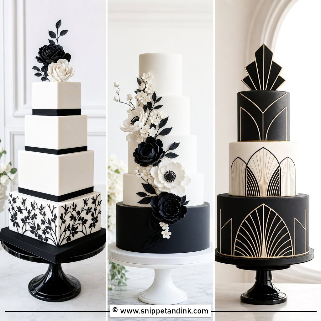
Black against white is the most formal contrast you can put on a cake stand, and the hardest one to keep clean. A matte black bottom tier under a white top tier looks crisp, and reversing it lightens the whole silhouette. I almost always do the black in fondant, because true black buttercream takes so much gel color that it can taste bitter and leave guests with grey teeth. White sugar flowers or a thin satin ribbon soften the edge. Keep the florals tight and controlled; a loose cascade breaks the graphic line that makes this one work in a ballroom or city venue.
2. Blush And Ivory Two Tone Wedding Cake
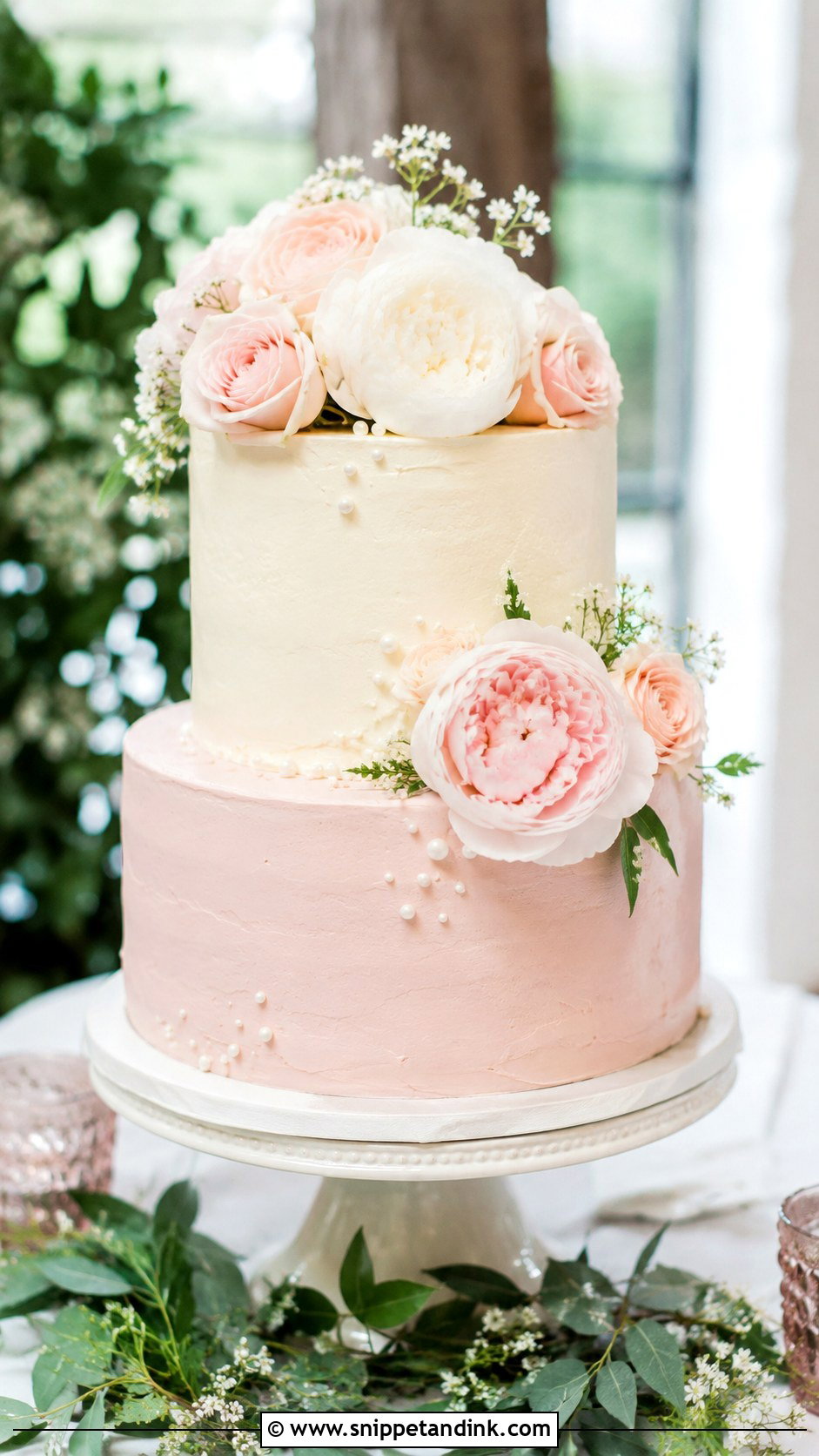
Blush with ivory is the pairing I make most often for garden receptions, partly because both colors sit happily next to roses, peonies and sweet peas. I put the blush on the bottom so the cake feels anchored. Buttercream is the right finish here, but know that real butter makes frosting naturally ivory, so your “ivory” tier is often just undyed buttercream, which keeps the flavor clean. Gold leaf or tiny pearl piping can go on top, though I’d pick one, not both. Pale pink fades in strong daylight, so if the cake will sit near a window for hours, ask your baker to keep it shaded.
3. Navy And White Two Tone Wedding Cake
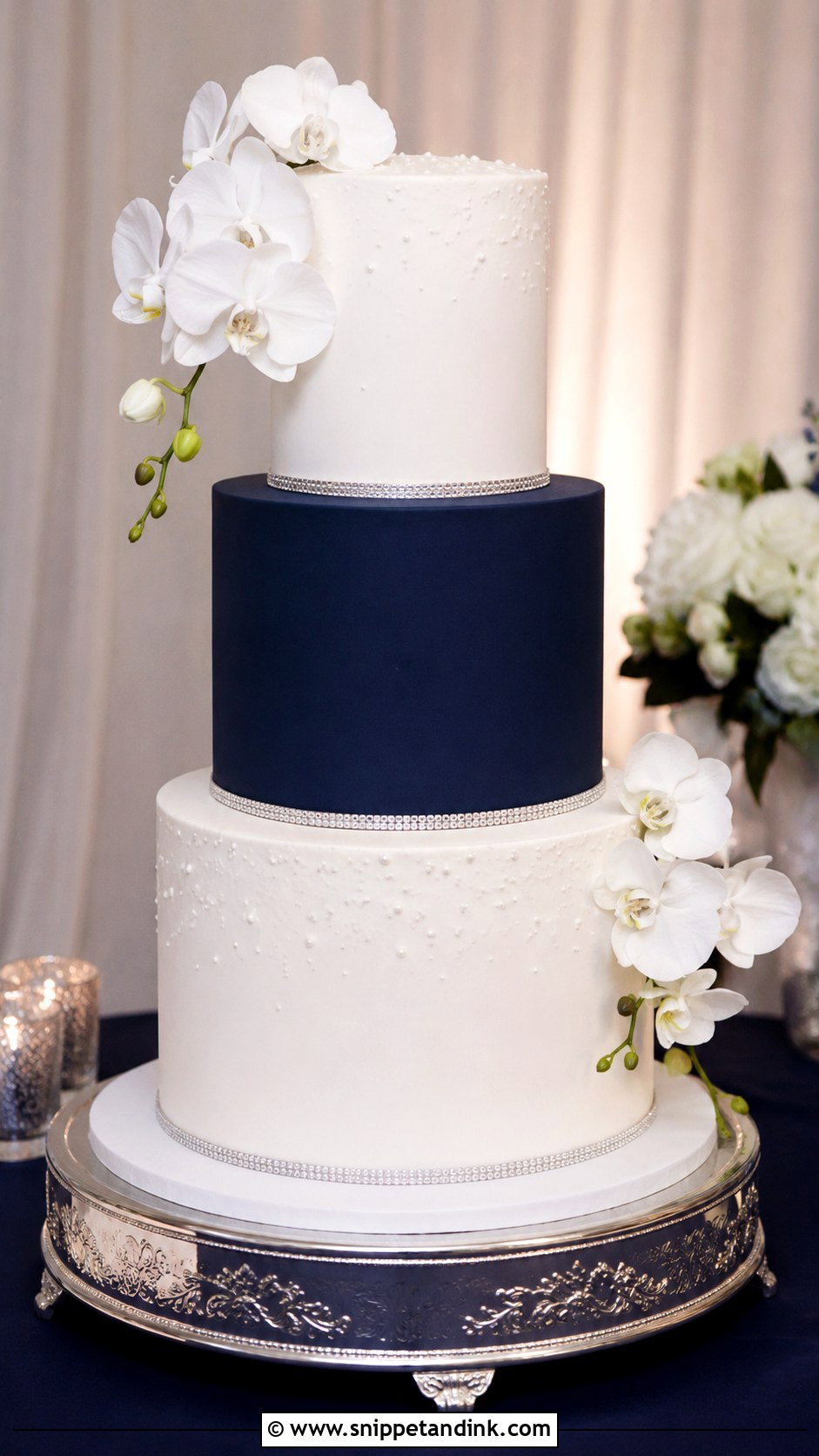
Navy reads as a confident, grown-up color, and the navy tier gives a white cake real depth. The catch is evening light. Under warm candlelight a deep navy can look almost black in photographs, so I mix it a shade brighter than the swatch when the reception starts after dark. Silver accents and white orchids sit nicely against it. Fondant keeps the line between the two colors sharp, and a thin metallic band at the join hides any small wobble where the tiers meet.
4. Sage Green And White Two Tone Wedding Cake
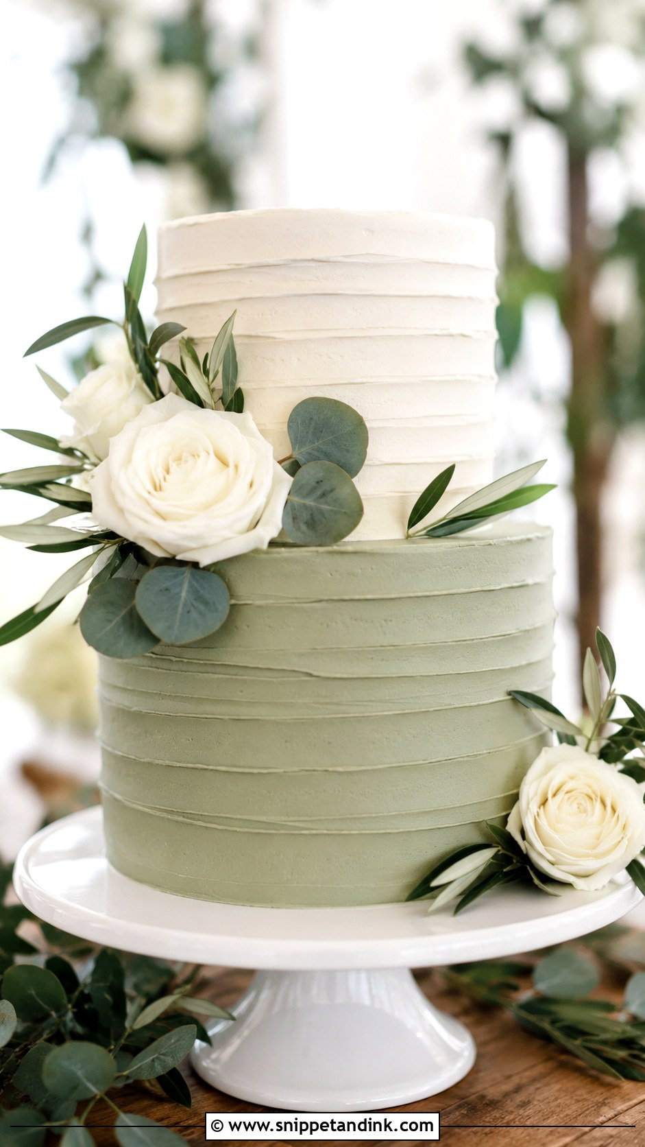
Sage green and white is calm and organic, and it sits comfortably with eucalyptus and olive leaves. Sage is also the easiest color to get wrong. Too much yellow and it turns khaki; too much black and it goes murky. I always pipe a test swatch and look at it in daylight before coloring a full batch. A sage base under a white top tier feels balanced, and a lightly textured buttercream suits barn and botanical venues better than polished fondant does.
5. Dusty Blue And White Two Tone Wedding Cake
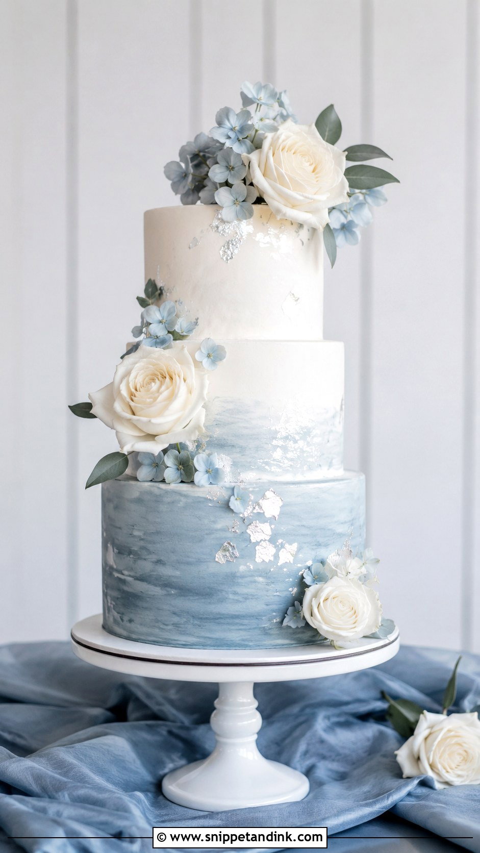
Dusty blue and white suits couples who want a soft color that still feels adult. The blue needs a touch of grey or a tiny amount of black to look dusty instead of nursery blue. Two ways to build it: a watercolor buttercream that blends the tones together on one tier, or separate colored tiers for a cleaner, structured look. I lean toward the watercolor style for spring and coastal weddings because small imperfections disappear into the blend, which matters if the cake has to travel.
6. Burgundy And Ivory Two Tone Wedding Cake
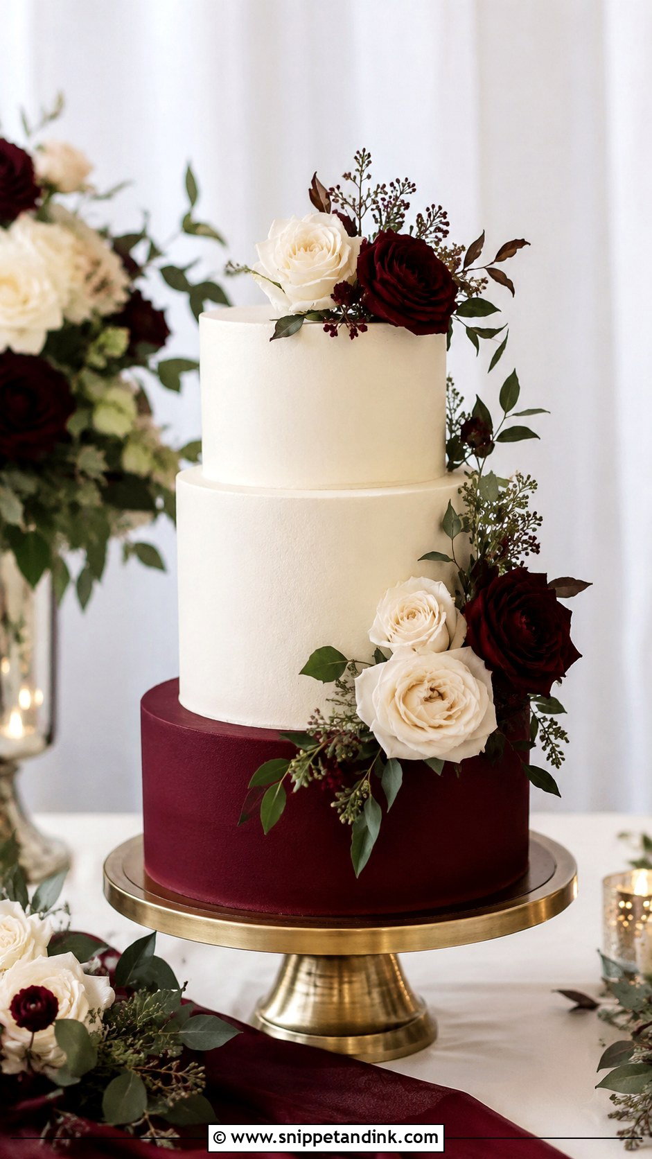
Burgundy carries drama on its own, so this cake needs very little decoration. The trouble is that deep reds in buttercream can taste of the dye, and they bleed into neighboring ivory if the cake sits in a warm room. My fix is to make the burgundy tier in fondant or a dark ganache-based buttercream, and to put a cake board and ribbon between the colors. Garden roses, dark berries and a few cream blooms finish it. It belongs at a candlelit fall reception, not a bright noon garden.
7. Champagne And White Two Tone Wedding Cake
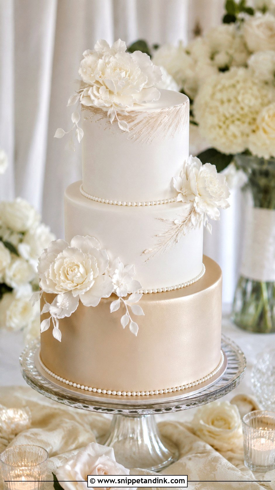
Champagne and white is the quiet luxury option, and it photographs warmer than people expect. Champagne is a pale gold beige, and it can drift toward yellow if the white tier next to it is a cool, bleached white. I match the white to the champagne by leaving a little natural butter color in it. Satin buttercream, pearls and a few sugar flowers are plenty. If you want shimmer, ask for a light dusting rather than a painted metallic finish, otherwise the cake starts to look like a gift box in hotel lighting.
8. Terracotta And Cream Two Tone Wedding Cake
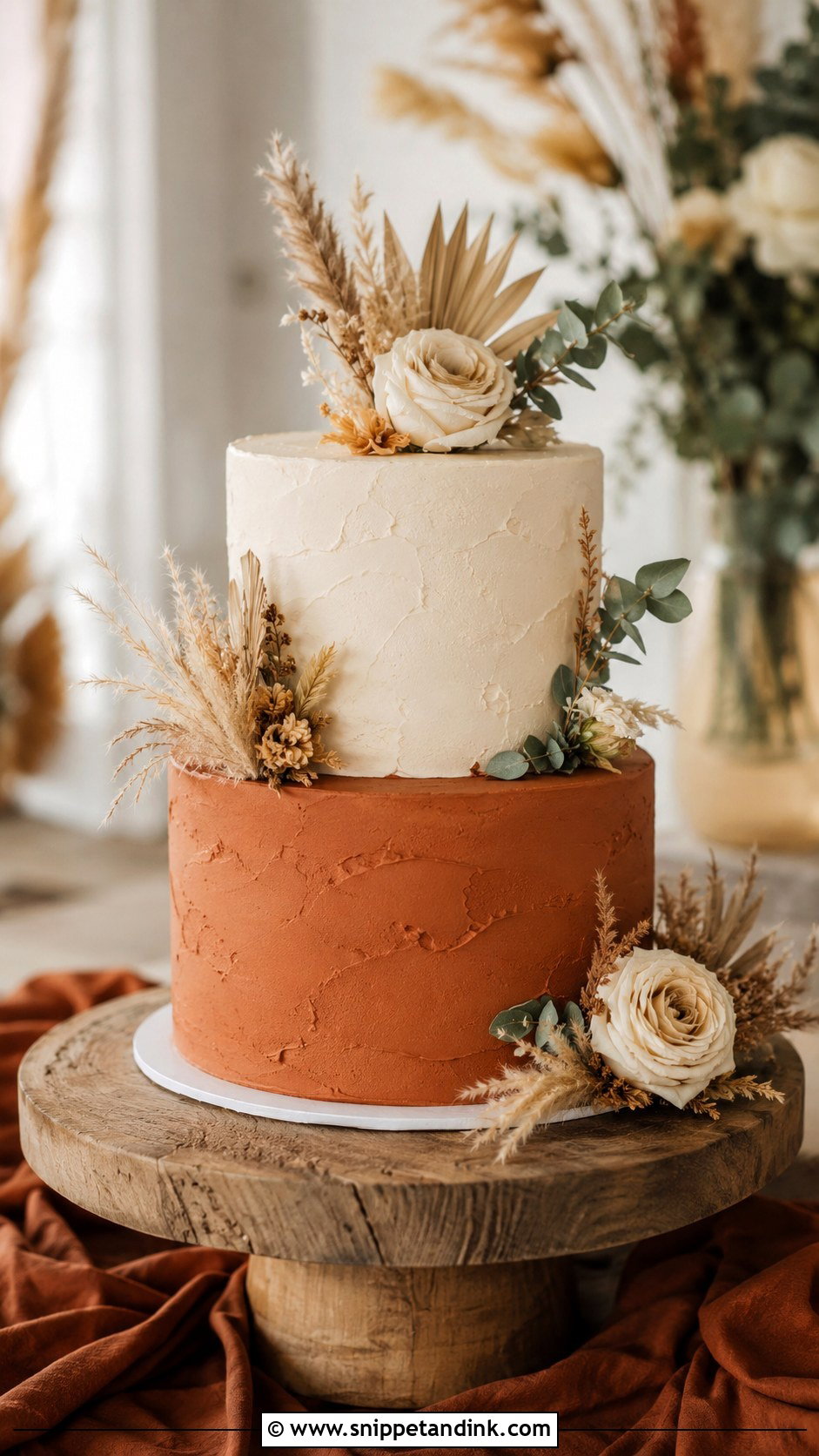
Terracotta and cream brings warmth that suits desert and boho receptions. Terracotta is a mix of orange, brown and a little pink, and it darkens as buttercream sits, so I color it a step lighter than the target and let it develop overnight. Textured buttercream with dried flowers or pampas looks natural. One warning: dried decorations that were not grown for food should never touch the frosting directly, so I wrap stems and place them on small food-safe discs.
9. Emerald Green And White Two Tone Wedding Cake
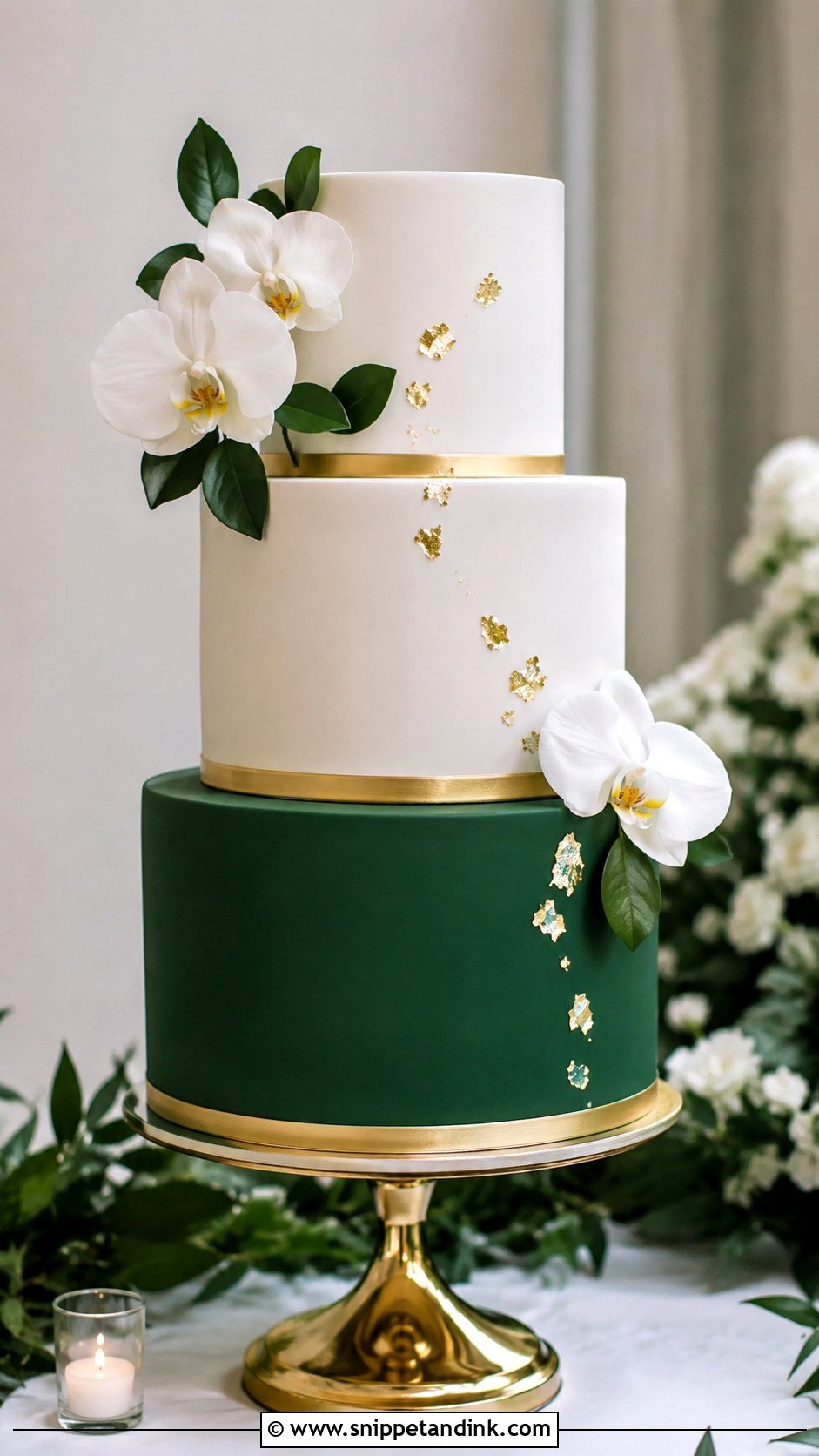
Emerald is rich and formal, and it needs very little help from decoration. Getting a deep emerald in buttercream is a struggle; the color often lands somewhere between teal and forest. Fondant gives far more control, which is why most emerald cakes you see are smooth-finished. A thin gold band between tiers or a few white orchids is enough. Leave the green tier mostly bare so the color does the work.
10. Pink And White Two Tone Wedding Cake
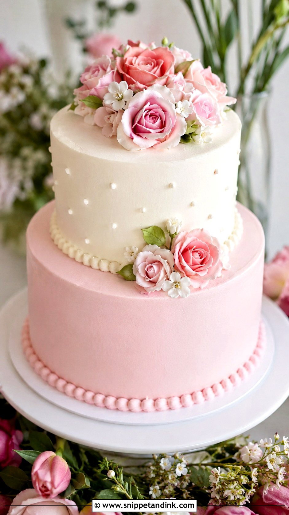
Pink and white is one of the easiest two tone cakes to tailor, because the shade changes the mood entirely. Pale pink reads romantic, rose pink reads playful, and a stronger pink feels more modern. Ruffled buttercream on the pink tier and a sleek white tier above it is a combination I like because the texture contrast does as much work as the color. Like all pinks, it softens under direct sun, so plan where the table will stand.
11. Gold And White Two Tone Wedding Cake
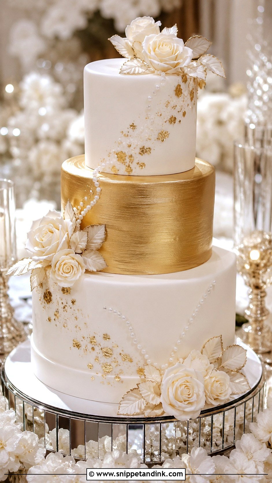
Gold and white can tip into flashy quickly, and the answer is restraint. Instead of glitter all over, I use a brushed gold tier, a few patches of gold leaf, or a single metallic band. Edible gold leaf is very thin and tears easily, so it goes on last, often on site, and it should never be applied on a humid afternoon when the frosting is tacky. White flowers and ivory roses calm the shine. Keep the table styling simple so the gold isn’t competing with mirrored chargers and sequins.
12. Lavender And White Two Tone Wedding Cake
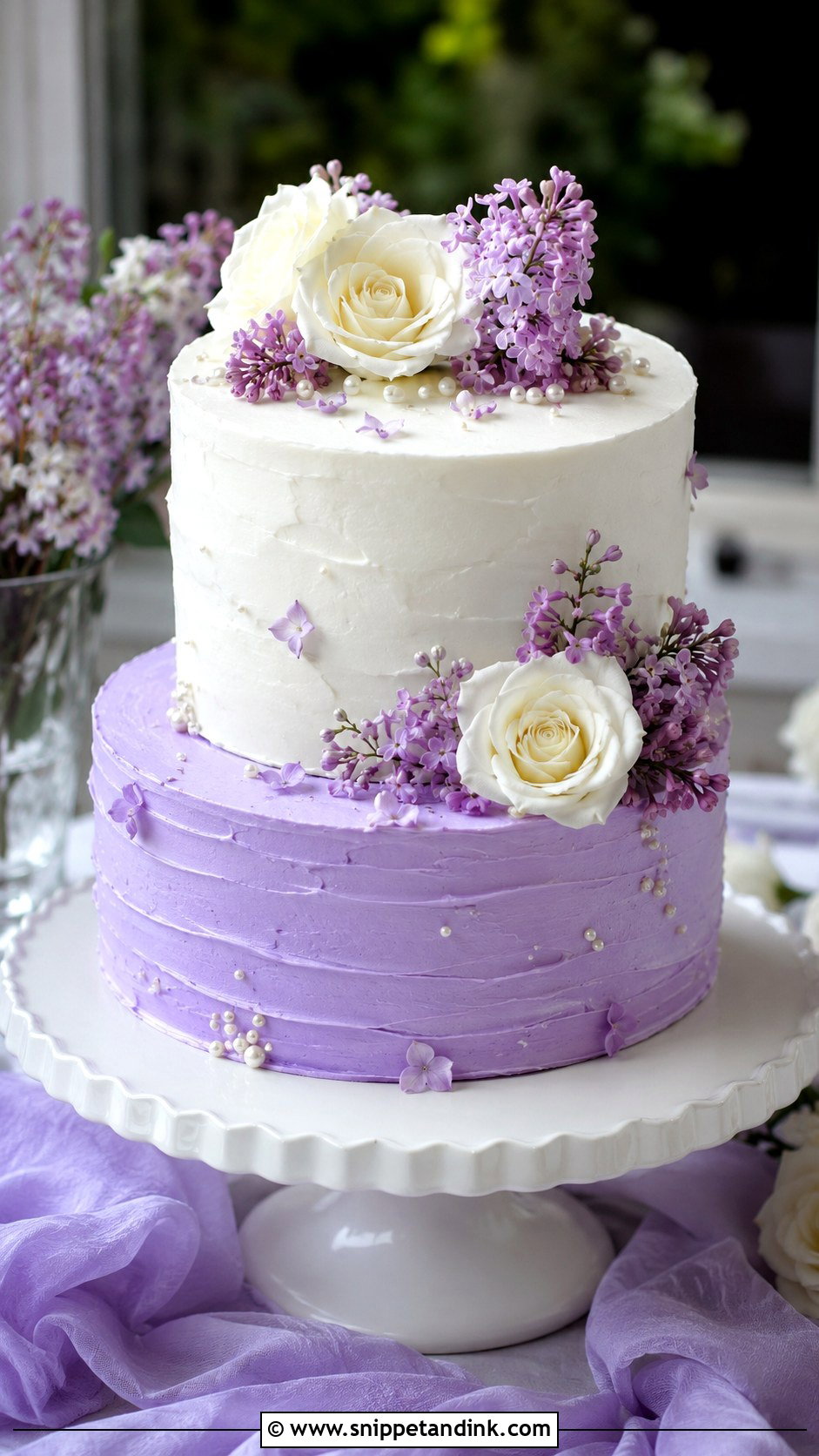
Lavender is the color I am most careful with, because purple dyes are known to fade toward grey or blue in daylight and fluorescent light. A cake that looked lilac at nine in the morning can look dove grey by the first dance. I add the lavender tier as late as possible and keep the cake out of the sun. Pair it with lilac blooms, edible petals or soft piping, and semi-smooth frosting that feels light and handmade.
13. Gray And White Two Tone Wedding Cake
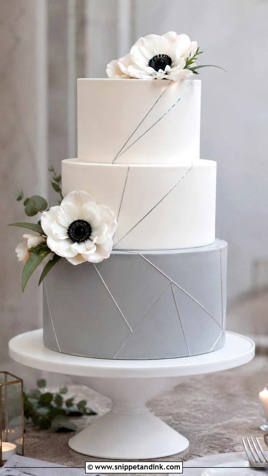
Grey and white is modern and architectural, which suits industrial spaces and neutral palettes. Dove grey keeps it soft, charcoal gives stronger contrast. Grey buttercream can look dirty if it carries a warm undertone, so I build it from black and a hint of blue rather than black alone. Smooth fondant with clean geometric lines reads most intentional here. It is a smart option if you want color without anything sweet or pastel.
14. Peach And Ivory Two Tone Wedding Cake
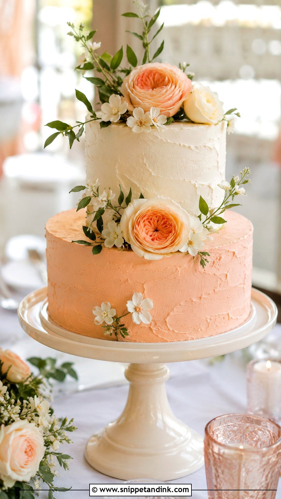
Peach and ivory has a warmth that suits spring and summer, and it sits naturally beside garden roses and ranunculus. The thing to test is lighting. Under warm tungsten bulbs, peach can slide toward orange, so I look at the sample under the same kind of light as the venue. A lightly textured buttercream keeps the shade soft. For a cleaner cake, smooth fondant and one floral arrangement on a single side does the job.
15. Chocolate Brown And Cream Two Tone Wedding Cake
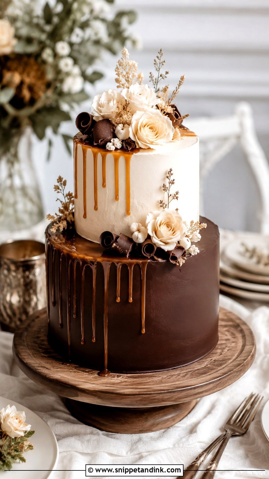
Chocolate brown and cream is the one pairing where the color comes from the flavor itself. A ganache-covered tier holds sharp edges and stands up to heat far better than buttercream, which is why I suggest it for summer and outdoor dessert tables. The cream tier keeps it bridal. Caramel drips, chocolate curls or cream roses fit, and a rough, textured finish takes it in a rustic direction. Guests tend to remember this one by taste first.
16. Red And White Two Tone Wedding Cake
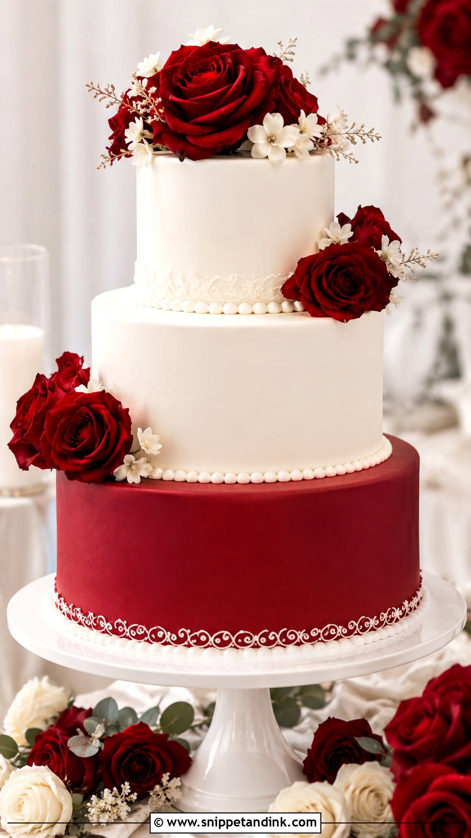
Red and white is bold, so the skill is in deciding how much red. One red tier, red floral clusters, or just a deep red base each give a very different cake. Bright red in buttercream needs a lot of dye, so I use a no-taste red gel and keep red tiers in fondant when the shade has to be strong. A darker red feels formal; a brighter red feels festive. White roses or pearl trim calm it down for classic and cultural celebrations alike.
17. Black And Gold Two Tone Wedding Cake
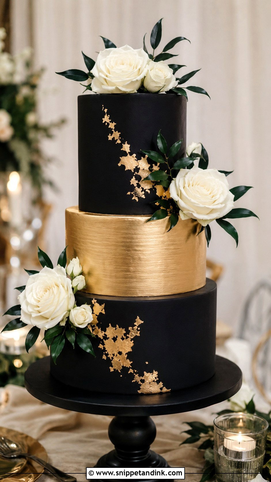
Black and gold is pure drama, and it only looks expensive when the edges are sharp. I cover these tiers in ganache before the fondant goes on, because the firm ganache layer gives crisp corners that buttercream can’t. A matte black tier with a brushed gold tier is the cleanest version; gold leaf patched onto black fondant is a softer one. White flowers add contrast, deep greenery grounds it. Use a plain stand so nothing competes with the metallic finish.
18. Blue And Silver Two Tone Wedding Cake
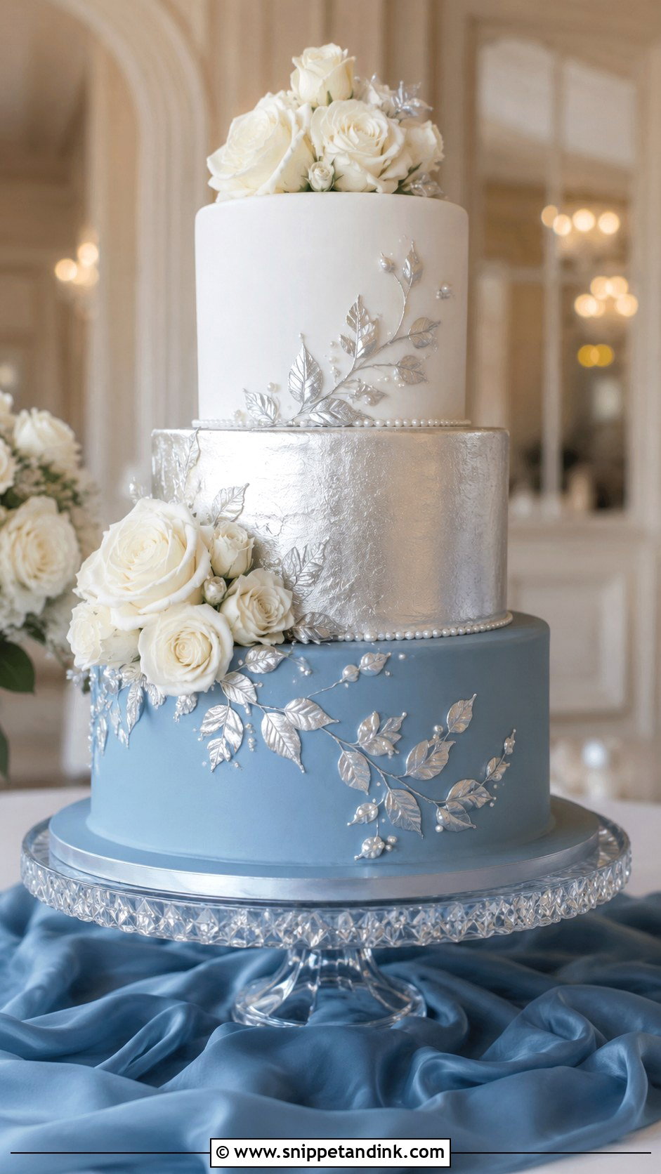
Blue and silver gives a cool, calm cake that suits ballrooms and coastal receptions. Soft blue keeps it romantic, deeper blue makes it more formal. Silver can come in as a metallic tier, thin bands, edible leaf or fine piping, and smooth fondant shows it off best because metallic paint drags on buttercream. I’d keep white linens and glass around it rather than pine and snowflakes, so it reads as a wedding cake and not a holiday one.
19. Mauve And Ivory Two Tone Wedding Cake
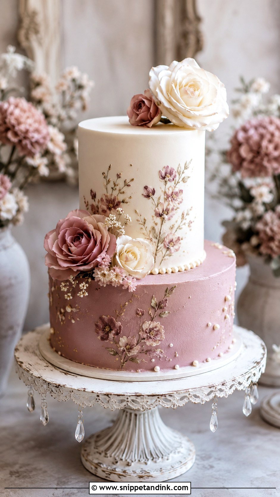
Mauve has more depth than blush, so it gives a vintage mood without looking dated. I pair a mauve bottom tier with an ivory top tier and mix the mauve with a touch of grey so it stays dusty rather than turning candy pink. Ivory roses, tiny pearls or hand-painted florals all suit it. Buttercream feels intimate, fondant feels formal. It sits nicely in palettes built around dusty rose, taupe and soft greenery.
20. White And Green Two Tone Wedding Cake
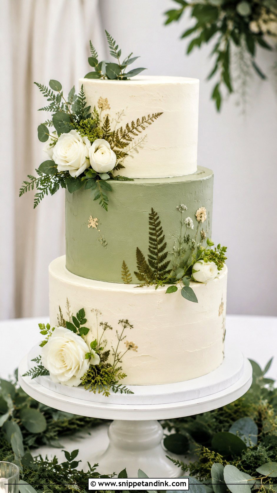
White and green is fresh and easy to style, and the green can be sage, olive, forest or soft pistachio depending on the venue. Real foliage is where I slow couples down. Eucalyptus is lovely to look at but should never touch the frosting directly, and olive branches and ferns need to be clean and wrapped too. For greenhouse and outdoor weddings, I often pipe or press edible botanical details instead, which gives the same organic feel with nothing to remove before slicing.
Dark Icing, Fading Pastels and the Seam Between Tiers
Couples choose two tone cakes from photos, and photos hide the practical side. These are the problems I plan around on every one of them.
Deep colors and taste
Black, navy, red and burgundy need a lot of gel color to reach full depth in buttercream. Too much can leave a bitter edge and stain lips and teeth, which nobody wants in the cake-cutting photos. Dark shades also deepen as frosting rests, so I mix them a day ahead, a little lighter than the goal. When a shade has to be truly dark, I switch that tier to fondant or a cocoa-based ganache.
Pastels in the sun
Pinks and purples are the colors most likely to fade under daylight and bright venue lights. If the cake goes on display hours before it is cut, ask for a spot out of direct sun, and ask your baker whether the colored tier can go on later.
Where the colors meet
In a warm room, a dark buttercream tier can bleed into a white one at the join. Each tier sits on its own board and dowels anyway, and a ribbon, pearl border or metallic band covers that line neatly. Make sure the venue keeps the cake cool until it is cut, especially in summer.
Your Second Color Is Probably Already on the Tables
A two tone cake is really a small color decision that has to agree with everything around it. Soft pairs like blush, peach, lavender and mauve suit daylight and gardens; black, navy, emerald and burgundy belong to evening rooms. Bring your actual linen and flower swatches to the tasting, decide early which color carries the bottom tier, and let the finish do the rest.
You'll Like These Ideas:


Leave a Reply