
Letters are the most personal thing I can put on a cake, and also the easiest thing to get wrong. A single shared initial on a quiet tier reads from across the room, while three letters in thin script can turn into a squiggle under reception lighting. Initials sit happily on smooth fondant, pearl piping, rustic buttercream, pressed flowers, metallic toppers and old Lambeth borders, so the finish matters less than scale and font. I always ask couples for their invitation suite before we sketch anything, because the lettering on the cake should look like it came from the same hand.
Sending Your Baker Letters They Can Actually Pipe
Most lettering problems start with a vague brief. “Our initials in gold” leaves the font, the order, the size and the tier all open, and each of those changes the cake. Here’s what I ask for before I quote:
- The exact letters, typed out in order. A traditional three-letter couple’s monogram puts the shared surname initial in the middle, larger, but plenty of couples keep separate names, and then two first initials with an ampersand often looks better.
- The font, ideally the file or a clear scan from your invitation printer. Very thin hairline scripts don’t survive piping, so I may thicken the strokes slightly.
- Which tier carries the letters and roughly how tall you want them. On a typical middle tier, letters around two to three inches tall read clearly in photos.
- Whether the initials are edible, a topper, or both.
Custom toppers are made to order, so give them at least six weeks. That covers production, shipping and a reprint if a letter arrives wrong, which happens more often than you’d think with mirrored or cursive designs. Approve a digital proof, and read it upside down too: a reversed letter is easier to spot that way.
1. Monogram Wedding Cake
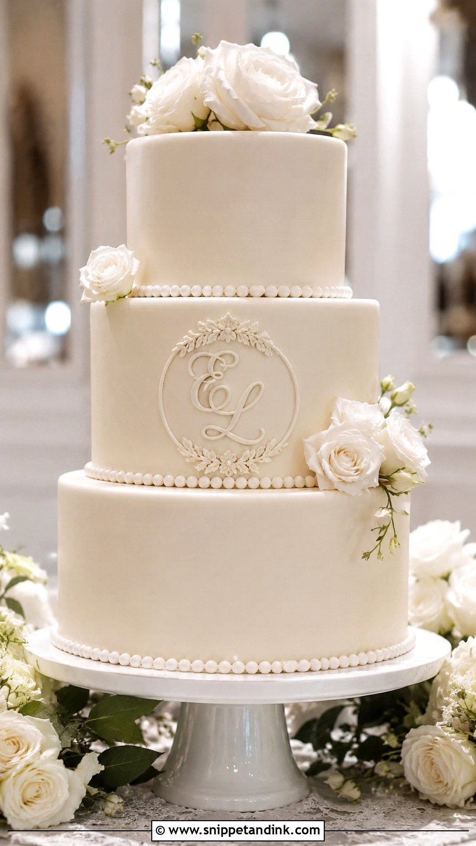
A three-letter monogram is the version I’m asked for most, and it lives or dies on spacing. On a smooth white or ivory tier I center the shared last initial slightly larger with the two first initials beside it, or use one shared letter alone. Raised fondant or gold lettering suits a formal room. Piped buttercream initials are softer, but they need a cool kitchen, since warm buttercream loses its edge halfway through a letter. Keep the rest of the tier quiet: a few fresh stems or small sugar blooms, never a wreath that crowds the letters.
2. Initial Wedding Cake Topper
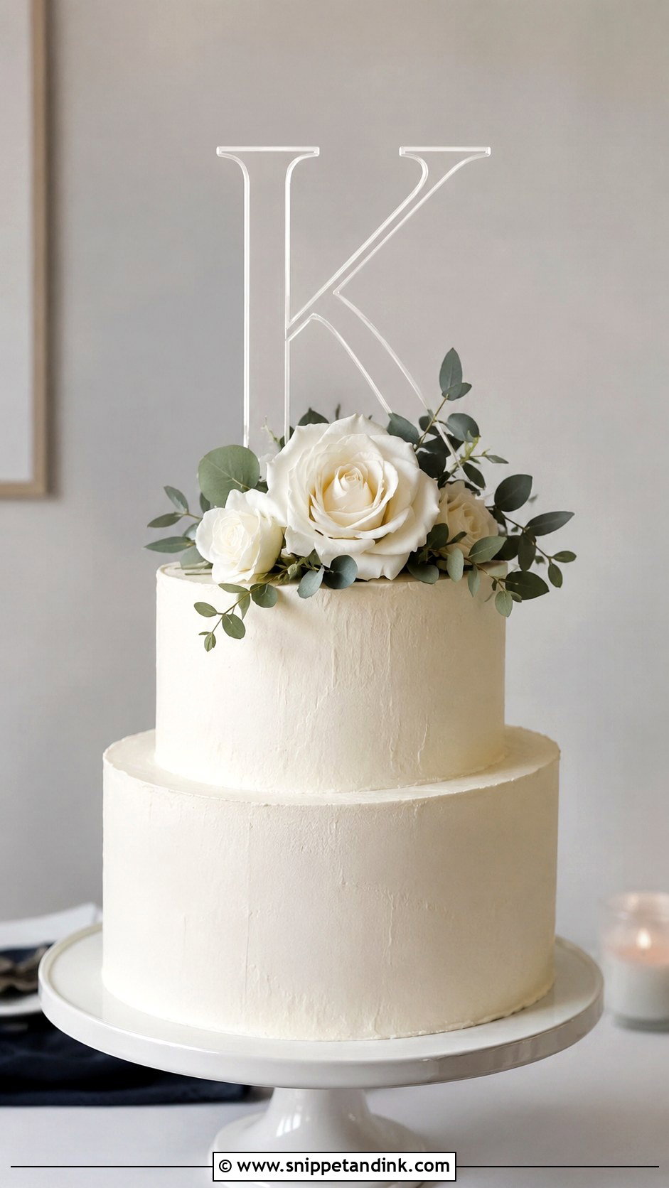
Toppers are the practical answer for couples who want to keep the letters afterward. Acrylic, wood, metal and mirror finishes each shift the mood, with metallic reading ballroom and wood reading barn or garden. The mistake I see most is sizing. A topper wider than the top tier turns a small cake into a stand for a sign, so I measure that tier and keep the letters inside its diameter. On a two-tier buttercream cake, one initial with a little greenery is often enough. Check the stakes too, because the long prongs on mail-order toppers sometimes need trimming so they don’t punch through to the board.
3. Gold Initials Wedding Cake
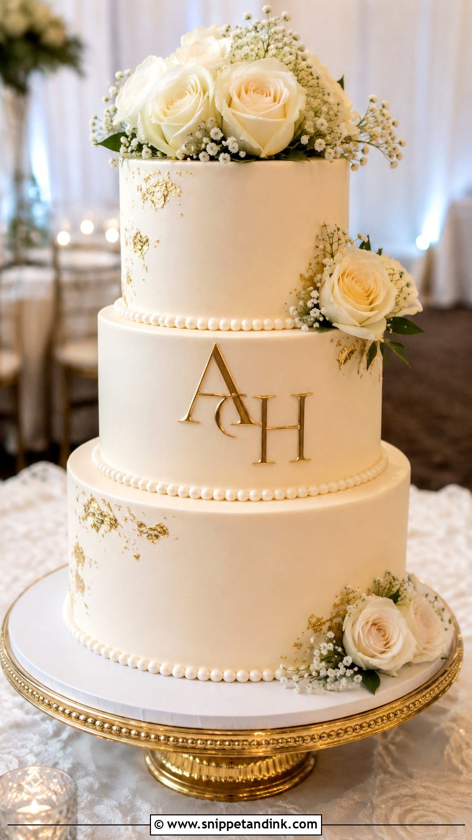
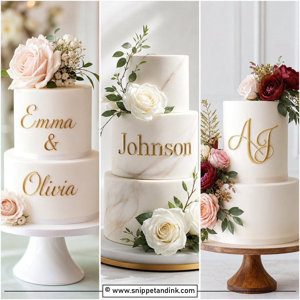
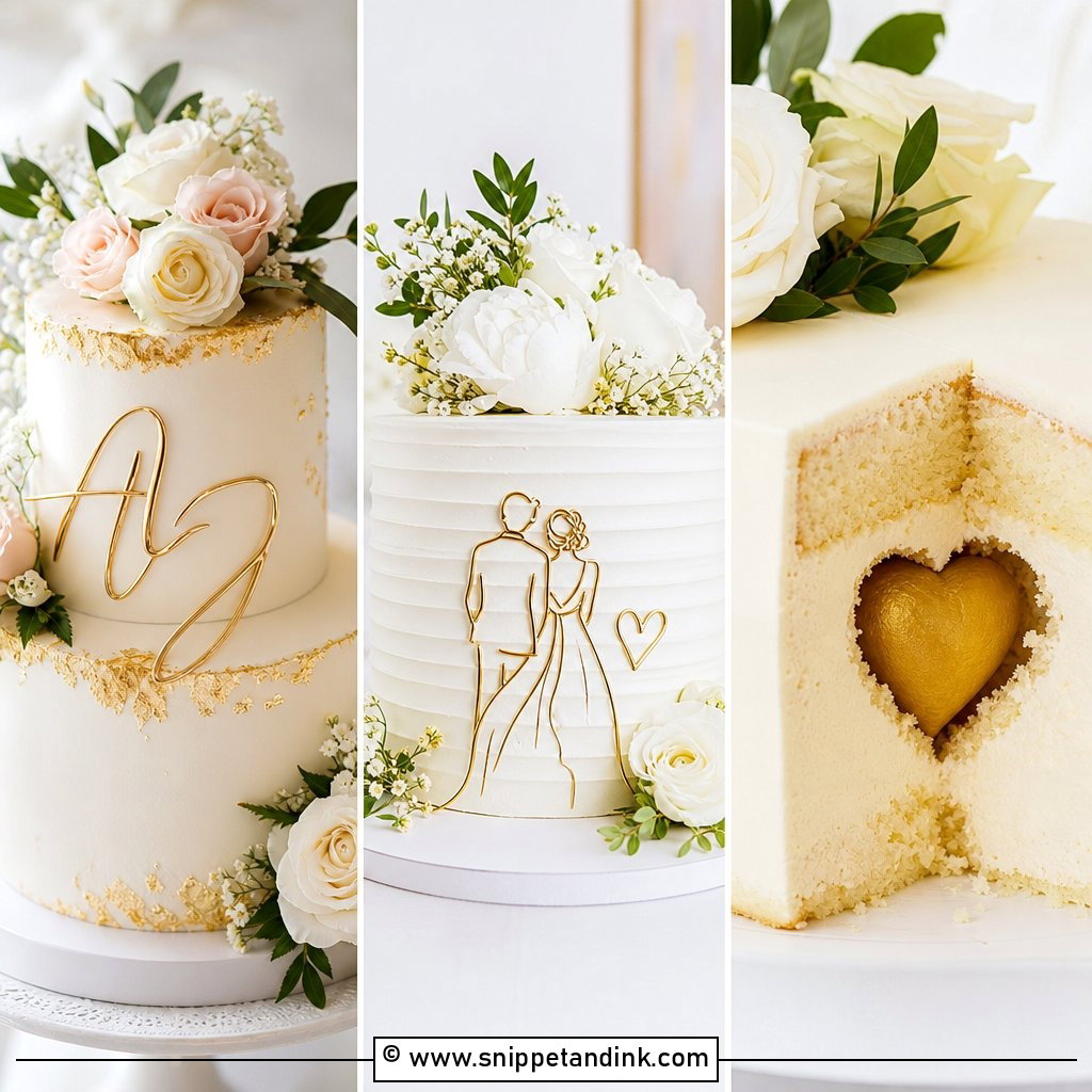
Gold can arrive as a topper, edible lettering, hand-painted fondant or small metallic accents around the monogram, and those don’t behave the same. Painted gold on fondant gives the richest shine; brushed straight onto buttercream it tends to look patchy because the surface isn’t sealed. Ivory, champagne, blush and soft white bases flatter it most. I’d pair the letters with gold leaf, pearl piping, or one thin gold band per tier, and stop there. Three tiers of smooth buttercream with a fondant plaque carrying gold initials on the middle tier, plus white roses, is hard to overdo.
4. Silver Initials Wedding Cake
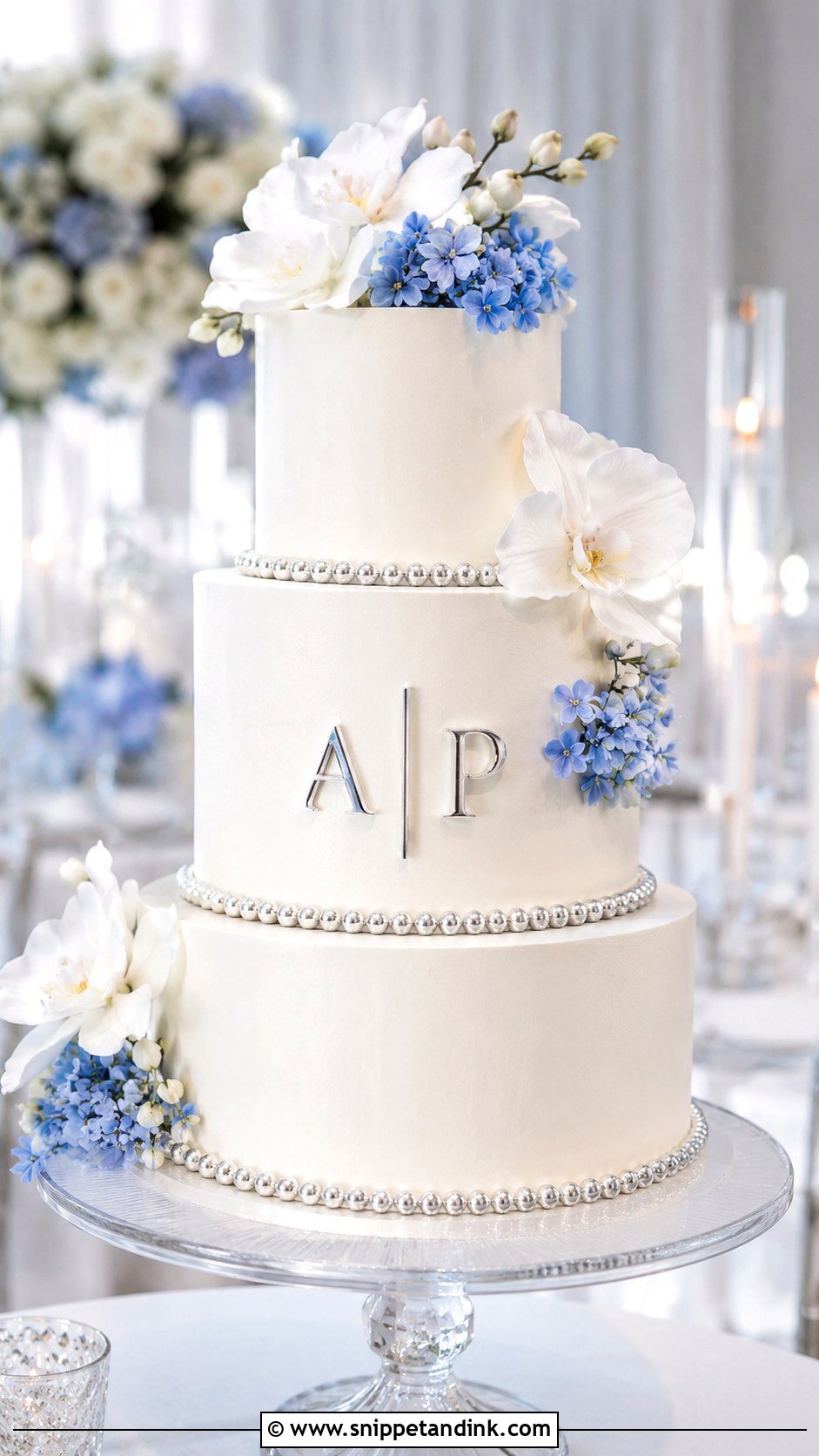
Silver is cooler and quieter than gold, so I suggest it for white, pale blue, grey, lavender and icy ivory palettes. Edible silver usually reads slightly grey in photos rather than bright chrome. If you want true mirror shine, a mirror acrylic topper is the honest choice, and it catches candlelight well at an evening reception. For something subtle, thin silver initials pressed onto one tier do the job. Pearls, white orchids or soft ruffles stop it from looking like a cold metal plate.
5. Acrylic Initials Wedding Cake
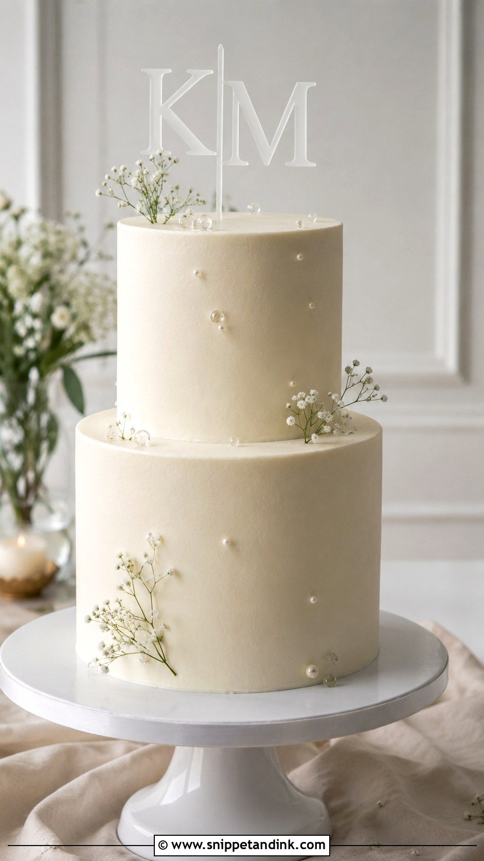
Clear acrylic makes letters look as if they’re floating, which suits minimalist cakes that need height more than decoration. Frosted, white, gold or mirror acrylic gives a bolder outline. What couples don’t expect is that clear acrylic vanishes against a busy background, so in front of a flower wall I’d switch to frosted or mirror. Script fonts suit a romantic wedding, block capitals a modern one. I tuck a few small blooms around the base so the topper looks planted rather than stuck in.
6. Wooden Initials Wedding Cake
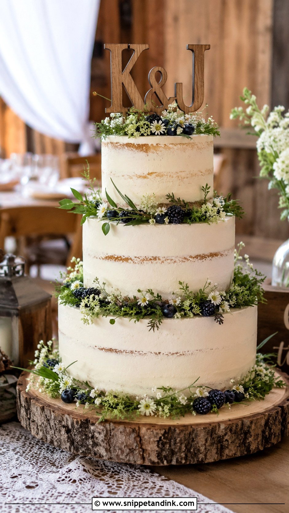
Wood suits rustic, barn, garden and woodland weddings because it warms up a pale cake. It sits well on semi-naked frosting, textured buttercream, greenery, wildflowers or a wood slice stand. Very thin laser-cut wood can warp a little after hours in a damp marquee, so I prefer a thicker cut with clean, readable letters. Light birch feels airy; stained walnut gives contrast against ivory. A vanilla or almond cake with ivory buttercream, eucalyptus and a wooden monogram is about as simple as a wedding cake gets, and it rarely looks overdressed.
7. Floral Initials Wedding Cake
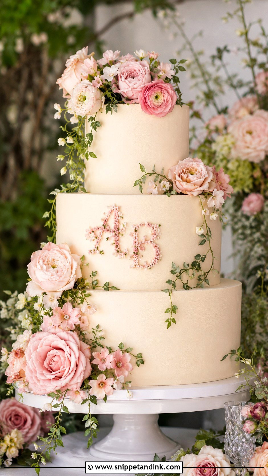
Letters built from tiny piped flowers, sugar flowers or pressed petals take more hours than anything else here, and they reward it. Flowers naturally want to spill over a letter, though, and once they do, nobody can read it. When I plan one, I draw the initials first and let the blooms frame them instead of filling them. Matching the bouquet ties the cake to the day, and spring or summer gives the widest flower choice. For a garden setting, pastels and a light frosting texture keep it natural.
8. Pearl Initials Wedding Cake
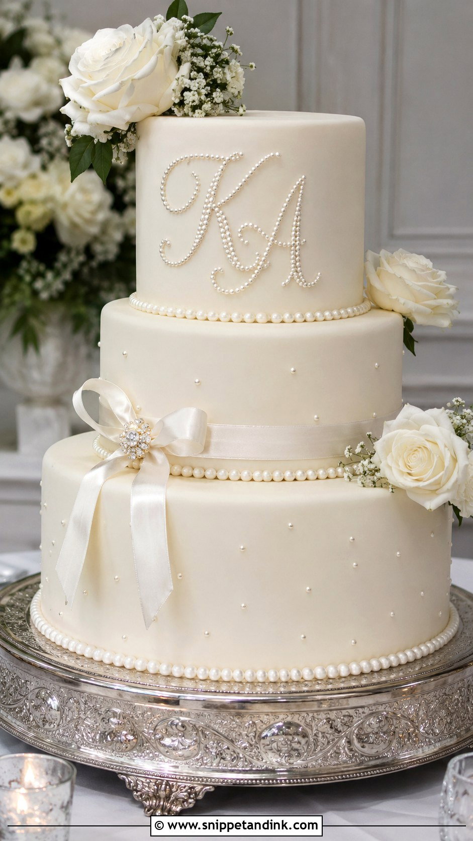
Sugar pearls outlining initials give a raised, delicate texture that suits vintage receptions and gowns with beading or pearl jewelry. Each pearl is set by hand, so it’s slow work, and it needs a very smooth base: any ripple in the frosting shows up as a wobble in the letter. I place the initials on the front of the middle tier and repeat pearls as borders on every tier so the detail looks planned. White roses, satin ribbon and ivory keep it calm.
9. Vintage Initials Wedding Cake
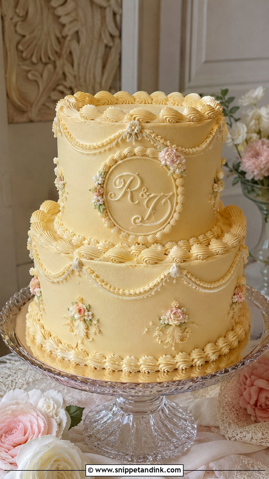
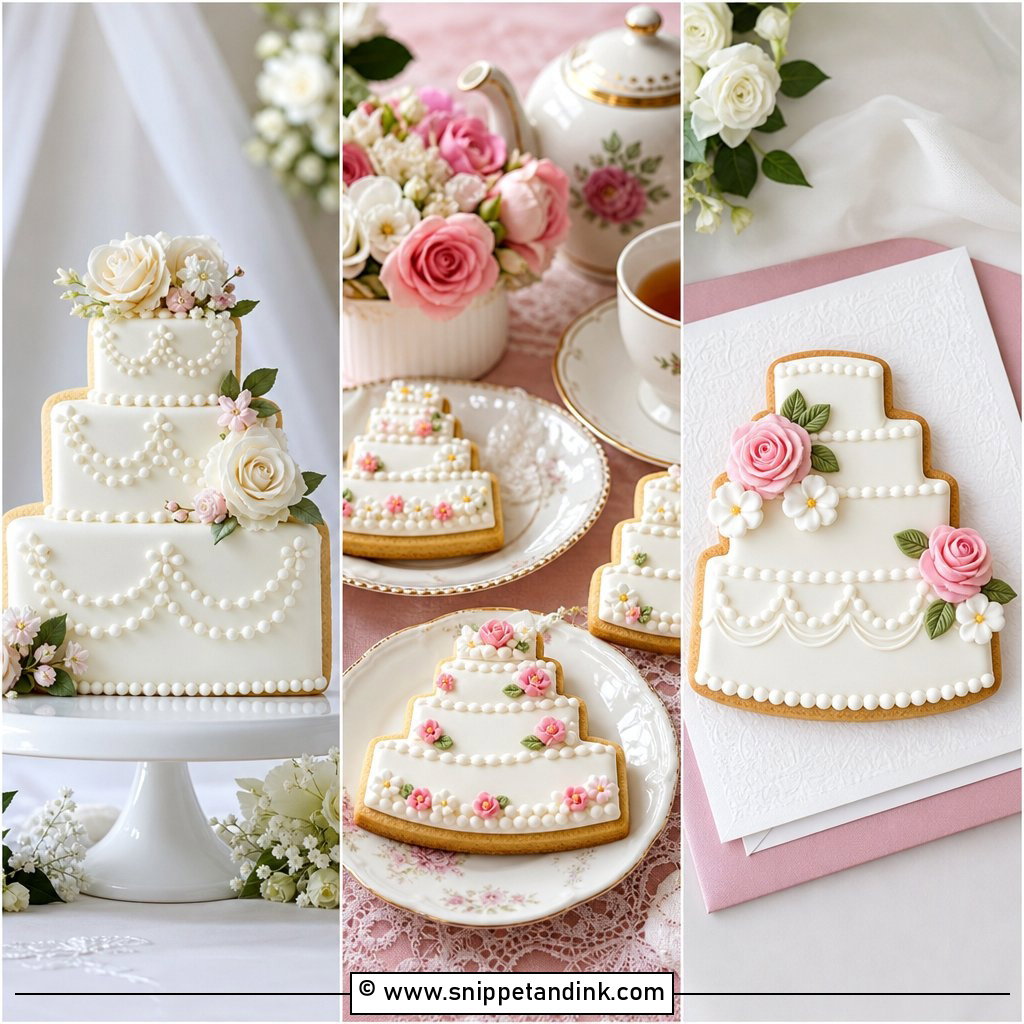
Anyone who loves old-fashioned piping will gravitate here. Expect Lambeth-style borders, shell work, bows, pearls and hand-piped initials on the front. Lambeth is overpiped in layers, so it’s heavy and takes hours, and I’d only put it on a firm buttercream or fondant cake with proper internal supports. Round tiers in ivory, blush, butter yellow or pale blue suit it, with the initials inside a piped heart, oval frame or small plaque. Keep the palette tight, because with this much texture a third color gets busy fast.
10. Minimal Initials Wedding Cake
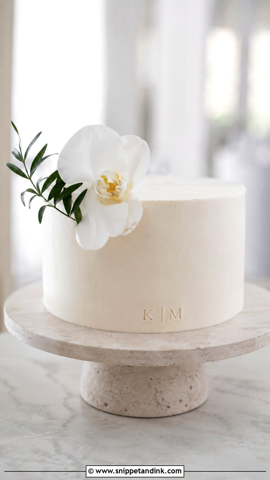
Minimal cakes are harder than they look. With nothing to hide behind, every uneven edge shows, and the letters carry the whole design. Tiny initials near the base, a small acrylic topper or raised white-on-white lettering on the front tier all suit modern venues, courthouse weddings and small receptions. One bloom or a couple of stems of greenery is my limit.
11. Rustic Initials Wedding Cake
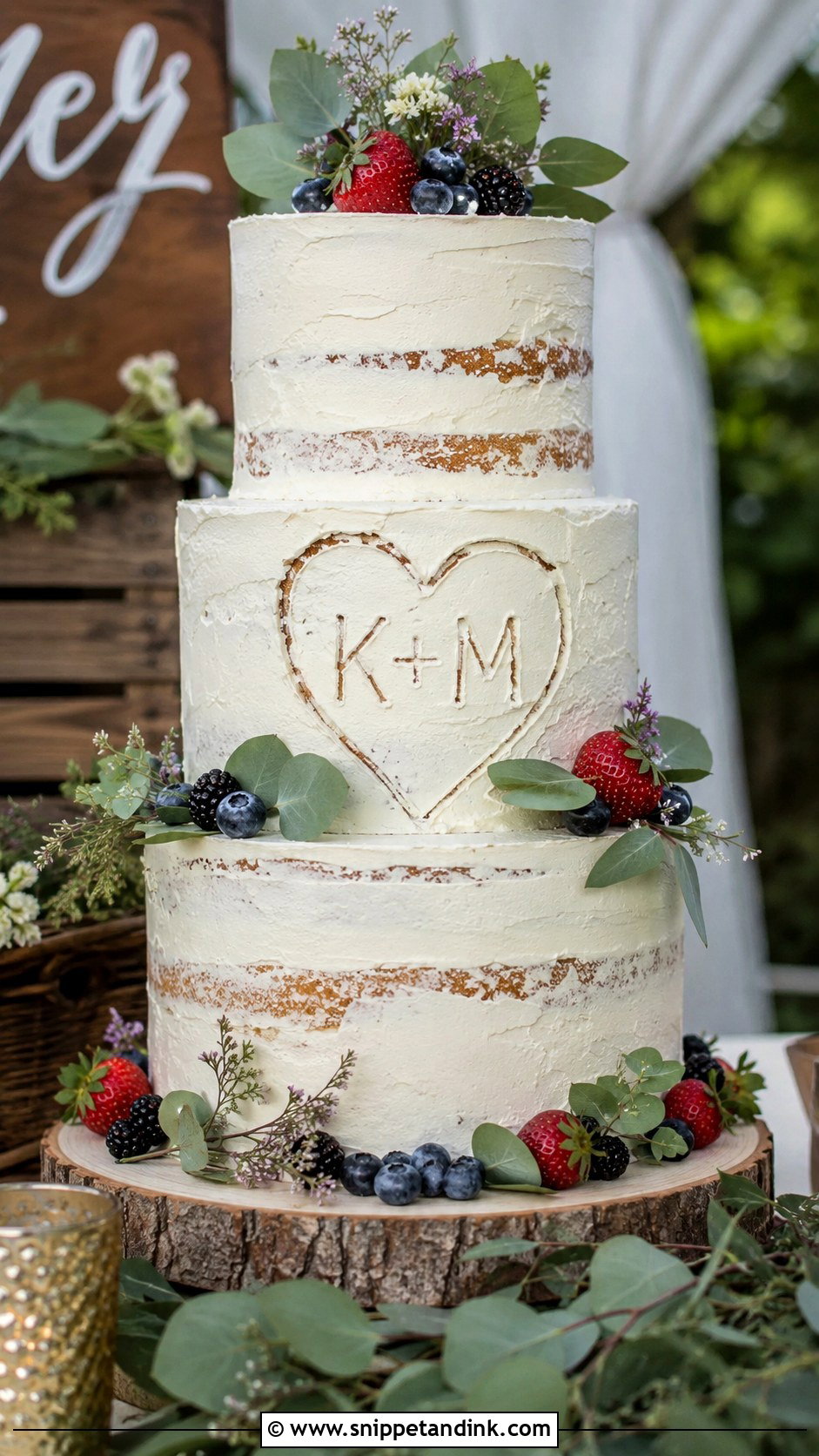
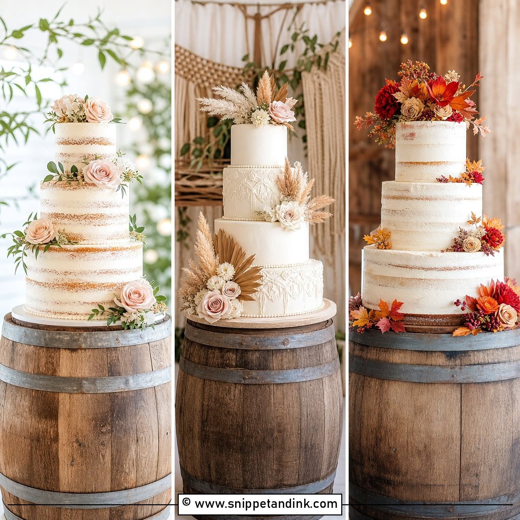
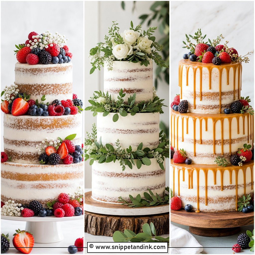
Rustic cakes forgive the most, which is why I like them for outdoor receptions. Textured buttercream, semi-naked layers, natural flowers, burlap-style ribbon and a wood stand set the tone, and the initials can be a wooden topper, carved-look lettering or piped inside a heart on the side. Semi-naked sponge dries faster because so little frosting seals it, so I assemble these as close to the event as I can. Ivory, sage, cream, dusty rose and soft brown keep the colors natural. A three-tier semi-naked cake with vanilla sponge, fresh berries, greenery and wooden initials has a homemade warmth while still looking finished.
12. Buttercream Initials Wedding Cake
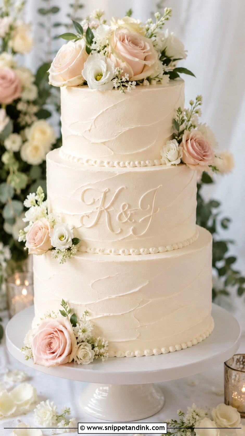
Piped buttercream letters taste as good as they look, whether in script, raised on a small buttercream plaque or tone-on-tone. The catch is temperature. American buttercream crusts and holds a crisp line, while Swiss meringue is silkier but softens quickly in a warm room, and a soft letter blurs. Tell your baker where the flowers will sit so a rose doesn’t end up covering the initials, and ask for a clear font. Soft swirls, piped initials and fresh roses on white buttercream is a classic I never tire of.
13. Fondant Initials Wedding Cake
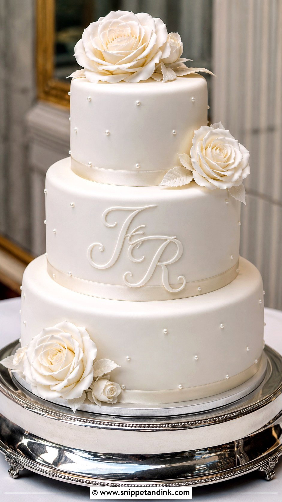
Fondant gives me a smooth canvas for raised letters, embossing, painting or cutouts, and it holds a sharp edge far better than buttercream in a warm room. That makes it the safest base for detailed lettering at a formal wedding. The trade-off is taste: plenty of guests peel it off, so make sure the cake underneath is one you love. All white is traditional; metallic letters add contrast. Three tiers with raised initials on the center tier, thin ribbon borders and sugar flowers gives the structured finish people picture.
14. Embossed Initials Wedding Cake
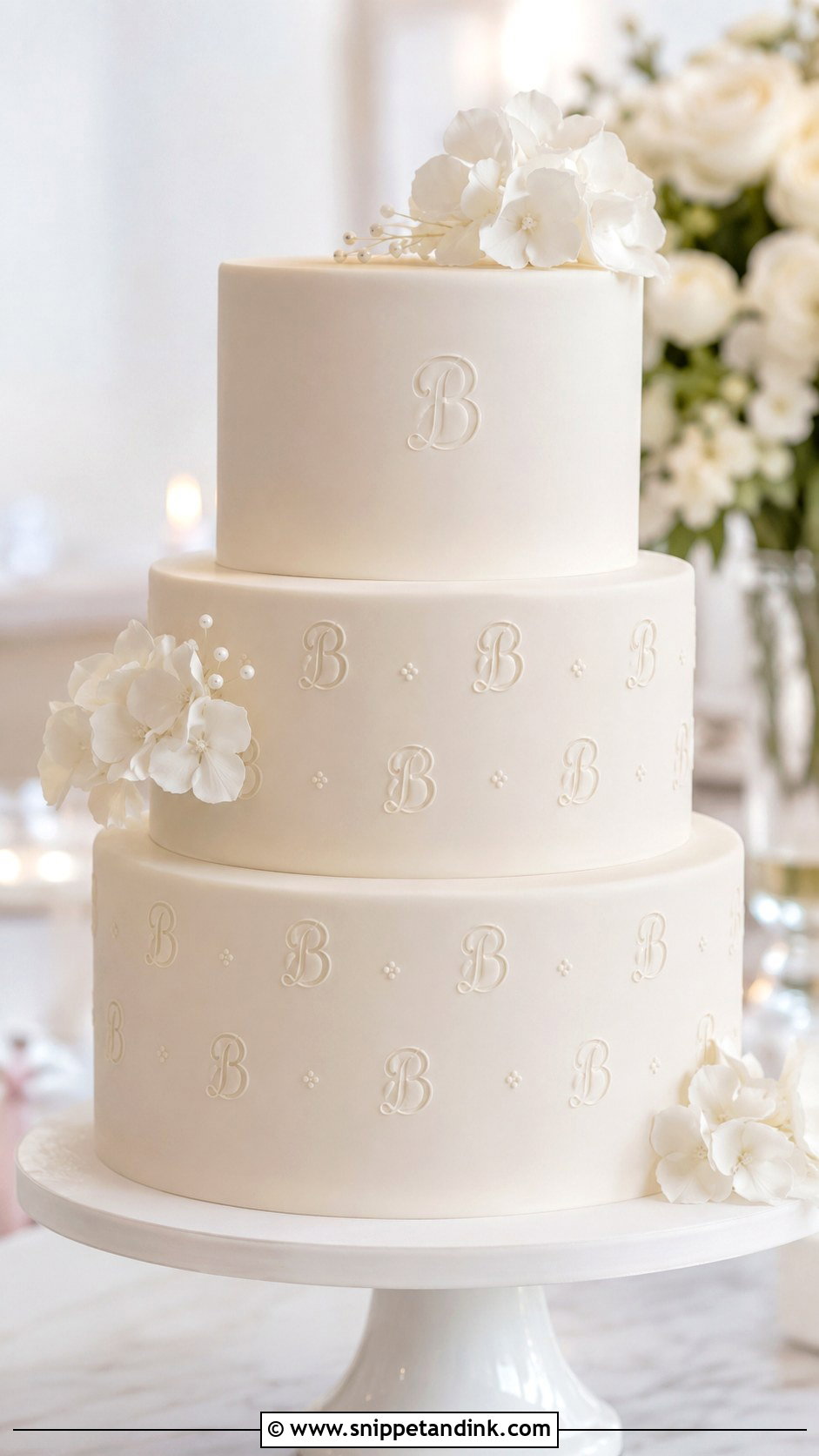
Embossing presses the initials into the fondant instead of sitting them on top, so the texture becomes part of the cake. It has to happen while the fondant is still soft, within minutes of covering a tier, which means the design must be final before the baker starts. White-on-white embossing mostly shows in side light, so it suits a cake placed near a window or under a directional lamp. Repeating the initials as a small pattern feels custom. Keep other decoration light so the impressions stay visible.
15. Hand Painted Initials Wedding Cake
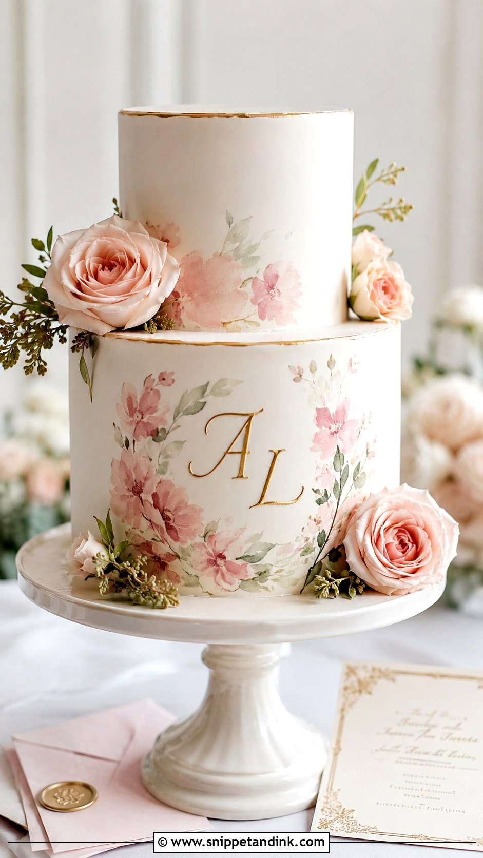
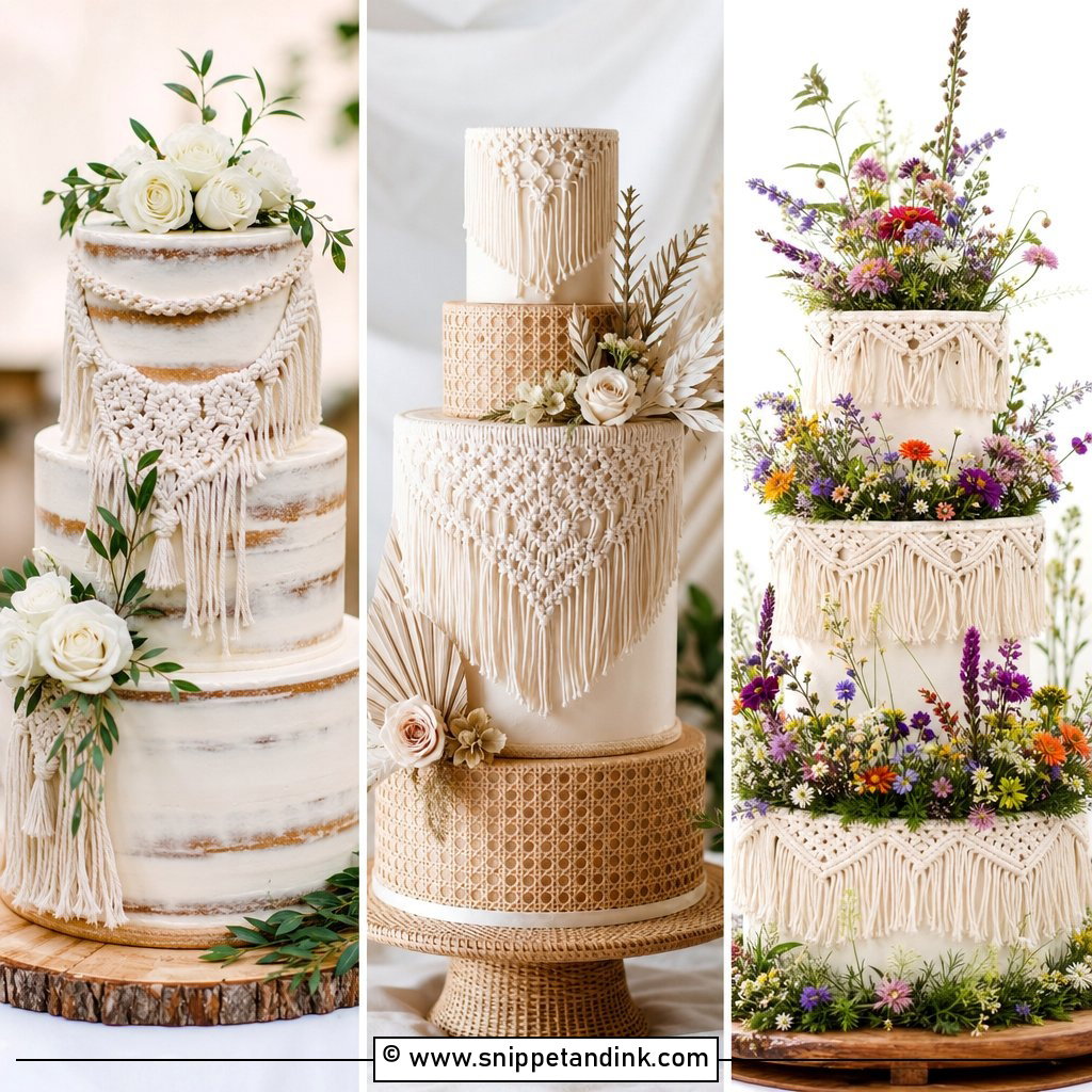
Painted initials are my favorite to do and the least forgiving. Watercolor lettering looks soft; metallic brushwork looks bold. Both need smooth fondant or very smooth, well-chilled buttercream, because a brush drags on a soft surface and leaves streaks. I usually copy the letterforms from the invitation, signage or crest so everything matches. One painted tier is plenty, with a few flowers nearby. Pale blush watercolor initials and gold edging on a white cake with fresh roses gives a one-of-a-kind piece without any heavy decoration.
16. Initials Inside Heart Wedding Cake
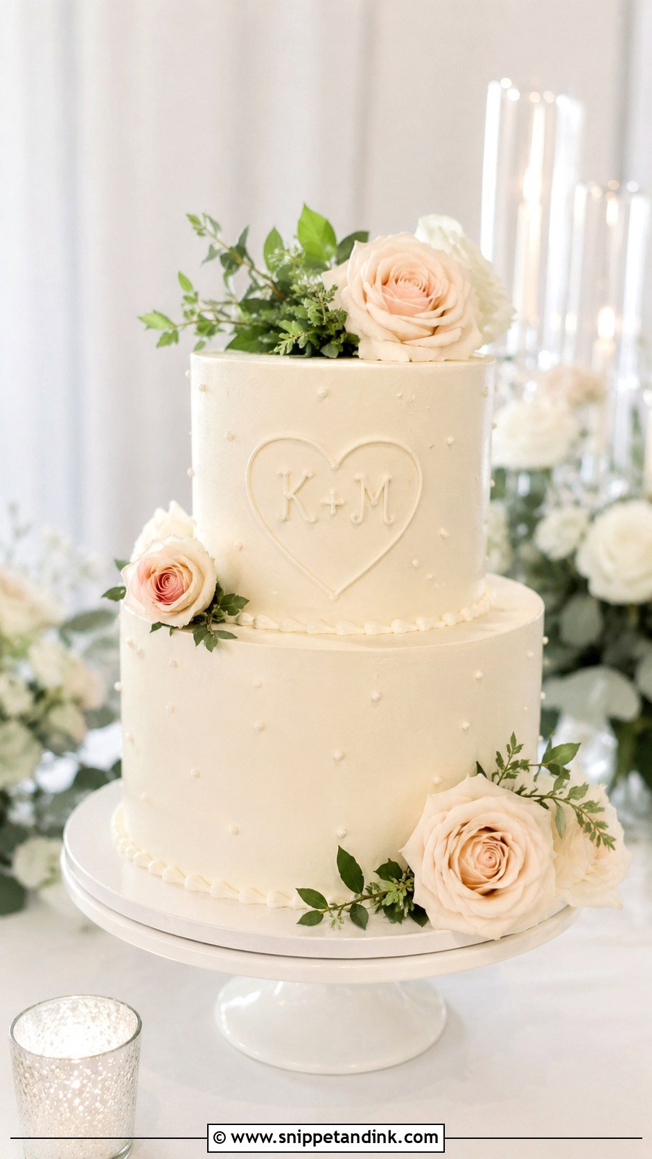
A heart around initials reads instantly, even from the back of the room. The finish decides the mood: a piped heart on buttercream feels traditional, carved-style letters on fondant bark feel outdoorsy, and a thin gold heart on one tier stays clean. It’s a good middle ground if you want visible personalization without a large topper. Tie it back to the rest of the cake with soft florals, pearl borders or greenery, or the heart can look like a sticker.
17. Initials With Wedding Date Cake
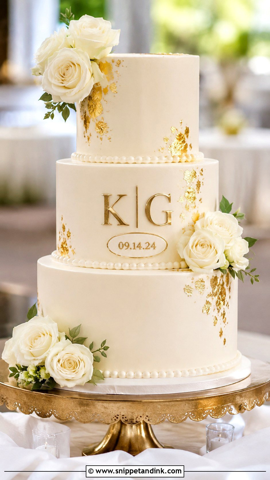
Adding the date makes the cake mark one specific day, but text adds up fast. I keep it to initials above a short date line, or a small plaque on the front tier. Numerals in script are surprisingly hard to read, so I often set the date in a plain serif even when the initials are in script. Using the invitation font for the letters keeps everything coordinated. Small weddings suit this best, since guests stand close enough to read it. Smooth ivory, gold initials, a date line and white flowers is the version I’d sketch first.
18. Initials And Last Name Cake
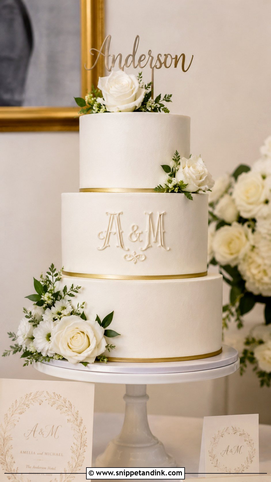
A shared surname works when the layout stays simple. The name can sit on a small fondant plaque, an acrylic topper or a hand-lettered front tier, with initials above or beside it. Long surnames are where it falls apart: the letters get squeezed to fit, and on a round tier the ends curve out of sight from any side angle. If the name is long, I put only initials on the cake and save the full name for the topper. A white three-tier cake with a gold surname topper, small initials, smooth buttercream and soft roses suits modern and formal receptions alike.
19. Initials On Black Wedding Cake
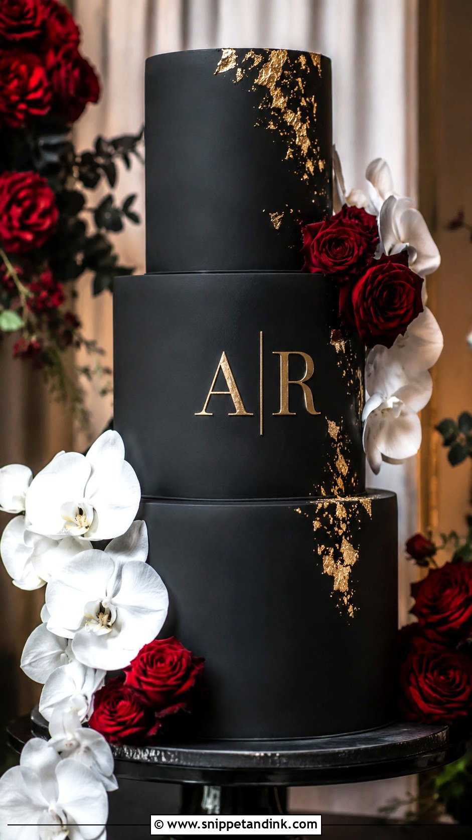
Black gives gold, white, pearl or silver letters the strongest contrast of anything here. It also stains. Deep black icing takes a lot of coloring, which can tint teeth and lips, so I usually cover the cake in black fondant or start from a chocolate base to use less dye. Clean lettering and a few accents, such as gold leaf, white orchids or deep red roses, keep it rich rather than busy. A matte black tiered cake with gold initials on the center tier suits evening receptions and formal venues.
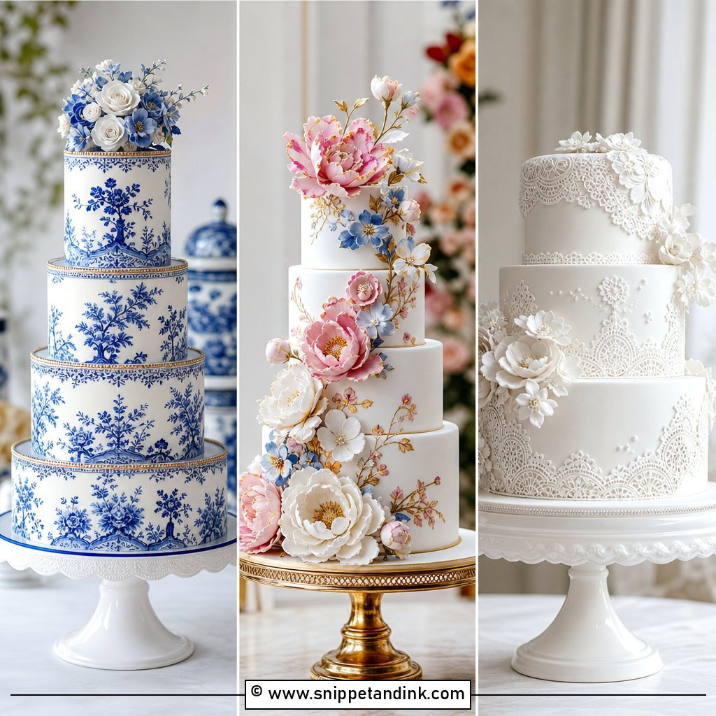
20. Initials On White Wedding Cake
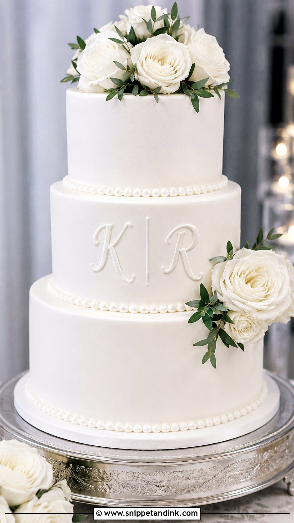
Initials on a white wedding cake are the easiest to style, since white takes any palette. White-on-white embossed letters are subtle, gold reads formal, piped initials read romantic, and flowers, pearls, lace piping and ribbon all show up without clashing. One thing to know: real butter makes buttercream naturally ivory, so if you picture stark white, fondant is the reliable route. I put the initials on the middle tier and leave the top for flowers or a small topper.
21. Blush Initials Wedding Cake
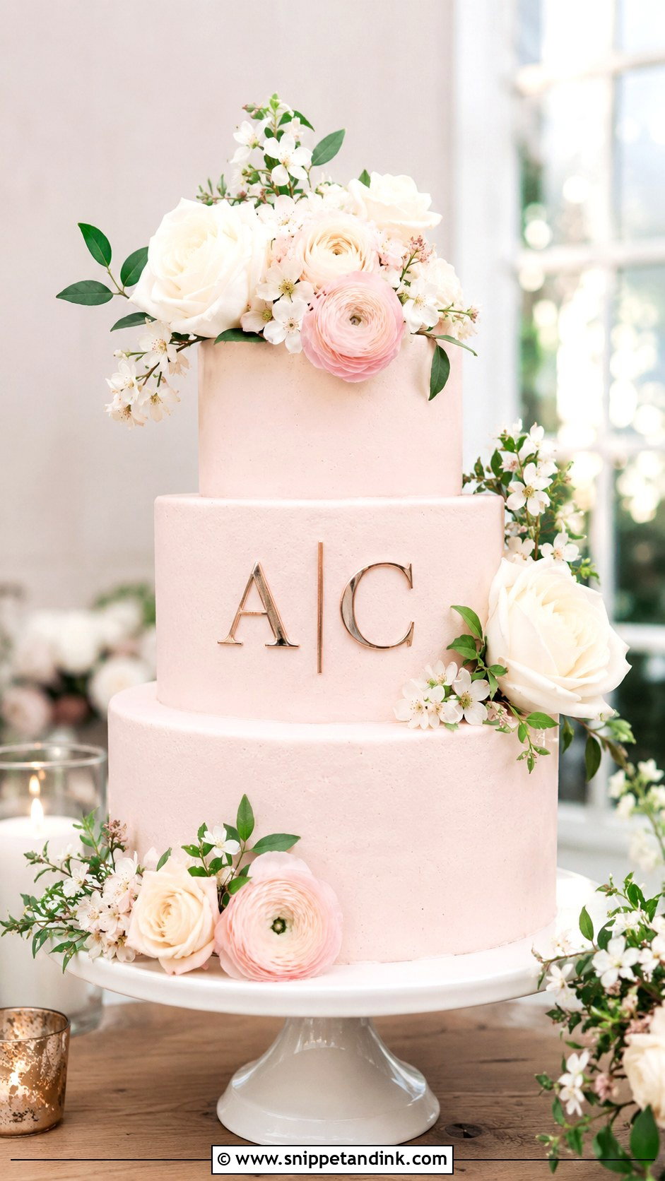
Blush flatters ivory, champagne, rose gold, sage and cream, and the initials can be rose gold acrylic, painted, pearl or raised fondant. Getting the shade right is the real work. Pink gel color keeps deepening for hours after it’s mixed into buttercream, so I mix it a touch lighter than the swatch, and I check it under warm light because blush can drift toward salmon. Blush roses, ranunculus, peonies or small white blooms suit garden and spring receptions. Keep it muted, or it tips toward a child’s birthday cake.
22. Marble Initials Wedding Cake
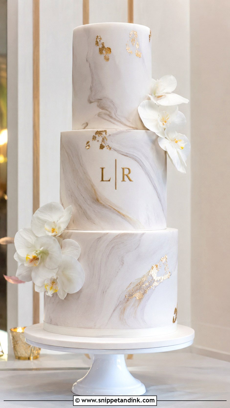
A marble initials wedding cake looks modern and upscale, whether the veining is soft grey on white, blush or darker stone tones. Busy veining swallows letters, so the initials need clear contrast in gold, black, white or raised fondant, and I keep the marbling lighter directly behind the lettering. Metallic accents, clean edges and a few white orchids are all two or three tiers need.
23. Initials With Fresh Flowers Cake
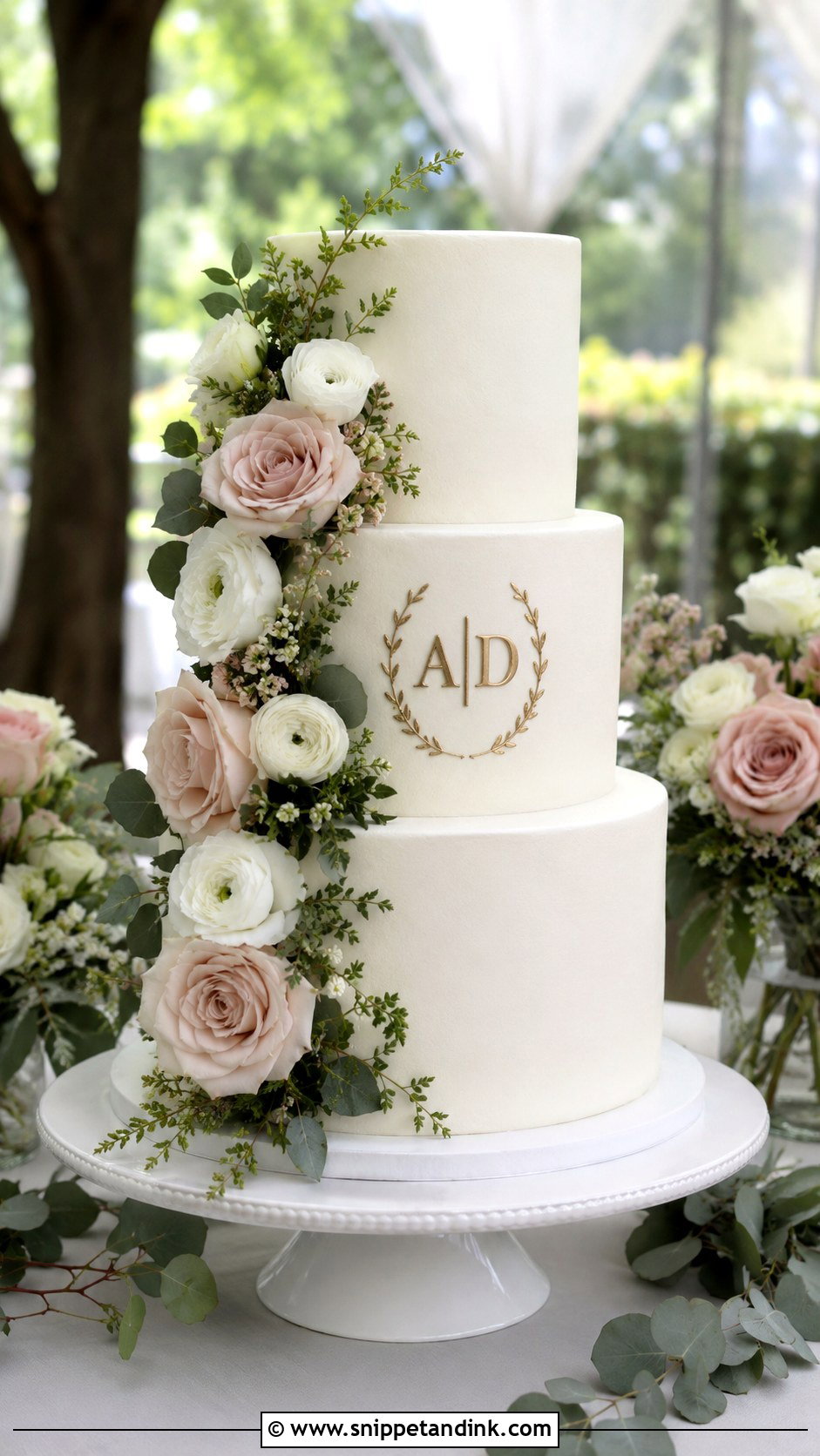
Fresh flowers frame initials well when they sit to one side of the front-tier lettering, or gather around a topper on the top tier. Matching the bouquet ties the cake to the rest of the decor, and roses, orchids, ranunculus and greenery are reliable picks. Not every flower or leaf is food safe, eucalyptus included, so I wrap stems in floral tape and use picks or a barrier for anything touching the cake. Before the cake leaves my hands, I check from the camera side that no bloom covers a letter. White buttercream, gold initials, blush roses and eucalyptus makes a fresh, easy pairing.
24. Initials With Sugar Flowers Cake
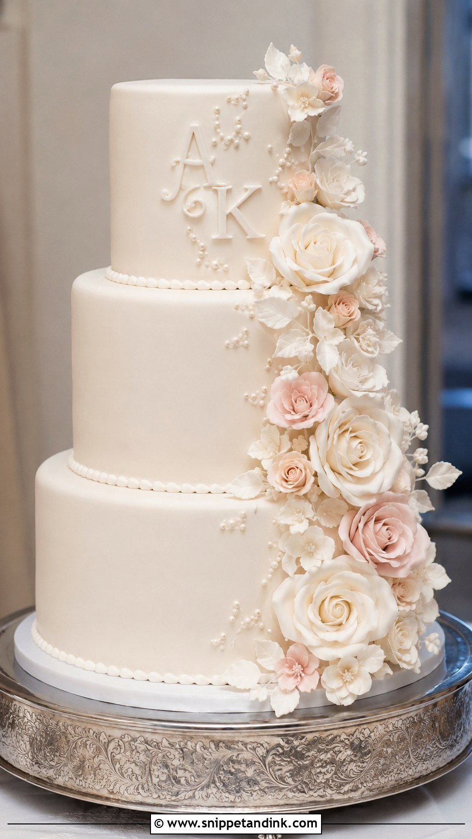
Sugar flowers mimic real ones and hold their shape for hours under warm lights, which fresh flowers won’t. They also take patience: a sugar rose is built petal by petal and left to dry, so they need ordering well ahead. They belong on smooth fondant at a formal wedding. Place the initials on the front tier and let the flowers cascade down one side. White, blush and ivory keep it classic, while bolder colors can match a strong palette. Raised initials with handmade sugar roses is the most detailed option in this collection.
25. Initials With Lace Wedding Cake
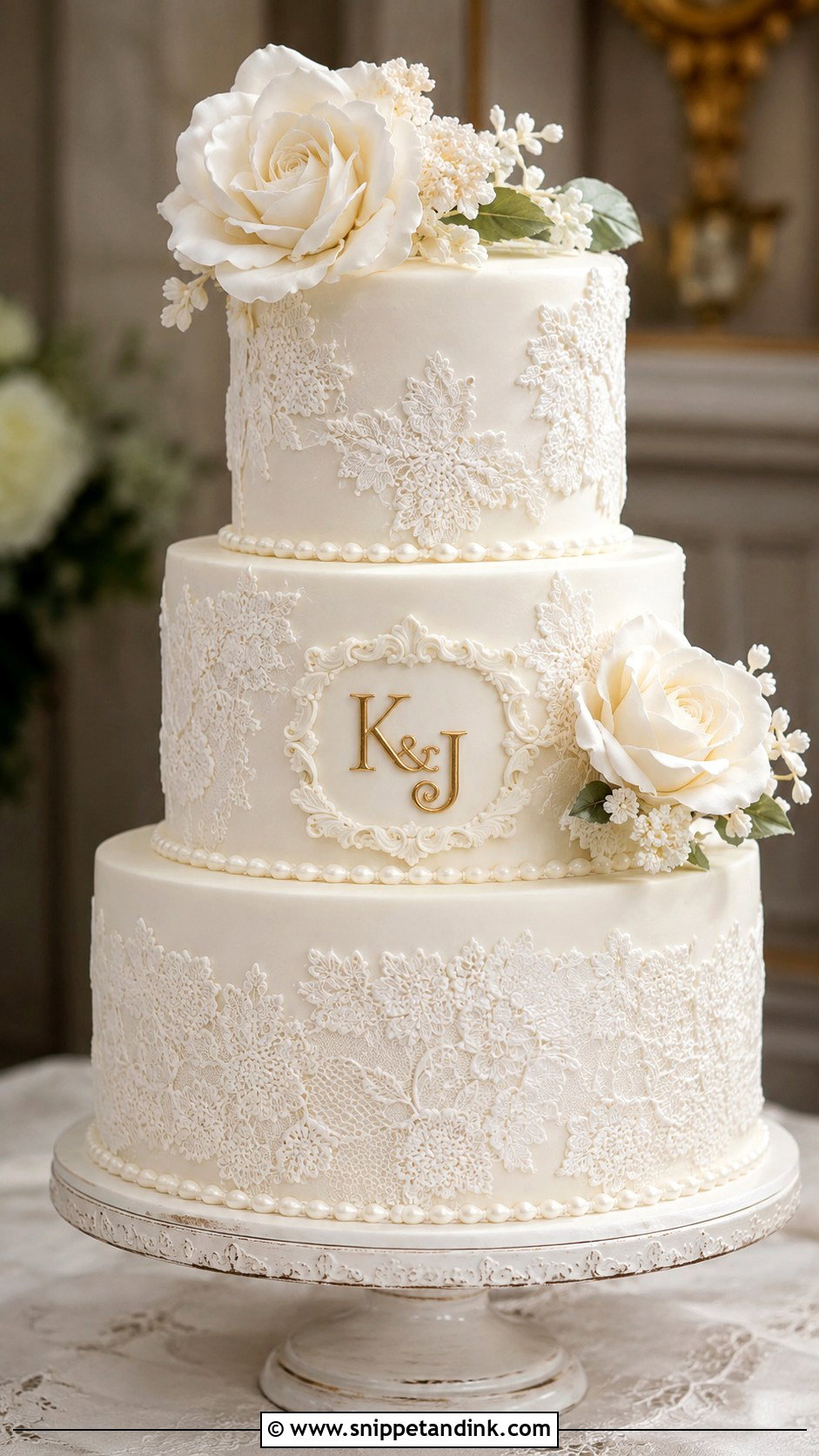
Lace feels bridal, especially when it echoes the lace on the dress or veil. It can be edible sugar lace, piped buttercream or fondant applique. Bring a photo or a fabric swatch of the gown’s lace to the tasting so the motif can be copied. The initials need a smooth frame or plain panel, otherwise they vanish into the pattern. Ivory-on-ivory is subtle; gold initials add contrast. Three tiers with lace texture, pearl borders and a small monogram on the center tier suit traditional weddings and chapel ceremonies.
From the Delivery Van to the First Cut
Lettering is the most fragile part of a decorated cake, and most damage happens in the few hours between delivery and cutting.
Warm rooms and soft letters
Piped buttercream initials start to slump once a room gets properly warm, and a cake carried from a cold fridge into a humid tent will sweat, which makes painted gold run. I’d ask the venue to keep the cake away from windows, heaters and the dance floor lights, and to set it out as late as the schedule allows.
Edible shine versus decorative shine
Some metallic dusts are labeled non-toxic rather than edible, which means they’re meant for decoration you remove, not for letters people will eat. Ask your baker which one they use on lettering that gets served. Edible gold leaf is high-carat gold and is safe in the thin amounts used on cakes.
Keeping the topper
Pull the topper before the cake is cut, or it ends up in the kitchen. Wash acrylic with warm soapy water and a soft cloth, and skip alcohol or glass cleaner, which can cloud or crack it. Wipe wood with a barely damp cloth and let it dry flat, then wrap either one in tissue so the letter edges don’t scratch.
Letters That Still Read From the Back of the Room
Initials can be as bold or as quiet as you like. A topper is easy to remove and keep, while piped, embossed, painted or fondant letters become part of the cake itself. Decide how visible you want them in photos, then let cake size and palette settle the rest. Readability is the test I use at every design meeting: if a script font or a cluster of flowers makes the letters hard to read from a few steps back, simplify. Rustic wood, pearl, gold or acrylic, the right initials make the cake unmistakably yours.
You'll Like These Ideas:


Leave a Reply